
How to setup CMS extensions for Shopware store

With a big catalog of 224+ extensions for your online store
A content management system (CMS) is a piece of software that allows eCommerce store owners to generate, update, and publish digital website content without having to write any code. Users may also change the style and feel of the online store. For Shopware store owners, CMS extension is included in the Professional Edition and becomes available to you instantly when you purchase the license. What matters is that it is important to learn how to configure it for your stores. In today’s blog post, we’ll take you through the process of setting up CMS extensions for Shopware store. Let’s dive deeper into it with the following sections.
An overview of CMS extensions for Shopware store
Do you want your clients to be able to examine goods quickly and simply without having to leave the shopping experience? You may enable the Quickview functionality for your items using this CMS Extension plugin, regardless of whether they’re featured in a Shopping Experience, landing page, category, or store page.
The scroll navigation is another function of the CMS-Extension. You may use this to set specific scroll spots within your world of experience, name them separately, and flawlessly guide your consumers around your world of experience.
The Quickview options may be accessed on the detail pages of the Shopping Experiences, and the scroll navigation settings can be found in every commerce element.

Key features
- The CMS functionality for your online store is included in the Professional Edition CMS.
- Quickview for your items that is easy to use
- It’s simple to turn on for different product sections in the store.
- The Quickview feature allows customers to stay within the Shopping Experience.
- It’s possible to activate it for a number of different product boxes.
How to setup CMS extensions for Shopware store
Now let’s see what you need to do to set up your CMS extensions for Shopware stores.
Functions settings
This feature allows you to see products right in the listing.
This implies the client won’t have to leave the Listing to receive a more in-depth look at the product.
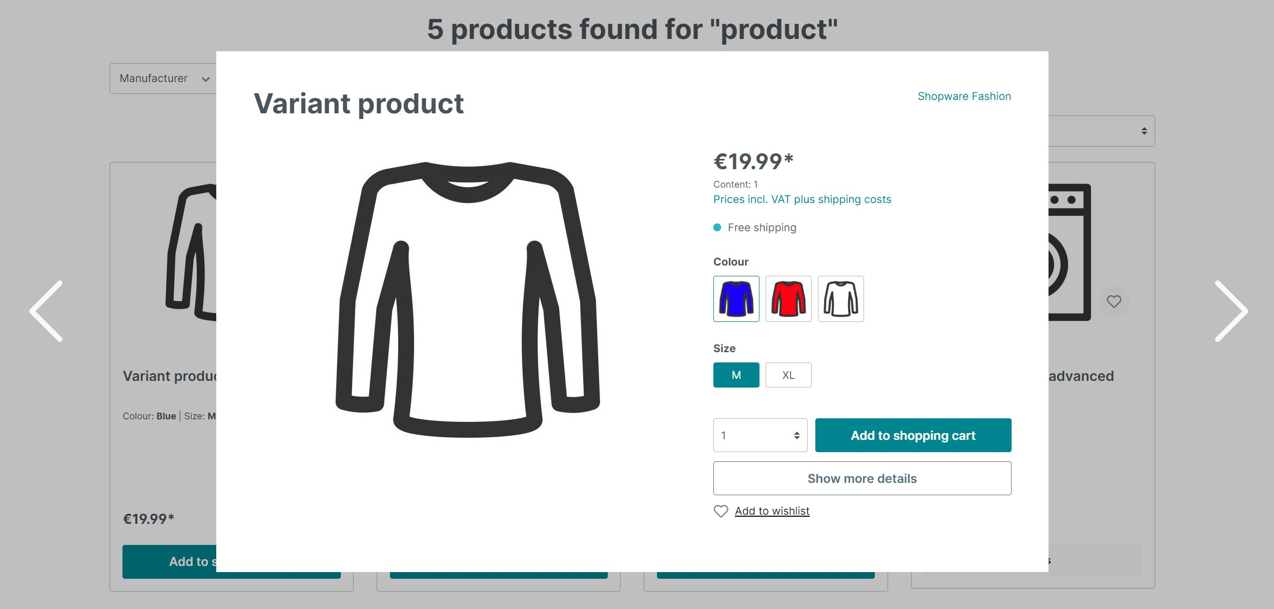
1. Quickview
The function may be turned on in the relevant shopping experience and is accessible for the following commerce elements: “Three Columns, Product Boxes,” “Product Slider,” and “Cross Selling.”
You can activate quick view (1) under item behavior if you have selected a related element in the shopping experience editor.
This will then be applied to all of the categories that this shopping experience is allocated to.


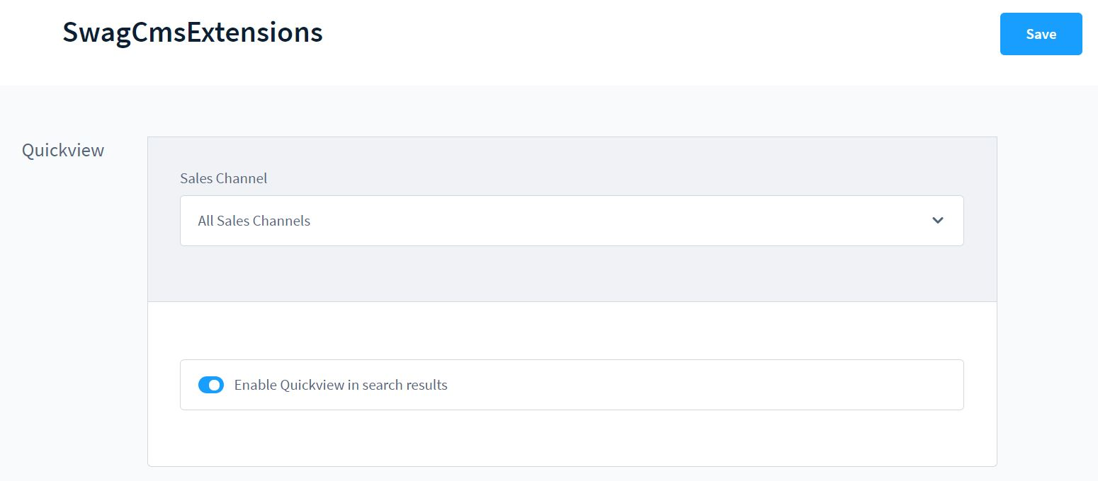
2. Search results Quickview
This product view can also be enabled for the search results.
This feature may be enabled directly in the extension’s setup. To do so, go to your extensions in the administration and click the three dots on the right-hand side to view the CMS extension’s setup. The function may then be activated and saved.
3. Navigation Points
The scroll navigation feature allows you to create navigation points in a purchasing experience. A navigation menu is presented on the left side based on these navigation points, allowing you to move straight to the specific parts. In addition, the URL parameters can be used to access the parts directly.
Activation
Each component of the shopping experience might have its own navigation point. The extension adds a new section Scroll Navigation to the section settings for this purpose.
To designate a navigation point, use the symbol on the left side of the section to enter the section settings (1). You may now unfurl the Scroll-Navigation configuration on the right side (2). You may name the navigation point (3) and activate it there (4). An extra symbol appears on the left side if the navigation point is active (5). This allows you to check if a section’s navigation point is active right away.

We recommend that each individual segment fills at least half of the screen; otherwise, going to the required area may be erroneous.
Animated scrolling
When hopping to a navigation point, this function will enable animation scrolling.
Animated scrolling (2) can be engaged in the settings of the shopping experiences (accessed through the gear wheel symbol) in the item Scroll navigation if at least one navigation point is configured in the shopping experiences (1).

You may customize your scrolling experience by selecting from a variety of scrolling behaviors (3) and setting an animation length (4). Other parameters (5) are available in addition to the continuous scroll behavior (linear). The elastic scrolling (6) animation allows the image to “jump” slightly before and after the scrolling action. Alternatively, you can change the course curve’s degree (7). This number governs the scrolling’s acceleration or deceleration (not with constant (linear) or active elastic scrolling).
Frontend view - desktop

To access the specific navigation points, use the navigation bar (1) on the left side.
The name of the section will be displayed if you hover your mouse pointer over one of the navigation points.
Frontend view - Mobile

The navigation menu is displayed at the bottom right of the mobile view. You may hop between the separate navigation locations by pressing the arrow button (1). To expand the menu, press the button with the three dashes (2).

Individual sections are now presented with their respective names in the extended overview (1).
Call by URL parameter
A navigation point can be accessed directly via a URL parameter. This is done by using the navigation point’s name. “Lorem Ipsum” is the name of the navigation point in our case. The URL is used to make the call: https://your-shop.com/Test-Landingapge/#lorem%20ipsum
4. Individual Blocks visibility
Using the rule builder rules, the plugin allows you to manage the visibility of particular blocks on a CMS page.

- Block (1): Select the desired block to update the parameters.
- Block settings (2): This opens the right-hand block settings.
- Visibility (3): Define the block’s visibility.
- Rule builder rule (4): By default, the block is always visible; choose a rule to control when it is hidden.
In case this is active, the set rule will be reversed. Visible if rule does not apply (5): If this is applied, the set rule will be reversed.
Individual forms settings
With the CMS extension for Shopware 6, you may add your own custom forms to the shopping experience in addition to the default form.
To add a form to a shopping experience, go to Content > Shopping Experiences and choose the one to which the form will be attached. Then, to create a new block, click the + sign and choose form as the block category. You may now bring your own form into your shopping experience, in addition to the default form, for example, for the contact.

A pop-up box appears, giving you the choice of using an existing template or creating a new one.
Even if you utilize a template, you may still make changes to it afterwards.
1. Options
The form settings window opens with the various choices and fields when you create a new form or change an existing one. The options tab is where you make the form’s basic parameters.

- Name (internal) (1): Enter the form’s internal name. If you save the form in the templates, for example, this name will be utilized.
- Headline (2): The headline is used as the headline for the form during the shopping experience, i.e. in the frontend.
- Confirmation text (3): As soon as the user has completed the form, the confirmation text appears.
- Recipient address (4): Enter all of the e-mail addresses to whom the completed form should be delivered. Simply hit the Insert key once after each address to enter multiple addresses.
- Email template (5): Choose an email template to deliver the form’s content to the recipients’ addresses.
2. Fields
You may choose which fields the user can or must fill out in the Fields tab. You may accomplish this by creating groups that include one or more fields.

- Group (1): The form’s groups are listed on the left side. You may adjust the order of the groups by dragging and dropping the dots on the left.
- Group context menu (2): On the right side of each group, you may alter its location, remove it, or duplicate it using the group context menu. You may also change the group such that other group selections appear on the right side of the screen. You may edit the group’s headline and enter the internal name of the group here. In the frontend, the header is also visible.
- Field (3): The fields are grouped together. Using the dots on the left, drag and drop the fields inside the group to modify their order.
- Context menu for a field (4): You can modify the field’s location, transfer it to another group, duplicate it, or delete it from the right side of the field. You may also update the field there to display more field options on the right side of the screen.
- Add field (5): This command adds a new field to the specified group.
- Add group (6): This button is used to create a new group with a field.
- Options (7): On the right-hand side, depending on whether you’re editing a group or a field, you’ll see additional choices for that group or field. When modifying a group, the information Name (Internal) and Heading will appear. The frontend will see the header, while the internal name will be used for internal identification. As an example, in email templates as a variable. When you modify a field, you may see which alternatives are presented here.
- Save as a template (8): You may save the form you just made as a template using this button. During your purchasing experience, you may alter and pick these templates.
- Finished (9): Click done to save all changes to the current form.
3. Field options
On the right hand side of the screen while editing fields, you’ll notice the choices you may change. Depending on the sort of field you’re updating, you’ll have different alternatives. For each category, however, the following options are always accessible.

- Internal Name (1): The Internal Name is a unique identifier for using this field as a variable. For example, in email templates.
- Name (2): This is the name that appears on the form in the frontend.
- Type (3): Select the type of field that should be used. This type controls which values can be input and how they should appear in the field. The types that are available are given below.
- Width (4): This is where you specify the width of a field. Two consecutive fields are displayed next to each other in the form if they consume a maximum of 100% of the width. This is helpful, for example, if data must be submitted in two fields yet the content must be entered concurrently.
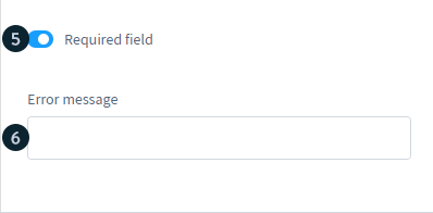
- Required field (5): Indicates whether or not the field is required.
- Error message (6): If a necessary field is not filled in, the user will see this message on the frontend.
Text field & email field
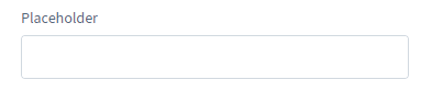
You can define a placeholder text to be displayed if the field type is Text or Email and the field has not yet been filled up.
Number field

You can indicate whether a minimum or maximum limit should be applied to fields of the type number. You may also define the stages the user can take to input numbers. If you put a 3 here, for example, the user will only be able to choose from the numbers 3, 6, 9, 12, 15, and so on….
Selection field
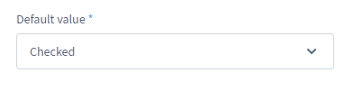
The user may activate or deactivate the selection field, which is a checkbox. You can indicate whether the field should be active by default or not in the default value.
Selection
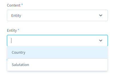
The selection type provides the user with a preset list of options from which to pick. Using content = entity in the second step allows you to choose which shop object the user may choose from.
Using content = user-defined in the second step allows you to input values from which the user can pick. Press the enter key after typing the values into the field values.
Text area

A lengthier text can be entered in the text section. You may also define how many lines the user can use and if the user can adjust the size of the text area in addition to the placeholder text.
Top 4 Shopware CMS Plugins
In case you need more facilitation from Shopware to level up your CMS, below is the list of Top 4 Shopware CMS Plugins. All of them are available in the Shopware Store.
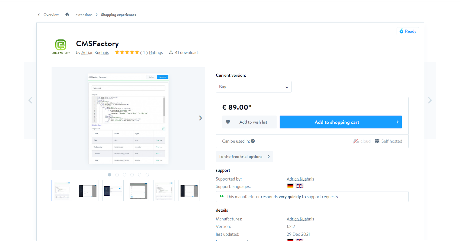
1. CMS Factory
You may create your own Shopping Experience Elements using the CMS Factory. Without the CMS Factory, every new element would need the development and installation of a separate plug-in. This is fairly simple to perform in the backend with CMS Factory. Any combination of text, media, and category fields can be used to create any input set. A repeater field is also offered for expanding lists, which can include any input fields. The element output template (Twig template) can be easily modified in the backend with no need for FTP access. CMS Factory builds a twig template (sample code) depending on the input fields as a convenience.
KEY FEATURES
- For shopping experiences, you may create your own CMS elements.
- It also facilitates the creation of your own output template (Twig template).
- It combines text, textarea, wysiwyg editor, media, category, product and variation, color picker, choice (custom values), and checkbox input fields.
- For the creation of expandable lists, repeater blocks are permitted.
- An example twig template is automatically produced.
PRICING
You can choose between buying and renting CMS Factory with the following pricing plans:
- Buying: € 89.00
- Renting (including trial month): € 7.95* / month Free including updates and support and will be cancelable monthly
2. ContentBuilder CMS
It’s simple to add, modify, and rearrange content blocks. The ContentBuilder may be converted from a desktop view to a tablet or smartphone view for control, allowing you to quickly and simply manage content for multiple resolutions. Shopware media management is integrated, and images and files can be added. Google fonts may be utilized for typographical design, and there are over 700 high-quality icons included, which can be easily picked. The ContentBuilder is supposed to enhance, not replace, the shopping worlds. The Wysiwyg editor may be fully disabled and replaced with a pure HTML editor.
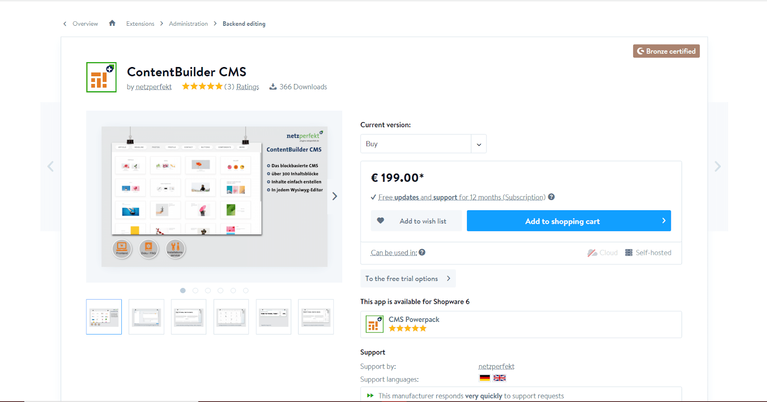
KEY FEATURES
- Every Wysiwyg editing field has a block-based CMS.
- You may choose a template, insert it, and edit it.
- It comes with a plethora of layouts, icons, and fonts.
- It features a Shopware media management integration.
PRICING
You can choose to Buy ContentBuilder CMS with € 199.00, including free updates and support for 12 months (Subscription) or try a 30-day free test.
3. CMS Powerpack
Each CMS element has a matching block, which makes integration into the shopping world more easier. Existing blocks may, of course, be swapped out for new elements at any moment. Furthermore, any CMS style may be utilized as the shop’s header and/or footer. As a result, comments or messages in the header and supplementary information in the footer may be quickly incorporated across the board. Snippets (and other Twig expressions) may be used in both articles and categories (name + description) (description only). This allows you to alter reoccurring description texts from a central location effortlessly! New elements will be added to the CMS PowerPack on a regular basis.

KEY FEATURES
- Grids and column layouts are available.
- CTA/Button element, Testimonial element, Alert element, Tab element, Accordion element, HTML / CSS element, Google Maps element, and Countdown element are all included.
- The CMS page may be integrated into the shop’s header and/or footer, as well as the order completion page.
- Snippets (name, description) + categories can also be used in articles (description),
PRICING
You can choose to Buy CMS Powerpack with € 99.00 including free updates and support for 12 months (Subscription) or try a 30-day free test.
4. CMS Bootstrap Grid Section
The CMS Bootstrap Grid Section plugin adds functionality to Shopware that was previously unavailable. Right from the CMS Page Editor, you may add rows and columns exactly as you would in code. Don’t bother changing your grid by adding new ‘columns’ blocks or expanding your theme. Create the layout of your dreams with this plugin. The plugin includes a new type of section that lets you pick grid configurations based on the Bootstrap grid at will.

KEY FEATURES
- Custom bootstrap grids and CCS classes are included.
- You may make a column into a sidebar.
PRICING
You can choose between buying and renting CMS Bootstrap Grid Section with the following pricing plans:
- Buying: € 49.00
- Renting (including trial month): € 6.00 / month Free including updates and support and will be cancelable monthly
Final thoughts
On a daily basis, the world of eCommerce takes on new forms. That’s why picking a great eCommerce CMS is so difficult - we have to think about everything from marketing to design to technological skills, as well as potential future requirements. Remember that buyers want excellent digital experiences, imaginative product presentations, and brand purpose from companies of all sorts and sizes, whether you choose an eCommerce-first or a content-first platform. We hope that our information in this post will help you out with Setting up CMS for your Shopware store.
Increase sales,
not your workload
Simple, powerful tools to grow your business. Easy to use, quick to master and all at an affordable price.
Recent Tutorials
How to insert Order Attributes to Transactional Emails - Mageplaza

How to add Order Attributes to PDF Order Template - Mageplaza
Setup Facebook Product Feed for Magento 2 - Mageplaza
Explore Our Products:
Stay in the know
Get special offers on the latest news from Mageplaza.
Earn $10 in reward now!


