

How to Show Custom Fields in the Storefront in Shopware

With a big catalog of 224+ extensions for your online store
In this article, we will focus on How to Show custom fields in the storefront in Shopware. The functionality is used to replace Shopware 5’s free text fields, allowing you to create custom sections and extend the basic data presentation in Shopware 6. The post discusses Shopware 6’s custom field kinds. Following that, you will learn how to use Shopware 6 to create custom field sets, and how to show custom fields on the interface.
Table of Contents
- What are Shopware Custom Fields types?
- How to Create Custom Fields in the storefront in Shopware
- How to Show Custom Fields in the storefront in Shopware
- Final thoughts
What are Shopware Custom Fields types?
Custom Fields are used to add additional fields to certain program areas. For instance, you can use custom fields to display any additional information about products or categories that is not already included in the standard system.

The following are the available custom fields:
1. Select
You can define many alternatives for this custom field type after selecting. The following configurations are available:
- ** Technical name**: A system-specific identifier for your field. It is unchangeable.
- Position: The custom field’s sort order within the set: The lower the value, the more prominent the custom field is displayed.
- Required: This toggle controls whether or not a selection is required.
- Label: A name for the administration modules that is user-friendly.
- Placeholder: Text which is displayed in the dropdown menu in the absence of a selection.
- Help text: Additional information is displayed when a blue question mark symbol has hovered over.
- Multi-select: A toggle switch that specifies whether or not multiple alternatives can be selected.
2. Object selection
This field type enables you to make direct references to existing data fields by selecting direct references. The following configurations are available:
- Technical name: A system-specific identifier for your field. It is unchangeable.
- Position: The custom field’s sort order within the set: The lower the value, the more prominent the custom field is displayed.
- Required: This toggle controls whether or not a selection is required.
- Label: A name for the administration modules that is user-friendly.
- Placeholder: Text which is displayed in the dropdown menu in the absence of a selection.
- Help text: Additional information is displayed when a blue question mark symbol has hovered over.
- Multi-select: A toggle switch that specifies whether or not multiple alternatives can be selected.
3. Text field
A text field can be configured in the following ways:
- Technical name: A system-specific identifier for your field. It is unchangeable.
- Position: The custom field’s sort order within the set: The lower the value, the more prominent the custom field is displayed.
- Required: This toggle controls whether or not a selection is required.
- Label: A name for the administration modules that is user-friendly.
- Placeholder: Text which is displayed in the dropdown menu in the absence of a selection.
- Help text: Additional information is displayed when a blue question mark symbol has hovered over.
4. Media
You can include a media file in frontend pages using this field. With this Shopware 6 custom field, the following setups are available:
- Technical name: A system-specific identifier for your field. It is unchangeable.
- Position: The custom field’s sort order within the set: The lower the value, the more prominent the custom field is displayed.
- Required: This toggle controls whether or not a selection is required.
- Label: A name for the administration modules that is user-friendly.
5. Number
You may enter numbers in this box. Assemble it in the following manner:
- Technical name: A system-specific identifier for your field. It is unchangeable.
- Position: The custom field’s sort order within the set: The lower the value, the more prominent the custom field is displayed.
- Required: This toggle controls whether or not a selection is required.
- Label: A name for the administration modules that is user-friendly.
- Placeholder: Text which is displayed in the dropdown menu in the absence of a selection.
- Help text: Additional information is displayed when a blue question mark symbol is hovered over.
- Number type: Specify the number type for the entries – integer or float.
- Steps: Specify the sequence of possible events.
- Min/Max: Provide the smallest/largest possible values for the input.
6. Date/Time
This field corresponds to a date and time selection mask. It comes with the following setup options:
- Technical name: A system-specific identifier for your field. It is unchangeable.
- Position: The custom field’s sort order within the set: The lower the value, the more prominent the custom field is displayed.
- Required: This toggle controls whether or not a selection is required.
- Label: A name for the administration modules that is user-friendly.
- Help text: Additional information is displayed when a blue question mark symbol has hovered over.
7. Checkbox
Utilize this custom field to include a checkbox that displays a boolean value (“0”/”1”). Assemble it in the following manner:
- Technical name: A system-specific identifier for your field. It is unchangeable.
- Position: The custom field’s sort order within the set: The lower the value, the more prominent the custom field is displayed.
- Required: This toggle controls whether or not a selection is required.
- Label: A name for the administration modules that is user-friendly.
- Help text: Additional information is displayed when a blue question mark symbol has hovered over.
8. Active/Inactive switch
A similar possibility is provided by a switch: It performs background operations on a boolean data set:
- Technical name: A system-specific identifier for your field. It is unchangeable.
- Position: The custom field’s sort order within the set: The lower the value, the more prominent the custom field is displayed.
- Required: This toggle controls whether or not a selection is required.
- Label: A name for the administration modules that is user-friendly.
- Help text: Additional information is displayed when a blue question mark symbol has hovered over.
9. Text Editor
Include stylized text in templates by entering it within the editor:
- Technical name: A system-specific identifier for your field. It is unchangeable.
- Position: The custom field’s sort order within the set: The lower the value, the more prominent the custom field is displayed.
- Required: This toggle controls whether or not a selection is required.
- Label: A name for the administration modules that is user-friendly.
- Placeholder: Text which is displayed in the dropdown menu in the absence of a selection.
- Help text: Additional information is displayed when a blue question mark symbol has hovered over.
10. Color Picker
This Shopware 6 custom field enables the user to select a color from a palette. Additionally, you can input a HEX color code:
- Technical name: A system-specific identifier for your field. It is unchangeable.
- Position: The custom field’s sort order within the set: The lower the value, the more prominent the custom field is displayed.
- Required: This toggle controls whether or not a selection is required.
- Label: A name for the administration modules that is user-friendly.
How to Create Custom Fields in the storefront in Shopware
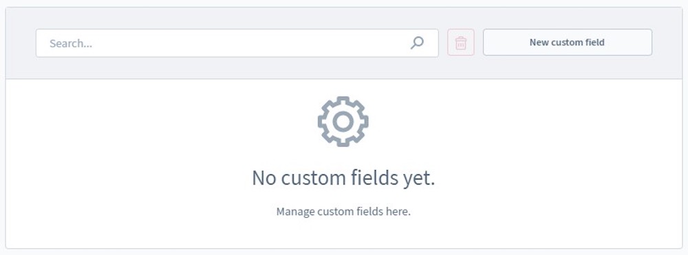
Step 1: Find the Custom Fields page
Custom fields can be created via Settings > System > Custom fields.

The panel displays pre-configured Shopware 6 custom field settings. You can either delete or edit them using the context menu on the right.

Step 2: Add a new Set
Click on Add new set to create a new custom field.

Step 3: Configure the Set settings
Take note that custom fields are no longer created directly for a program section in Shopware 6. Rather than that, you must do it using the administration’s settings section. Custom fields in Shopware 6 are organized into groups and allocated to one or more program areas, such as product pages or categories.
As previously stated, you must click the Add new set button in Shopware 6 to create a new set of custom fields. The following window appears like this:

To create a new set, specify a unique technical name. Bear in mind that it cannot be changed later. Additionally, you can modify the field’s position and label (frontend display). With the “Manage labels in all administration languages” checkbox, Shopware 6 enables you to apply localized labels. You can also attach your set to store pages.
Select Save after finishing your settings.
Step 4: Create a new Custom Field
Click on New custom field to generate the new custom field for your store.
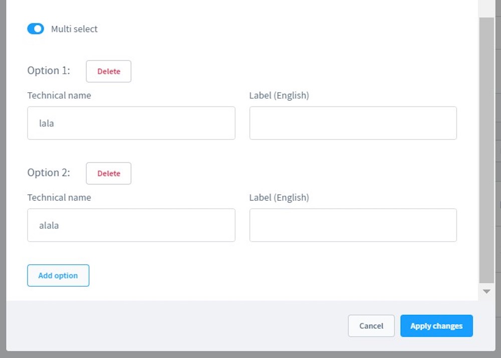
Other options may vary depending on the field type selected. In the example below, you must additionally define the technical name, position, if the field is necessary or not, label, placeholder, and help text for the field.

Select whether the custom field is multi-select or not and configure its settings.
Step 5: Add value to the Field
Then, return to the list of products and add value to the fields. Choose Product > Edit > Specifications > Custom Fields Selection > Insert Data > Save.

How to Show Custom Fields in the storefront in Shopware
Adding new fields to the storefront is a straightforward process. Twig is basically used in the following way:

Final thoughts
These are all you need to know about Shopware Custom Fields and how to generate them as well as display them in the frontend.
Do you find this article informative? If yes, stay tuned for even more useful instructions, tips and advice from us. With the help of our team, creating and managing an eCommerce business is just a piece of cake.
Increase sales,
not your workload
Simple, powerful tools to grow your business. Easy to use, quick to master and all at an affordable price.
Recent Tutorials
How to insert Order Attributes to Transactional Emails - Mageplaza

How to add Order Attributes to PDF Order Template - Mageplaza
Setup Facebook Product Feed for Magento 2 - Mageplaza
Explore Our Products:
Stay in the know
Get special offers on the latest news from Mageplaza.
Earn $10 in reward now!


