

How to Create a New Layout in Shopware

With a big catalog of 224+ extensions for your online store
A print or digital design’s overall effect may be greatly influenced by the page arrangement. The goal of design should always be to convey information to the viewer in a straightforward and understandable manner, regardless of whether the medium is print or digital. Creating a balanced page layout is a great method to guarantee that the reader gets the most important points across.
Understanding the importance of designing layout, our article today will answer the question How to create a new Layout in Shopware. If you are having trouble or new to the platform, this is perfect for you. Keep reading to find out more!
Table of contents
- Shopware Layout Overview
- How to Create a New Layout in Shopware?
- How to edit your Shopware Layout?
- Conclusion
Shopware Layout Overview
From your Shopware main menu, open the “Shopping Experiences” section just right under the “Content”, where content pages like landing pages, store pages, and category layouts may be created and managed in one place, making it easier for you to keep track of them. Sections of the layouts are divided into blocks, each of which has a single element, such as text or an image:
All layouts that have been produced are shown in the overview. You may search for a layout in the search box. The “Sort by” drop-down option lets you sort the list based on the date it was created or last edited:

Using the left-hand menu “Layouts”, you may sort layouts alphabetically or by theme. You may, for instance, only show products from a certain store or from a specific landing page.
In each entry, you may remove or preview the layout by clicking on the context menu at the bottom of the entry page. In order to help you identify between the layouts in this overview, we’ve included this preview.
You may build a new layout with the button “Create new Layout”. A single click is all it takes to make changes to an existing layout.
How to Create a New Layout in Shopware?
Now in order to diversify your website, we will need to create a brand new Layout using Shopware provided tools. Follow the following steps and you will be able to produce an outstanding layout in just a few minutes.
Step 1: Click on “Create New Layout”
When you navigate to the “Shopping Experiences” section from your Shopware Dashboard, you will see a blue button saying “Create new Layout” located on the right corner of the screen. Click on it just like what we did below:

Step 2: Decide the Layout Type
The page type for which you wish to build a layout must be specified after clicking “Create new layout”. Firstly, you may better arrange your layouts in the overview this way. Additionally, you have the option of selecting from a variety of blocks based on the block type. Shop, landing, and category pages are all now supported:
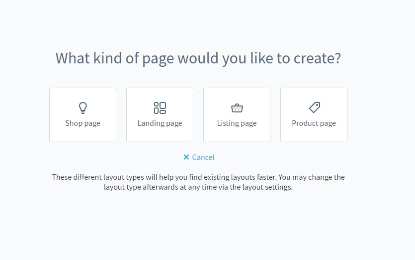
- Shop Page: All of your store’s service pages should be considered as shop pages. The terms and conditions page, the shipping conditions, and the contact form, for example, all fall within this category.
- Landing Page: A vast variety of design and marketing possibilities are available to you via landing pages. These serve the consumers that are browsing your store, or they can be themed sites where marketing can be done.
- Category Page: A product listing appears by default on the category page. Additionally, you have the option of displaying category-specific content on a category page. Use the Data mapping option at the upper right of the text element editor to choose the dynamically displayed text.
- Product Page: Each product has its own page, where you can find all the details about it and add it to your shopping cart. It’s currently possible to include a product description or a buybox with a product picture gallery. However, you have the option of designing the whole page from scratch.
Step 3: Choose the Layout Structure
After you’ve selected a Page Type, you need to customize the layout by deciding how each component of the page is organized. You may use either a sidebar or the whole width of the page as a layout. The category navigation or filtering will be shown in the sidebar:
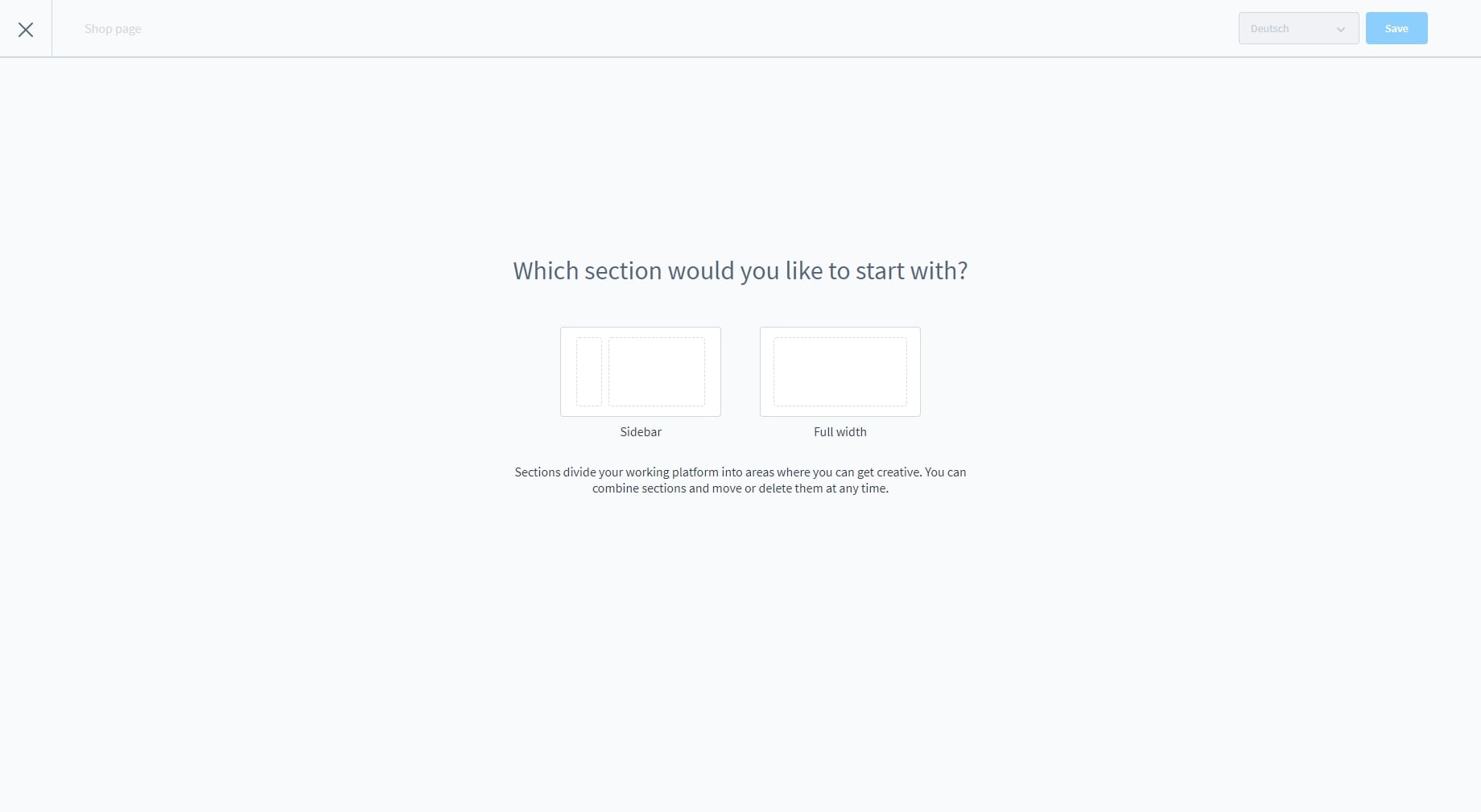
Additional parts may be added at a later time, and they might have a different layout from the one first selected.
Step 4: Assign the name
A name is required for the layout that you are designing in the next step. Choose a name that accurately conveys the mission of the new created Shopware layout:

Step 5: Save your changes
Once everything is done, the Layout Editor will open, which will be further discussed in the next part of our article!
How to edit your Shopware Layout?
These are the steps where you will be making your Shopware Layout more visually appealing in the customers’ eyes. Stay close to our tutorial because it is going to waste more time compared to the creation process.
Step 1: Open the Layout Editor
As we have mentioned previously, the Layout Editor will automatically open when the creating steps are completed. In the layout editor, you may create new layouts and modify current ones:

In the image is your layout’s primary editing space. On the right side of the screen, you’ll see the menu bar, where you may access the many editing options. Settings, Blocks, and Navigator make up the bulk of the app. Clicking on a single block or the whole section, for example, will take you to either the Block Settings or the Section Settings page.
The section that follows provides further specifics. The “+” buttons in the editor allow you to create a new section at any time. It’s not necessary to follow the current section’s structure (with or without sidebar).
Switch between the various viewports using the devices icons in the screen’s top bar. This will show you how the layout appears in each one. It’s easier to fill existing items using the list view since there is no need to open each one.
Step 2: Change the Settings
The layout name and layout type may both be modified in the “Settings” after they have been created:

Step 3: Adding Blocks
Predefined blocks are accessible under the “Blocks” menu item and may be selected from a drop-down menu organized by category. It is possible to fill each of the blocks with different content.
Feel free to drag and drop your Blocks onto the web page at any place you want it to appear:

Move the mouse over an element in the preview to make changes to its content. The top right corner of the element will show two symbols. It is possible to specify the content of an element by clicking the gear symbol. A picture may be substituted for text using the symbol with the two arrows:

Text Block
Blocks that exclusively include text are known as text blocks. These may be found in a variety of forms. A text editor may be used to change the text in the text element’s settings. The data mapping may be found on the right side of the editor, above the editor, if you’ve selected Category Page as your layout type. A dynamic category description may be selected here and then shown in this element by clicking on the drop-down menu:

In addition to variables, category and product pages may also include them. This enables you to retrieve product or category information and include it into the text. The editor functions may be used to format the variables (e.g. bold). Keep in mind that the curly brackets “” are included in the formatting of the whole variable. Because if the variable isn’t properly saved in source code, the real content can’t be substituted for it.
Images
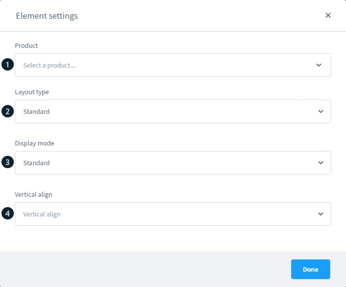
These are the blocks that only carry your images, mostly would be product pictures. You have the ability to alter the image that will be shown. Using the “Data assignment” item, you may have the image’s content be filled in for you. You may, for example, provide a preview picture of the product or the manufacturer on a product page. You may use the data assignment to show the category image of the allocated category on a category page:

With the “Display Mode” field, the picture may be presented in any way you like. If you’re using Standard, the picture will fit inside the box up to its original size. When you use Fill, the picture in the box is totally filled in. Stretch enlarges the picture to fit the box’s dimensions.
Then, you may choose whether the picture should be shown in the middle, on the top or bottom edge, or in any other way through the “Vertical Alignment” field.
Finally, the “Link to” will be the place where you provide the URLso that customers can connect to it when you click on the picture. Either in the current tab or a new one.
Slider and Gallery
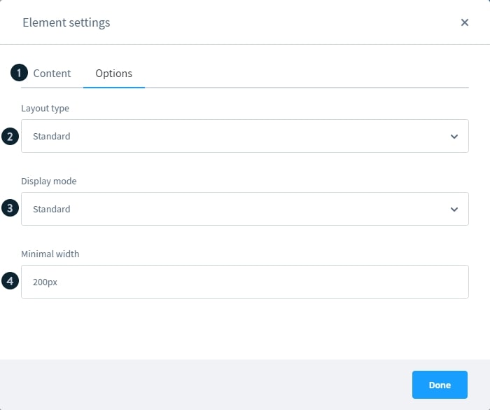
There are three “Display mode” for you to choose when it comes to these sliders:
- Standard: The picture is shown in its entirety. As a result, the slider’s overall height is dynamic and will change as needed. So it’s best if all photos in the slider are of the same aspect ratio, otherwise the components below it will “jump up and down”.
- Cover: The picture has entirely occupied the space inside the element. This results in the stretching of smaller pictures (and thus possibly appearing blurred). As a result, the longer side of the picture is omitted, and the whole image is not seen.
- Contain: The element’s height is automatically calculated based on the most recent picture that has been submitted. When moving between photos, this does not change, unlike the standard mode. The vertical alignment item may be used to set the position of lower pictures.
Other settings included in the “Slider” blocks are:

- Minimum height: Only the Fill display mode has access to this option. Unless an entry is made, no photographs will be shown. The number is entered as an integer in pixels, with the suffix “px” appended immediately thereafter. In this case, the entry would appear like 500px.
- Vertical align: Located in the display mode contain menu, this option allows you to choose where the photos should be shown inside the slider element. Free spots are shown for photographs of a lesser size.
- Arrow navigation: Adds arrows to the photos so that you may scroll through them. It’s up to choose whether or not the arrows appear next to or on top of the picture that’s being shown.
- Dots navigation: The dots navigation may be used instead of the arrow navigation. A little dot indicates each deposited picture and may be used to immediately access the corresponding image. The picture may be shown above or below the display.
- Link to: You may add an external link for each picture you submit to the slider so that when clicked, the image will take the user to that location. Alternatively, you may use a checkbox to specify whether the link should be opened in a new tab.
Commerce
You’ll discover a variety of product-specific blocks in the commerce blocks to help you provide and promote items in your store.
A text block and an image block make up the product name and logo block. During a product page, the text box is filled with the product name, and the picture block is highlighted and linked with the manufacturer’s logo:
Then we will have the Product slider settings, which would be something looking like this:
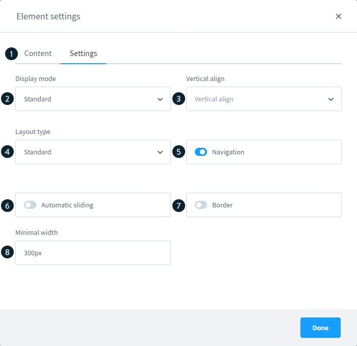
- Content: The title of the slider and the goods that will be shown in the slider are both entered in the content tab.
- Display mode: just like a typical slider, it will be displayed in three different modes including Standard, Cover and Contain.
- Vertical align: this field contains an option that controls how the photos are to be arranged in the slider element. Displayed open spaces related to smaller photos.
- Layout Type: Product presentation is outlined in this document. A huge picture or little text may be shown for the product in the default view.
- Navigation: The side navigation arrows may be turned on or off here.
- Automatic sliding: This option causes the slider to cycle through the next product every five seconds.
- Frame: A frame may be drawn around the slider in order to isolate it from the rest of the interface.
- Minimum width: This number determines the smallest possible box width for each product.
There is a Gallery photo block and a Buybox in each of the blocks. A product may be connected in the Buybox, as well as the specific location of that product inside the Gallery block. The gallery and the buybox are automatically connected to the designated product if the world of experience is a product page.
The description of the product and a customer review may be found in this section. In the element options, you may choose the product for which this block will be used. Whenever a block appears on a product page, it’s immediately associated with the corresponding product.
Moreover, you will also find the “Cross Selling” block where all the settings field works similarly with the image sliders:
In order to make your shop page look even more outstanding, feel free to insert Youtube or Vimeo videos. For those Youtube links, it is possible to customize the appearance of a video link after it has been produced. If you use the advanced privacy setting on YouTube, no visitor data will be saved until after the video has been seen. The start and finish times allow you to pinpoint precisely where in the video you want to see:

For Vimeo films, you can also pick the color of the navigation bar and the information that the video producer will put on display:

In the element settings, you may first choose whatever form you want to show in the form block. A title and a confirmation message may also be added. You may specify the recipients of the completed form in the “Settings” page:
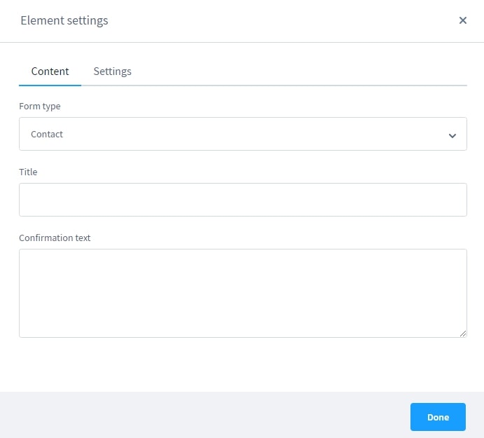
After a customer fills out the contact form, it is sent to the store owner. The contact form email template is available in the email templates and may be modified.
“Sorting” allows you to choose how the goods in the product listing are displayed:

- Show product sorting: This product listing’s sort order selection may be activated or deactivated from this page.
- Use custom sorting: In the Settings > Shop > Products area of the app, you may pick a default sorting for your products.
- Default sorting: If you have enabled custom sorting, you may choose the default sorting for the product list. It’s possible to customize the sorting by going to Set Up > Shop > Products and making changes there.
- Product sortings: Here you may pick all the assortments that the consumer should be able to choose from in the product listing. The assortments are then shown in the front end as a drop-down menu.
- Priority: Double-click the priority in the list of chosen sorting choices to modify it. Priority-based sorting is shown in the front-end, with the most important alternatives first.
- Delete: The chosen sorting option may be removed from the list by using the drop-down menu on the right.
Step 4: Configuring your Blocks
Using this method, you may access the settings for a block by selecting the block settings icon found directly below the plus symbol for new blocks in a preview. In this section, you may configure the basic options for the block you’ve presently chosen:

- Name: Using this name, the block may be better identified. For instance, it may be seen in the navigator.
- Background color: The background color of the block may be selected here. The hexadecimal value of color may also be used to provide a consistent appearance.
- Background image: You have the option of uploading your own background picture in place of the default one. Background images for text and patterns are two examples of how you may use this picture.
- Image mode: Choose whether or not the picture fills the block or is aligned with the block if you’ve made a background image for it.
- Layout settings: Adding your own CSS class and defining the spacing between a block’s items and its edges are both possible under the layout settings.
Step 5: Website navigation bar
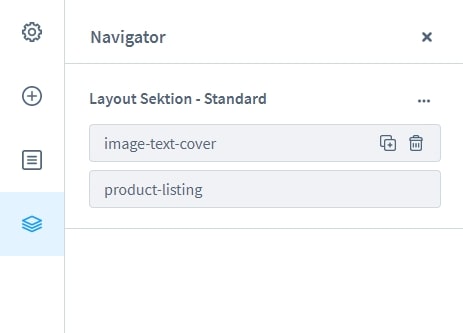
All blocks are listed alphabetically in the navigator. Drag and drop is used to rearrange the blocks. You may build a clone of a block by pressing the plus sign. You may remove the block by clicking on the trash can icon:
Step 6: Assigning shopping experience to your pages
In the Layout Editor, you may assign categories directly. Click on Layout assignment in the right-hand menu to get started. Open the assignment window by clicking the “Assign layout” button:

Select categories in the assignment box by clicking on the Select categories section. Click the “Assign layout” button to make the selections permanent:

As long as one or more chosen categories have a different layout, another confirmation box opens in which you have to approve the change again:

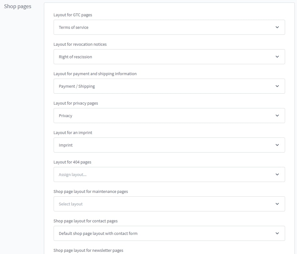
Shop pages like terms and conditions and imprints are shown using experience worlds. In the store pages area, go to Settings > Shop > Basic information and complete the assignment:
The category listing may be customized using the experience worlds available in each category. On the other side, a landing page may also be assigned:

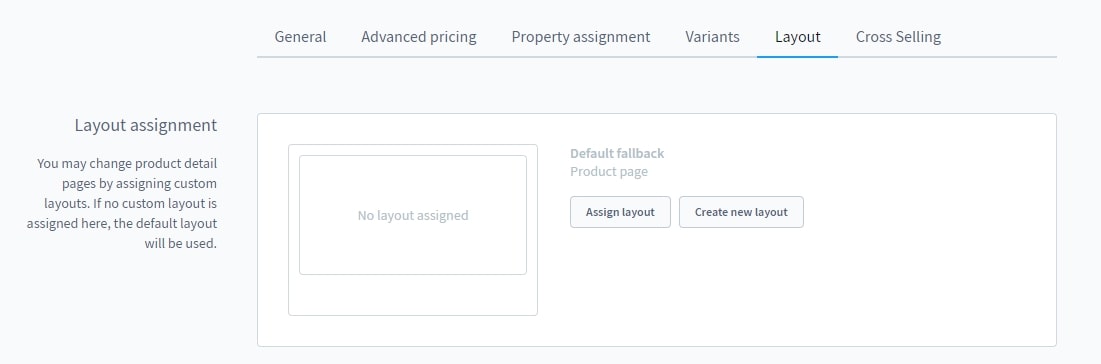
You may use the shopping experience to develop product pages that can then be linked to items. You may do this by going to the Layout tab on the product’s Admin page. Then choose a product page that you’ve already built:
Step 7: Save and view the results
After everything is set and done, don’t forget to “Save” your work or else you may have to start all over again!
Conclusion
To sum up, we hope that our article today on How to create a new layout in Shopware has provided you with everything related to the subject. From then, designing your own storefront will become easier than ever. If you have any questions, please let us know in the comment section below!
Increase sales,
not your workload
Simple, powerful tools to grow your business. Easy to use, quick to master and all at an affordable price.
Recent Tutorials
How to insert Order Attributes to Transactional Emails - Mageplaza

How to add Order Attributes to PDF Order Template - Mageplaza
Setup Facebook Product Feed for Magento 2 - Mageplaza
Explore Our Products:
Stay in the know
Get special offers on the latest news from Mageplaza.
Earn $10 in reward now!


