
What is a Landing Page? 8 Tips to Optimize your Landing Page
Summer Nguyen | 03-02-2020

The Most Popular Extension Builder for Magento 2
With a big catalog of 224+ extensions for your online store
Searching on the Internet, you may see the term “landing page” everywhere. It raises a question in people’s minds that what exactly is a landing page, why it is important and different from other pages. The definition of a landing page would not be completed, but it is not just a word or a form to show.
In this blog, we would love to provide a comprehensive introduction to the landing page, and you can find some tips to improve to create a useful landing page.
What is a landing page?
A landing page, you may know under other names like a destination page or a lead capture page, is a standalone web page that appears when a potential customer clicks on an online advertisement, a search engine link, marketing promotion, or marketing emails.
In simple terms, a landing page is a web page that has the same interface, content, and domain name as a normal web page and only focuses on a specific purpose of the content. The content of the landing page focuses on the needs of viewers. It can be a topic, an introduction of a particular service or products.
Landing pages eliminate unnecessary objects such as navigation paths, toolbars, footers, etc. and focus entirely on intended action. The action that an audience takes on the landing page meets the shop owner’s goal. There are two general goals of the landing page, which are to convert site viewers into sales or leads.
If the purpose is to obtain a lead, the landing page will include some ways that visitors are willing to leave their contact information so that you can get in touch with them later to convert them to your customers.
One the other hand, if the goal is a sale, the landing page usually has a link for shoppers to click; then, it will redirect them to a shopping cart or a checkout area.
What is the difference between a landing page and a home page?
There are some keys elements to differentiate these two kinds of pages like the audience, purpose, goals, and traffic.
The first different difference between a landing page and a home page is the audience. The landing page is exactly what it sounds. It is the page that someone lands after clicking on an advertisement.
The viewers of your landing page have already shown their interest in your company or your specific product. This means that your landing page needs to be tailored to this type of audience with useful information about these products that they are interested in. They are less likely than organic traffic who just simply explore your site. So the landing page should show them the information and content that push to convert them to your customers.
Secondly, the content of your landing page should show the information related to the offer, product, and service that you are trying to promote. Unlike visitors who navigate to your home page to discover, you should show the advertisement, overview information to bring them to your landing page.
The most significant difference between a home page and a landing page is that a landing page is action-oriented. It shows some types of Call to action that encourages to convert viewers to your leads. A Call to action can be anything from filling out a form to calling a phone, having a specific offer associated with the Call to action helps to boost conversions. Making your audience feel like they are going to get something in return for their information will incentive them to act now.
Landing pages are relevant because they increase your conversion rates in the most powerful or optimized way possible. A superior landing page is designed to maximize your marketing through message matching.
Heightened attention to conversion optimization is what makes landing pages one of the most important marketing tools your business can utilize and one that we believe should accompany every promotion or campaign.
Differentiate between landing pages and other web pages?
The real difference between a landing page and a normal page is its intent. The purpose of other web pages is to inform, entertain, persuade, sell, etc. Depending on each plan, the web page can be a blog page, cart page, content page, and introduction page, etc.
Not every landing page has the goal that wants to sell visitors something, but every landing page wants viewers to take another step toward the store owner’s goal.
The goal of a blog is to generate readers and build trust with potential customers. A blog page contains navigation and a sidebar.
A product page is designed to provide information for the user. The information is usually about a product or a service. It should introduce your brand, educate your customers on your product, and provide links to other places on your website, help visitors navigate to an area of interest.
Content pages help visitors continue their journey that they start from your home page. In the customer’s journey, content pages are used for the people who are in the consideration and decision stages. They want to know more about the solution and what you can offer them. People often come to these pages from the home page or the drop-down menu.
The purpose of the content pages is to move your site visitors from page to page quickly and to help them continue their journey. The ultimate goal of the content page is to have your website rank on page one in search engines for the pages that contain relevant content to their search. The second goal is to get your visitors to stop searching and to contact you to attempt to earn their business.
Four essential elements of the landing page
Headline

Since it is the first thing that your users see on your page, you need to make this key to drawing potential customers to get the relevant information that they need. There are three parts that you need to focus on: Main Headline, Supporting headline, and Hero shot.
Main Headline
The headline needs to be more than an overview of your page. It needs to raise the readers’ interest in some ways. Depending on your business, what you want people to do on your page, you can use different types of headlines.
The first thing to keep in mind in writing a great headline is to understand who your audience is, the reason they arrive at your landing page, and how your product can solve their problem. Once you know those things, you will have a good headline.
Supporting Headline
If your headline has not addressed those questions who, why, and what, you can expand it with a supporting headline. You can consider the supporting headline is an opportunity to fill the critical thing and bring more details to the viewers.
The headline always conveys the most crucial thing and convincing arguments that you want visitors can take. However, a little extra detail can push people to make their decision to purchase.
As you can see, the main message is in the headline, but the supporting headline adds essential detail that makes the main headline more compelling. Not every landing page needs a supporting headline, but when used effectively, a great supporting headline can make your landing page much more compelling.
Hero Shot
Hero Shot is a visual representation that demonstrates how our product or service works. The hero shot is usually a photo or a video and should clearly show the benefits and context of use.

The idea is to get the customers to emphasize and place themselves in a scenario where they are using it in photos or videos. The primary and support headlines can only say in words. It can be hard to get someone to have an emotional response in just one or two sentences. Create an infographic can bring more advantages to convert visitors to customers as they can image in a simple way how the products work in reality.
Show the benefits that customers can receive
If visitors scroll through your landing page from the headline to the rest of your page, it means that you already attract the audience in the first step. They need to know more information to answer their question, “Why should I buy this product?”

Most businesses have a struggle in expressing the benefits that customers may get when they use their products. They often talk about all the extraordinary things that make their business unique and the features of the products. The only problem is visitors on your landing page do not care about that. They want to know, “How can this product make their life easier?”
Depending on what you’re selling and who you are marketing to, you might answer that question in several different ways.
For example, if you are selling software products, you should show your customer the support service, how many users you have, how you can handle the error if it occurs after installing your products.
The important thing is to keep the focus on how your software can make their life more natural instead of how great your product and offer is.
Social proof
Showing testimonials is the simplest way to show social proof on your landing page. It’s hard to believe how your products are excellent, and most people do not trust marketing digital. If you want your testimonial to be believable, you need to make them reputable and have valid sources.
Here are some ways to do that.
-
More details means more believable: If your testimonial includes enough detail like name, location, a job title that it would be easy to track down your source and verify the quote.
-
Include pictures: If your testimonials agree to use their photo, your reader can feel that these customers are highly comfortable with your business.
-
Video testimonials: If your video testimonial shows genuine enthusiasm for the product, you can bet that your audience will be interested in your offer.
Call to Action
The landing page intends to answer the question: “What do you want your visitors to do when they are landing on this page?”
The simple answer is that you want your audience to take some action like make a purchase directly from your landing page, read more about the features of products, subscribe to the lead form, etc. To make this real action happens, you need to convey viewers to go through your landing page to the Call to Action button.
Call to Action is essential and do not forget to end the page with a call to action button. Besides, to optimize the conversion rate, you should smartly arrange the call to action appropriately everywhere on the page to motivate customers to take action. Trying to write down the Call to action sentences that really convince customers is the key to a successful landing page.
Why having a right landing page is essential?
The landing page is an indispensable part of your marketing. Landing pages have specific benefits that make them an effective lead generating and marketing tool. Why is a landing page crucial?
Support directly your business goals
One of the main benefits of the landing page is that they directly support your business goals to promote a new product, getting new customers, or close more sales. Landing pages benefit your business because they can be catered to the specific audience or goal you are targeting, and allow you to measure success in relation to that goal.
Specific actions can be tailored to meet your business goal, landing goals. Landing pages can encourage people to take action, such as sign up for the mail list, provide contact information, make a purchase.
Increase the conversion rate and brand awareness
It is true to say that the landing page much influents visitors’ purchase decisions. You will see more action being taken by showing on your landing page the necessary information and call to action terms. Landing pages benefit your business because more conversions typically lead to more customers and more money for your business.
The landing page will help improve relationships with customers and the success of your marketing campaign. When visitors land on your landing page, it is a chance to make them feel more familiar with your business again as it enhances the consistency of your brand across multiple media forms and brings more opportunities to recognize and engage with your brand. Customers are often making a purchase or use service from a business they know.
Collect customers’ data and insights
You can use the landing page to track viewers’ behavior, which helps refund your knowledge of your target audience and the campaign strategies. If you link a landing page to a specific action or campaign, you will see which topics are bringing in the most leads, which offer that users are interested in it.
These types of ideas can produce valuable insight, which helps you improve the effectiveness of your business overall.
Increase credibility
As the primary purpose of landing pages is to focus on one particular task, you need to optimize content and elements to facilitate this task. When a user feels like your description is clear and how you can help them to achieve their goals, they recognize that you understand their problems and put thought into creating the best process for solving them.
By including the testimonials on the landing page for the product or service it is representing, you help customers feel more secure in their decision to act.
Types of landing page for your business campaign
Choosing the appropriate landing page for your campaign is crucial. While creating any landing page is a task in itself, crafting the optimal one is an entirely different challenge. The term “landing page” encompasses five distinct types:
- Squeeze page
- Splash page
- Lead capture page
- Click-through page
- Sales page
The selection of the landing page type depends on your campaign goal and your prospect’s position in the customer journey. Deploying a sales page at the beginning of your funnel is likely to yield almost zero conversions, whereas substituting it with a squeeze page would prove much more effective.
Squeeze Page
At the top of the marketing funnel, uncertainty prevails for both you and your prospects. Squeeze pages play a vital role in this stage by focusing solely on capturing a prospect’s email address, initiating a lead-nurturing process.
Splash Page
Typically, when users click on a paid ad, they expect to land on a landing page for evaluating an offer. However, a splash page, reached after redirection by the advertiser, serves various purposes such as conversion, announcements, or enabling visitor preferences. Regardless of the goal, a splash page requires a valid reason for redirection and a clear path, emphasizing the exit, unlike traditional landing pages.
Lead Capture Page
The most versatile among the landing page types, lead capture pages can be used at the top, middle, and bottom of your funnel. Their distinctive feature is the form designed to capture leads. The top-of-funnel pages request minimal information, ensuring a smoother conversion process.
Click-through Landing Page
Most effective at the bottom of the funnel, click-through landing pages warm up leads for a high-scrutiny offer. While applicable at all stages, these pages are particularly useful in easing visitors toward a conversion without the immediate pressure of a “buy” button.
Sales Page
The most challenging of all landing page types, the sales page targets the most valuable conversion – the sale. Its primary purpose is to drive conversions and generate sales for specific products, services, or offers. Sales pages are essential in e-commerce, online courses, software sales, and various direct-response marketing campaigns.
Crafting an effective sales page requires meticulous attention to detail and a deep understanding of your target audience’s needs and concerns.
Landing page examples for high conversions
AG1
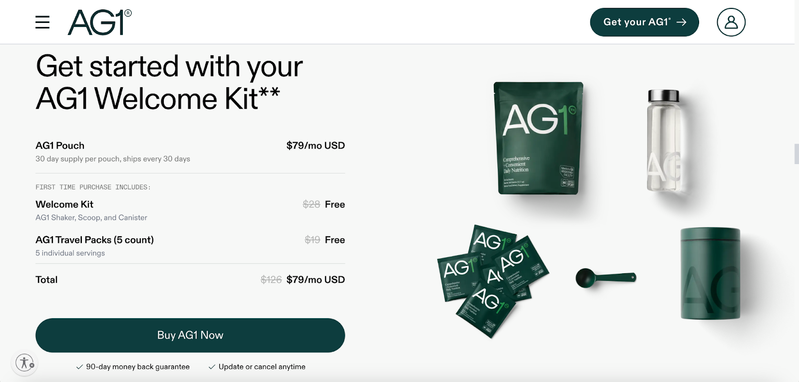
AG1 employs a strategic sales approach by incorporating a pricing table that delineates a spectrum of pricing choices for their primary product. Each package enhances the inclusion of bonus features, allowing customers to discover a package that aligns with their budgetary preferences.
This diverse range of offerings enables AG1 to effectively accommodate a wider array of customers, acknowledging and addressing the diverse financial constraints they may encounter.
In essence, their landing page prioritizes visual elements, utilizing professionally designed images to present the offer to potential buyers with a keen interest.
Nerva
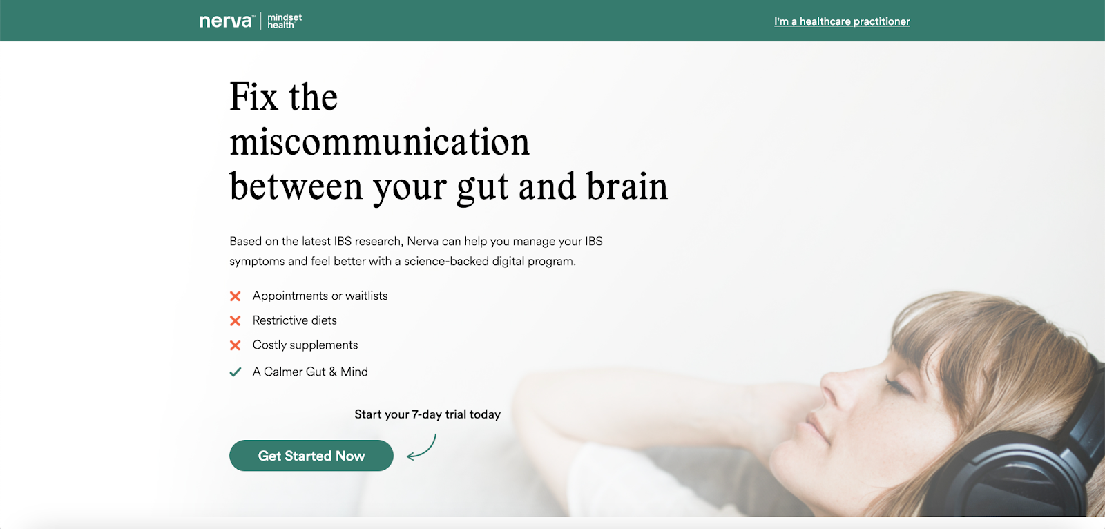
As part of its promotional strategy, Nerva incorporates a complimentary quiz for customers, aiming to gather insights into their specific challenges. Analyzing the quiz results enables Nerva to direct customers to a product version tailored precisely to their needs, a potent method for catering to a diverse customer base.
For businesses with a substantial customer volume seeking a more in-depth understanding of their clientele, conducting quizzes proves to be an ideal approach. This strategy facilitates audience segmentation, simplifying communication and enabling the provision of products that are directly relevant to individual segments.
In addition to leveraging quizzes, Nerva strategically employs imagery to set the desired emotional tone for potential customers contemplating a purchase. An example is the use of an image featuring a relaxed girl listening to music on headphones. This visual approach serves as a powerful and subtle influence on customers, cleverly shaping their emotional state and ultimately impacting their purchasing decisions.
Grind Coffee
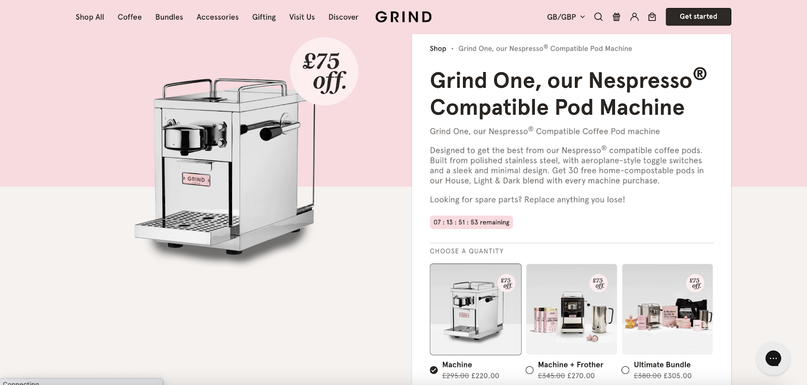
Grind’s landing page cleverly uses images to visually compare pricing packages, with the highest tier featuring more product images to enhance its perceived value. This subtle strategy encourages customers to opt for the premium option without resorting to hard-selling tactics. Consider incorporating a similar approach on your pages to showcase premium offers through images.
Additionally, Grind includes a concise product description near the Call to Action (CTA), providing impactful highlights of the product. This combination of visual appeal and brief product information contributes to an effective and persuasive presentation.
Glowright
Glowright strategically places Call-to-Action (CTA) buttons throughout its landing page. Clicking on any CTA smoothly guides visitors back to the primary order form, ensuring a direct and accessible path, regardless of their location on the page.
This approach improves customer experience, simplifies the purchase process, and enhances the likelihood of conversions by making the order form consistently clear and just a click away.
Dollar Shave Club
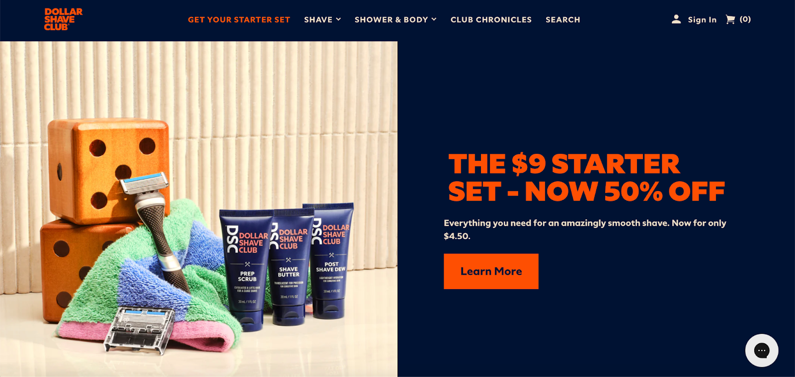
Dollar Shave Club provides an affordable and accessible introductory starter price, catering to customers interested in making a purchase. This approach is especially effective for business owners, as it allows them to capitalize on future payments by offering the product at its regular price, which might have been a challenging sell upfront.
Moreover, this strategy enables customers to try and experience the product’s value with minimal risk. Offering a low-priced trial is a compelling way to encourage customers to make a purchase, particularly when there’s confidence that the offer will benefit them.
Litter Robot
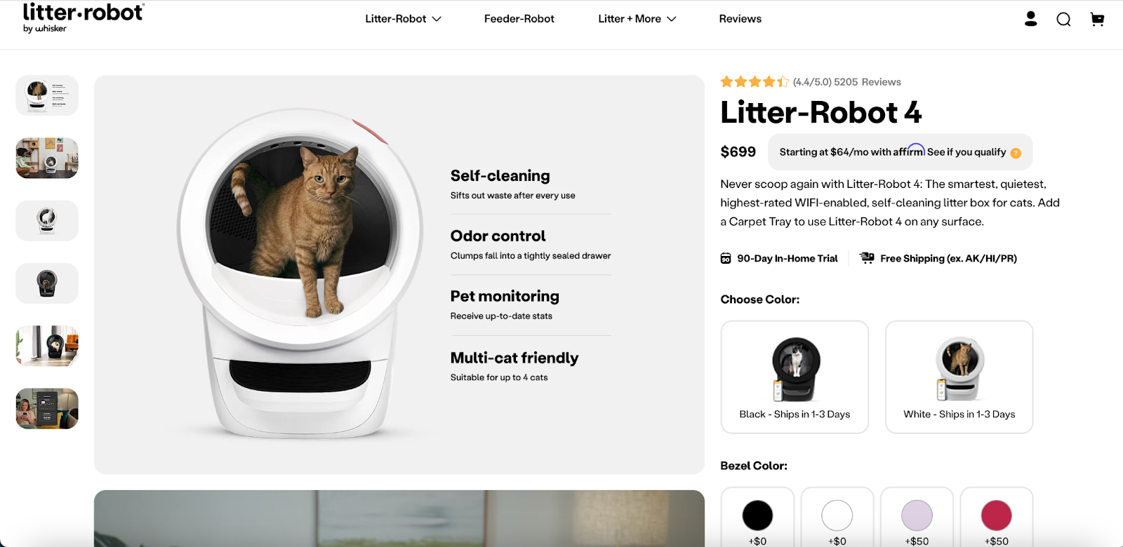
Litter Robot has incorporated a ‘bump-offer’ feature, allowing customers to opt for additional items or add-ons during the ordering process.
This strategy not only adds value for customers but also increases the potential total spend in a single transaction, effectively boosting the Average Order Value (AOV). By implementing such tactics, businesses can effortlessly encourage customers to invest a bit more, creating a win-win scenario where consumers receive additional value, and companies see an uptick in sales revenue.
Tips to optimize the landing page to increase sales

Improve the loading speed and limit navigation
Spending hours designing your landing page with perfect images and content is not enough if your loading time is high. Customers may leave your site if they need to wait for viewing the detail. The loading speed of your website must be within a few seconds.
How to maximize the web speed is a frequent question of store admin. The blog “Top 10 Ways to Maximize Magento Website Speed” can give you an overview on how to speed it up.
Besides, a crucial part is to remove the website navigation elements on the landing page, which helps put the focus back to the content and the form that you show on your landing page.
Related post: 12 Best practices for optimizing your landing page
Show an appealing Call to Action
The call to action button must be large, colorful, eye-catching, and contrast with the background color of the landing page.
Placing an attractive CTA button motivates and directs the visitor to take the desired action on the landing page. That’s one reason why a word like “Send” is a bad idea. It was so vague, and no one wanted to send anything, it needed to be more specific. Instead, tell buyers precisely what they got when they clicked that button.
Converting the visitors to your marketing leads is one of the primary purposes, so you can use some Call to Action words like “Try it out”, “Subscribe for free”, “Getting e-book”, etc. instead of “Buy it now”. Sometimes, they are still collecting the information before deciding to purchase.
They may not click the Buy button instantly, but they can subscribe to get a free e-book of your product. When visitors leave their email on your landing page, you will have more marketing plans to make them purchase your products in the future.
The call to action button on your landing page will bring better chances of converting viewers into purchasers and loyal customers.
FAQ section
Besides the FAQ page, showing some FAQs on the landing page is an excellent addition as users might need to be clarified before they sign up or purchase.
When visitors are interested in the features of your product, they will raise in their minds some questions. They want to have an answer as soon as possible. Showing the FAQs at the end of your landing page or before the Call to Action is a better chance to highlight the vital information that customers want to know.
You may want to read: The necessity of an FAQ page.
Create a bright and catchy headline
The headline is the first thing that the audience sees when they visit your landing page. They must pay attention to the headline before moving on to the rest of the page. Their stay and participation or navigation may depend on what the title says. That’s why it is essential to have a clear and concise headline. If the headline does not attract attention and makes everything clear, you will lose a visitor who can be turned into your potential customer.
The headline should immediately mention the offer with the appealing content and make visitors focus. The more information in the headline, the more likely it is to convert and retain customers. A supporting headline can provide more information on the benefits of your offer. It also can suggest and add the value of your landing page. You cannot summarize all the information into one main headline. Fortunately, supporting headlines will help you solve these concerns.
Focus on the benefits that customers can receive
First of all, describing full product information on the landing page is one of the most important things. It is obvious to have the necessary description of your product and service so that visitors can investigate if it meets their requirements. Some e-commerce stores make a mistake to show this information in a dim, non-detailed way that makes their viewers confused.
Besides providing full information for visitors, landing pages need to focus on the benefits that products or services can bring to users. Most e-shops nowadays talk too much about the features or the functionality of their products and forget to mention its benefits. We need to keep in the slogan “Sell benefits, do not sell features”.
It should only show three or five highlights of the benefits that customers may receive. Many web owners want to cram as much information as possible on their landing page. But the negative impact is that visitors may not remember all of what they will benefit from your purchase.
A few sentences or bullet points indicate the incentives customers will receive, and the reason for the difference cannot be found elsewhere like they can save their money, optimize the cost per month and get a free trial. The landing page needs to have at least four sections and no more than twelve sections as it is quite long for visitors who do not want to spend much time to scroll down.
Provide proof to make trust
The truth is that the information customers hear from others is more attractive when they hear from you. Evidence has a positive effect on a person when they discover that others are doing something. If a website visitor sees that the people who have used the offer are positive about it, then they are likely to think positively about it as well, and thus may fill out the form and convert it into potential customers.

Social evidence can take the form of:
- Testimonials from customers: A short line of feeling from satisfied customers who have received business incentives.
- Case studies
- Social media posts
- Number of downloads, users
On the landing page, you can set up one or two sections to gain more trust of customers in your product by four following ways:
- Show good feedbacks from your customers by including their pictures, job title, and their website if they have
- Add the opinions of industry experts who make a good review of the product
- Display certificates and awards that the product has achieved
- Publish the certificate of origin of products
It would be great if you can show in one section to introduce the team groups who make the specific product so that people can know how the outstanding teams create those products.
You may want to read: Ways to earn customers trust when you have zero sales
Product Reviews can be a great tool to support store owners to gain more feedback from their customers and show these proofs on their online shopping page.
Lead form
The lead form is an essential element on the landing page. Visitors will provide information to receive the offer that you provide. This form should be placed in the final section after readers have gone through all the above parts. Showing this form at the beginning when they enter your landing page may cause negative feeling, so that they may leave your page.
While businesses want to get the most information from their audience, visitors would like to spend as little time as possible to fill out this kind of form to get the benefits that they need.
However, store owners need to keep in mind the length of the form will certainly also determine the number and quality of leads you generate.
A concise, concise design form that is often understood by a large number of people will be willing to fill it in, thus creating more potential customers. But the quality of information will be higher as visitors are eager to fill in more fields and give you more information about themselves and for what they have searched.
As a result, shorter forms often bring in more leads, and longer forms earn less potential customers but are of higher quality.
Use the fear of scarcity to sell more
People tend to rush to buy if any product quickly goes out. The reason is that they are scared of the feeling of missing something. It is the typical mentality of humanity. Applying this to your landing page will increase your persuasion significantly because it helps to create a sense of urgency and time pressure on your customers.
As a result, they think faster, make decisions more quickly, which will help shop owners reduce the risk of being “weighed”. Scarcity rules are based on two basic principles: time direction (countdown, holiday sale, and seasonal sale) and quantity direction (limited edition or version, number of slots left to push this product, etc.).
Depending on each industry, web designers need to use the above factors and create a sense of trust for customers. For example, the deadline must be clear and the actual countdown.
Besides, luring customers with offers such as exciting promotions (80% discount, etc.) or gifts if they catch the threshold, will make customers see that the amount they spend much lower than the value they will receive. It is also a good tactic that you can consider to put on your landing page.
Conclusion
Using landing pages is one of the most important ways to increase leads, subscriptions, and sign-ups. You understand your audience more, and you will make the landing page better optimized. The reason is that you always try to address your customer’s pain points to show the benefits that they can receive with your products on the landing page.
There is no short cut or trick to make your landing page useful. The only way is that you need to understand your visitors. It will help you know which elements need to optimize on the landing page.
Table of content

A data-driven marketing leader with over 10 years of experience in the ecommerce industry. Summer leverages her deep understanding of customer behavior and market trends to develop strategic marketing campaigns that drive brand awareness, customer acquisition, and ultimately, sales growth for our company.
Related Post

Top 10 advantages of PHP over other languages
Join us to learn what the PHP programming language is and advantages Of PHP in practical applications!
14 mins read
|
07-25-2024
Shopify Vs Wix Vs Woocommerce: Which Platform Is The Best For You?
Shopify vs Wix vs WooCommerce: compare pricing, ease of use, features, scalability, integrations, and support to boost your online store. Discover the best ecommerce platform
14 mins read
|
07-25-2024
Mobile Web Development: A Comprehensive Guide for 2024 and Beyond
Your guide to mobile web development. Learn why it's vital, discover best practices, and leverage the latest technologies to drive business growth.
19 mins read
|
07-25-2024
Frontend Web Development: The Ultimate Guide for You
What is frontend web development and why is it crucial for your business? Learn the basics, benefits & key technologies in this guide to understand about the frontend.
14 mins read
|
07-25-2024
Website Support & Maintenance Services
Make sure your store is not only in good shape but also thriving with a professional team yet at an affordable price.