Cookies help us enhance your experience on our site by storing
information about your preferences and interactions. You can customize your
cookie settings by choosing which cookies to allow. Please note that disabling
certain cookies might impact the functionality and features of our services,
such as personalized content and suggestions.
Cookie Policy
These cookies are strictly necessary for the site to work and may not be disabled.
Cookie name
Description
Lifetime
Provider
_ce.clock_data
Store the difference in time from the server's time and the current browser.
1 day
Crazy Egg
_ce.clock_event
Prevent repeated requests to the Clock API.
1 day
Crazy Egg
_ce.irv
Store isReturning value during the session
Session
Crazy Egg
_ce.s
Track a recording visitor session unique ID, tracking host and start time
1 year
Crazy Egg
_hjSessionUser_2909345
Store a unique user identifier to track user sessions and interactions for analytics purposes.
1 year
HotJar
_hjSession_2909345
Store session data to identify and analyze individual user sessions.
1 day
HotJar
apt.uid
Store a unique user identifier for tracking and personalization.
1 year
Mageplaza
cebs
Store user preferences and settings.
Session
Mageplaza
cf_clearance
Store a token that indicates a user has passed a Cloudflare security challenge.
1 year
Cloudflare
crisp-client
The crisp-client/session cookie is used to identify and maintain a user session within the Crisp platform. It allows the live chat system to recognize returning users, maintain chat history, and ensure continuity in customer service interactions.
Session
Crisp
_ga
Store a unique client identifier (Client ID) for tracking user interactions on the
2 years
Google
_ga_7B0PZZW26Z
Store session state information for Google Analytics 4.
2 years
Google
_ga_JTRV42NV3L
Store session state information for Google Analytics 4.
2 years
Google
_ga_R3HWQ50MM4
Store a unique client identifier (Client ID) for tracking user interactions on the website.
2 years
Google
_gid
Store a unique client identifier (Client ID) for tracking user interactions on the website.
1 day
Google
_gat_UA-76130628-1
Throttle the request rate to Google Analytics servers.
1 day
Google
Advertising cookies
Advertising cookies deliver ads relevant to your interests, limit ad frequency, and measure ad effectiveness.
Advertising cookies deliver ads relevant to your interests, limit ad frequency, and measure ad effectiveness.
Cookie name
Description
Lifetime
Provider
_gcl_au
The cookie is used by Google to track and store conversions.
1 day
Google
__Secure-3PAPISID
This cookie is used for targeting purposes to build a profile of the website visitor's interests in order to show relevant and personalized Google advertising.
2 years
Google
HSID
This security cookie is used by Google to confirm visitor authenticity, prevent fraudulent use of login data and protect visitor data from unauthorized access.
2 years
Google
__Secure-1PSID
This cookie is used for targeting purposes to build a profile of the website visitor's interests in order to show relevant and personalized Google advertising.
2 years
Google
SID
This security cookie is used by Google to confirm visitor authenticity, prevent fraudulent use of login data and protect visitor data from unauthorized access.
2 years
Google
APISID
This cookie is used by Google to display personalized advertisements on Google sites, based on recent searches and previous interactions.
2 years
Google
__Secure-1PAPISID
This cookie is used for targeting purposes to build a profile of the website visitor's interests in order to show relevant and personalized Google advertising.
2 years
Google
__Secure-3PSID
This cookie is used for targeting purposes to build a profile of the website visitor's interests in order to show relevant and personalized Google advertising.
2 years
Google
SSID
This cookie is used by Google to display personalized advertisements on Google sites, based on recent searches and previous interactions.
2 years
Google
SAPISID
This cookie is used by Google to display personalized advertisements on Google sites, based on recent searches and previous interactions.
2 years
Google
__Secure-3PSIDTS
This cookie collects information about visitor's interactions with Google services and ads. It is used to measure advertising effectiveness and deliver personalised content based on interests. The cookie contains a unique identifier.
2 years
Google
__Secure-1PSIDTS
This cookie collects information about visitor's interactions with Google services and ads. It is used to measure advertising effectiveness and deliver personalised content based on interests. The cookie contains a unique identifier.
2 years
Google
SIDCC
This security cookie is used by Google to confirm visitor authenticity, prevent fraudulent use of login data, and protect visitor data from unauthorized access.
3 months
Google
__Secure-1PSIDCC
This cookie is used for targeting purposes to build a profile of the website visitor's interests in order to show relevant and personalized Google advertising.
1 year
Google
__Secure-3PSIDCC
This cookie is used for targeting purposes to build a profile of the website visitor's interests in order to show relevant and personalized Google advertising.
1 year
Google
1P_JAR
This cookie is a Google Analytics Cookie created by Google DoubleClick and used to show personalized advertisements (ads) based on previous visits to the website.
1 month
Google
NID
Show Google ads in Google services for signed-out users.
6 months
Google
Analytics cookies
Analytics cookies collect information and report website usage statistics without personally identifying individual visitors to Google.
Analytics cookies collect information and report website usage statistics without personally identifying individual visitors to Google.
Cookie name
Description
Lifetime
Provider
_dc_gtm
Manage and deploy marketing tags through Google Tag Manager.
1 year
Google
1P_JAR
Gather website statistics and track conversion rates for Google AdWords campaigns.
1 month
Google
AEC
1 month
Google
ar_debug
Debugging purposes related to augmented reality (AR) functionalities.
1 month
Doubleclick
IDE
The IDE cookie is used by Google DoubleClick to register and report the user's actions after viewing or clicking on one of the advertiser's ads with the purpose of measuring the effectiveness of an ad and to present targeted ads to the user.
1 year
Doubleclick
ad_storage
Enables storage, such as cookies (web) or device identifiers (apps), related to advertising.
1 year
Google
ad_user_data
Sets consent for sending user data to Google for online advertising purposes.
1 year
Google
ad_personalization
Sets consent for personalized advertising.
1 year
Google
analytics_storage
Enables storage, such as cookies (web) or device identifiers (apps), related to analytics, for example, visit duration.
What is a Call To Action? How to create a killer CTA button?
Summer Nguyen|11-11-2024
Getting potential customers to do what you want them to do is no more than herding cats. They leave shopping carts before checking out, they do not sign up for appealing promotion campaigns, and they do not even have the intention to read your blogs all the way to the end.
But a solution is there! To lead your prospects to your direction, all you need to do is include a compelling call to action on your website. Using CTA buttons is not new to businesses; however, understanding it from inside out is possibly new to everyone.
In today’s post, I am going to show you different types of CTA and the formula to make an outstanding CTA significantly driving your sales. So now, grab a coffee, a pen, a piece of paper, and get ready for the deluge of conversion you are about to experience.
Basically, a call to action is a statement designed to encourage the audience to take some sort of immediate response on your website when reading or hearing it. In business, it is considered as part of marketing strategies to get your target market to respond by taking action.
CTA can be positioned at the end or sometimes throughout a sales pitch to lead potential customers in the right direction and let them know what to do next if they are already interested in your offer.
CTA's influence
CTA can drive a variety of different actions according to the content’s goal. Here are a few different actions a visitor can get called to carry out:
Sign up: for inviting customers to sign up for a free trial, an online course, a future event, or a product.
Subscribe: rather than push customers to purchase; a CTA invites them to receive updates from the business, such as blogs, promotion campaigns, etc.
Get started: to drive a variety of behaviors for a company, from a free trial to virtual reality experience.}
Learn more: to provide potential clients with further information about your product, so they are prepared to buy it.
Try for free: allow the users to demo a product before deciding to buy it or not.
For many new businesses, they do not implement CTA in their marketing and sales pitches because of the following reasons:
The assumption that prospect already knows what to do next if they want to buy or learn more
Concerns that potential customer will be interrupted by CTA
Whatever the reason, leaving CTA out of marketing strategies is like accepting to lose prospects and money. Again, a CAT is precisely a powerful tool to seamlessly assist customers in their shopping journey and covert more sales.
Types of Call To Action
Marketing campaigns employ various CTAs based on their objectives and strategies to guide the audience through their journey. For example, a campaign focused on increasing newsletter subscribers might incorporate a form submission, while a campaign urging users to “learn more” could feature a button.
Here are common CTA types in marketing. It’s essential to recognize that each brand and audience is unique, making A/B testing of CTA types and designs valuable to determine the most effective ones for your goals.
Buttons
Widely used, buttons are icons with actionable phrases enticing users to click and take further action. Button designs may vary based on brand style and campaign goals, but it’s generally recommended to have a high-contrast color for visibility.
Banners
Positioned at the top, bottom, or side of a webpage, banners feature captivating copy and design to encourage visitors to take action.
Pop-Ups
Small windows that suddenly appear on the page, pop-ups are effective in communicating offers or enticing users to sign up. Exit-intent pop-ups, triggered when users are about to leave the site, are also commonly used.
Slide-Ins
Similar to pop-ups, slide-in CTAs capture attention by “sliding in” from the bottom or sidebar. They are less disruptive to the user experience compared to pop-ups.
Forms
Form submission CTAs convert site visitors into leads by offering something in exchange for their contact information. Offered content can include downloads, product quotes, service sign-ups, subscriptions, etc.
Contextual Links
Embedded within the body copy of a blog post, contextual links contain clickable text directing users to a related landing page.
Call to action words and phrases
There is a wide range of words and phrases that can be used to create an impressive call to action, however, action verbs such as Signup, Register, Call, Subscribe, Buy, Donate, Order, Share, Follow, Download, Click here for, etc., are always prioritized.
One of the most useful psychological tactics to get people to take action instantly is to add a sense of urgency and a fear of missing out. For example:
Buy now before supplies run out
Limited quantities available!
Offer expires on Christmas
Reserve your spot now!
Reserve my seat now!
Why does a CTA matter?
As we already mentioned, having a strategic CTA can help you increase your revenue while also expanding your customer base. But it not always enough to know its effects on the surface like that. We need to see dig depth into the actual case to get an idea of how a CTA can do for businesses.
Firstly, it helps to capture a web user’s attention within a second.
Because most visitors stick around less than 59 seconds, determining what’s worth paying attention to. Without a right CA, you will lose a chance to keep them stay longer. Conversely, a right message combined with the proper movement on your website at the right time is vital for breaking people out of their browsing trance and getting them to take action.
Secondly, it helps to target and convert online users based on their intent.
CTAs target and convert online users based on their intent
Targeting and converting by intent is the use of relevant CTA to meet an end-user or prospect’s intent, which is what they really want or need at that moment. When placing a CTA to do such as a job, there are a few factors that need to be taken into account:
Who they are
The content of the page a visitor is on
Where are they coming from
What intent is indicated by their behavior on your website
Let’s take an example. If an online visitor has read a significant portion of your blog and they are not already an email subscriber, via a CTA, you can offer them an opportunity to become a subscriber by engaging them with premium content.
Or, if a potential customer is on your pricing section for more than a few seconds and has not taken action yet, engage them will a CAT to chat with your team. By this, you can clear out their doubt and help them get started.
Thirdly, beyond intent targeting, a CTA also targets people on your website based on what stage of your funnel they are in.
The below screenshot may demonstrate how effectively a CTA can move potential clients further down to the sale funnel.
how can a CTA move potential clients further down to the sale funnel
Whenever the CTA is located, you can flexibly use them in your funnel to:
Engage and educate leads in your products
Guide returning leads to content and offers, converting them into customers
Upsell existing customers and encourage repeat purchase
In a nutshell, with the right CTA, you can create personalized flows for your visitors that retarget them with the next step and automate which CTAs people see as they progress through your funnel.
Categorizing your CTAs
There are serval ways to sort out CTAs’ type. Now, we will divide them into small groups based on their primary function and design.
Functions
Content boosting
CTAs promote the content at the top of the funnel
As the name suggests, this kind of CTA is typically used to promote the content at the top of the funnel. When someone visits your website for the first time, your target is to pull them in, get them to explore, then convert them into a lead, and capture their contact for further marketing.
Actually, they are not leads yet. But they will be after they are convinced by your excellent CTA and your brilliant content.
Conversion generating
Conversion generating CTAs target customers in the middle or button of the funnel. They are specially designed to turn currents prospects into leads and then into customers.
A great example of this type in your landing page is the button “Download Now”.
Business centered
Unlike the two types above, Business-centered CTAs that are more self-promotional in nature. They can be for event promotion, webinar, social sharing- something of your business that you really want to promote. Also, that might not necessarily relate to the content of the page on which it is located.
This type of CTA is perfect for keeping online users on your website when they are about to leave and go somewhere else.
Whenever the exit-intent technology senses someone is going to exist out of your website, the popup will be presented with some kinds of offers reasoning why they should leave and should hand over their information instead.
Inline/after-post
Inline/after-post CTA
If the web users already read through your post, an inline or after post will appear at the end of that content, asking for customer’s contact, coming along with your offer.
If you already have loyal readers, this type of CTA is especially useful because it does not interrupt their viewing experience yet still drawing their attention.
Floating bar
Known as a ribbon or header/footer bar, a floating bar popup floats above or below content, making sure that user experience will not be blocked but still remain visible as users scroll through content.
Floating bar CTA
However, the floating bar CTA is so subtle that users may not notice or recognize it’s there.
Slide-in
This kind of popup can be seen typically at the bottom left or right corners of the webpage. Slide-in CTA helps to convincing users to further engage with your brand by suggesting relevant pieces of content.
Sidebar
As the name suggests, this popup appears right in the sidebar for easy access. Although Sidebar CTA is non-threating to readers, sometimes, it is so subtle that they don’t even realize it’s there.
How to create a call to action?
A well-crafted call to action is designed to capture attention and create a compelling urge to proceed to the next stage in advertisements, emails, landing pages, and various other contexts. Continue reading to discover effective techniques for creating CTAs that consistently lead to conversions, regardless of the platform.
Use Action Words
Effective CTAs employ action words, clearly instructing viewers on the desired action.
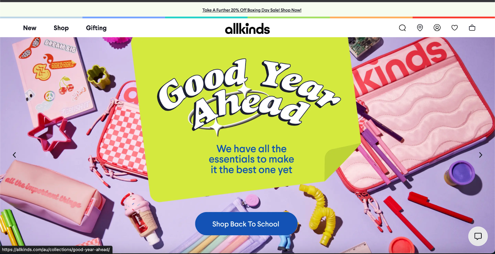
For instance, Allkinds uses the compelling action verb “Shop” with a directive like “Shop Back to School” to motivate their target customers of the campaign.
Emphasize Value
Some CTAs emphasize value by incorporating words like “Free” or “Risk-Free.” KlientBoost, for instance, uses a tempting CTA with “Get your free marketing plan” to convey the idea of getting something for free or at a discounted rate.
Design Your CTA Buttons
CTA design is crucial. We recommend effective use of white space, ensuring the button contrasts with the page’s colors, framing the button for contrast when necessary, paying attention to button size, and optimizing for mobile. The example of Nike shows distinct CTAs with black color, standing out against the white background.
Test Your CTAs
Data-driven decision-making is vital for CTAs. Conducting split tests allows experimentation with various elements such as button color, size, text, links, form, page design, and CTA placement. Analyzing the data helps determine the most effective elements for your target audience.
Creating effective CTAs: Best practices
Similar to trimming your bangs, creating CTAs requires a careful approach, considering elements such as copywriting, design, visuals, and webpage placement. To simplify this process, adhere to the following best practices:
Conciseness and Clarity
Ensure the CTA is concise, presenting a clear request for the customer, whether it’s to join a mailing list or make a purchase. Avoid burying the CTA within lengthy paragraphs, aiming for immediate understanding.
Visibility
Make your CTAs prominently visible on the page. Users don’t extensively read every word, so if your CTA isn’t immediately obvious, you risk losing their interest. Use design elements or imagery to direct attention, as exemplified by Fashion Nova, where the banner model’s positioning emphasizes the “Shop Now” CTA.
White Space Utilization
Surround your CTA with white space to enhance visibility. Don’t hesitate to incorporate white space on your website, as it allows viewers to breathe between content and emphasizes crucial information.
Contrasting or Bold Colors
Opt for contrasting or bold colors for your CTA buttons to make them stand out. While staying true to brand colors, consider using a secondary color to effectively capture attention.
Well-Considered Page Placement
Thoughtfully position your CTAs to align with the natural flow of the user’s journey. Place CTAs strategically under headers and at the bottom of pages to cater to both immediate action-takers and those who prefer scrolling through content.
Benefit-Forward Supporting Text
Craft supporting text that highlights the benefits awaiting users upon clicking the CTA. Clearly communicate the value proposition, ensuring users understand what they gain from taking the desired action.
Thoughtful Copywriting
Maintain consistency in your brand voice across all copywriting, from site headers to social posts. Use powerful language to resonate with your audience’s emotions, but ensure that CTAs remain clear and direct.
Testing
Conduct A/B tests on your CTAs to identify the most effective strategies. Experiment with variations in copy, placement, or colors, comparing the performance of each version over a set period to refine your approach continually.
Call-to-action examples
For creative motivation, explore how successful individuals employ a call-to-action to advance their marketing and business objectives. Here are some examples to kickstart your exploration.
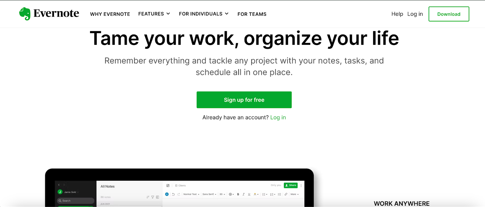
Evernote
Evernote effectively communicates its message and assistance to customers right from its homepage. The uncomplicated design enables visitors to promptly recognize the app’s value and benefits, with the “Sign up for Free” call-to-action (CTA) prominently featured.
The green color of the CTA button aligns seamlessly with the Evernote logo’s green, creating a visually cohesive effect that makes both elements distinctly stand out against the white page design.
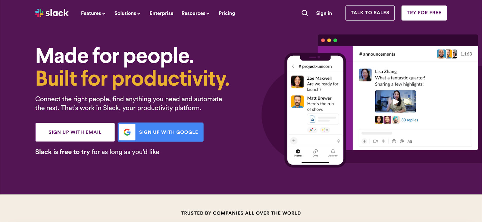
Slack
Slack’s website demonstrates effective organization, highlighting the proficiency it aims for customers to attain through its platform.
In the menu bar of its homepage, visitors are presented with two distinct CTAs: “Talk to Sales” and “Try for Free.” These CTAs cater to diverse audiences. The “Talk to Sales” option targets visitors who have a clear idea of their needs and are in the decision stage of their buyer’s journey.
Recognizing the varied stages of its audience’s buyer’s journey, Slack also provides a no-obligation “Try for Free” CTA, specifically for those in the awareness or consideration stages. This strategic approach showcases Slack’s understanding of its audience’s needs at different points in their journey.
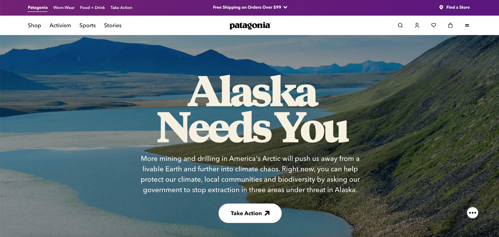
Patagonia
Patagonia, the outdoor clothing retailer, efficiently directs visitors to relevant categories such as shop, activism, sports, and stories, eliminating the need for extensive searching. This strategic navigation guides shoppers based on their preferences.
Consequently, each of these four pages features distinctive CTAs. As an illustration, on the Activism page, Patagonia showcases its environmental conservation initiatives, urging visitors to take immediate action with a compelling “Act Now” CTA, motivating them to actively participate.
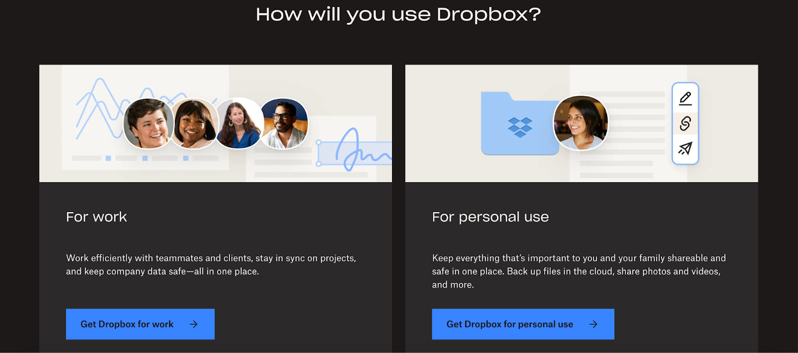
Dropbox
Dropbox strategically tailors its call-to-action (CTA) on its homepage for each of the customer’s purposes. For those who continue scrolling without engaging with this CTA, a secondary option, “View plans details,” is available at the bottom, allowing direct access to all plans without questionnaire interaction.
Embracing simplicity and ample white space, Dropbox employs bright blue CTAs that instantly capture visitor attention, standing out amidst the surrounding text and images. The consistency of the bright blue color, shared with the Dropbox logo, reinforces the association and effectively communicates the purpose of the CTA—finding a specific Dropbox plan.
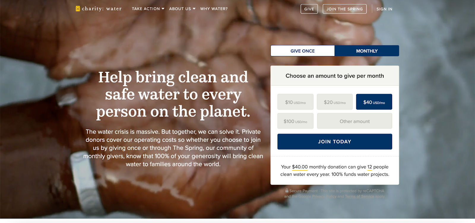
charity: water
The primary objective of charity: water is to secure donations for providing clean water globally. Acknowledging diverse donor preferences, they present distinct CTAs such as “Monthly” and “Give Once.” Notably, emphasizing a specific amount ($40) encourages potential donors to consider this option over smaller amounts.
Despite the variety, the uniform button sizes convey the importance and acceptance of all donations. Further enhancing donor convenience, charity: water offers options for giving through credit cards or PayPal.
This strategy succeeds because charity: water prioritizes options, tailoring approaches to their potential donors and understanding the motivations that drive them to take action, such as making a donation.
Final thoughts
In conclusion, Call To Action buttons are powerful tools that bring more lead to your sales funnel.
We may say that it is not complicated to create killer CTAs. Keep in mind your user’s problems and solutions that make your buttons stand out by applying the suggested rules above. Let’s put the basics into practice and boost your conversion rate now!
If you are also looking for Sales Booter Tools for Magento 2 Store. Get it here!
A data-driven marketing leader with over 10 years of experience in the ecommerce industry. Summer leverages her deep understanding of customer behavior and market trends to develop strategic marketing campaigns that drive brand awareness, customer acquisition, and ultimately, sales growth for our company.
Discover webhooks in Magento 2: a powerful tool to reduce manual workload for business owners. Learn how they work, their key features, and easy configuration tips.
This article will focus on the question “Should I hire a Shopify expert?”, unlock major reasons & practical tips to find the perfect fit for your business.


 For instance,
  Some CTAs emphasize value by incorporating words like “Free” or “Risk-Free.”
 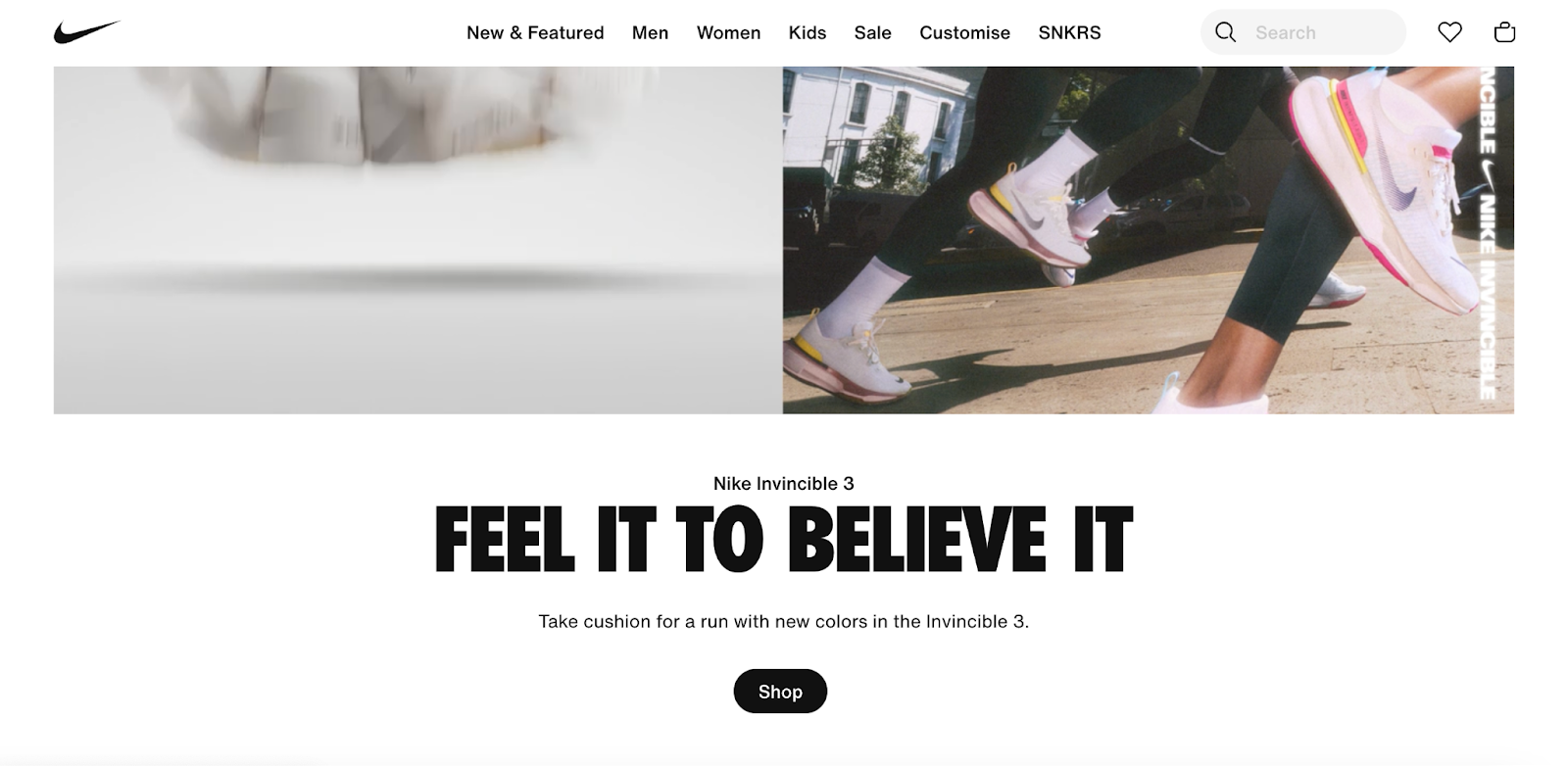 CTA design is crucial. We recommend effective use of white space, ensuring the button contrasts with the page’s colors, framing the button for contrast when necessary, paying attention to button size, and optimizing for mobile. The example of