15 Simple Website Design Examples To Grow Revenue
Summer Nguyen | 08-14-2024
Picture this: clean layouts, seamless navigation, and content that captivates instantly—qualities that draw every audience member in.
Today’s article delves into 15 brilliant examples of simple website design that redefine user interaction. Each site will showcase how less can truly be more in creating memorable online experiences. Ready to be inspired?
Key Elements of A Simple Website Design
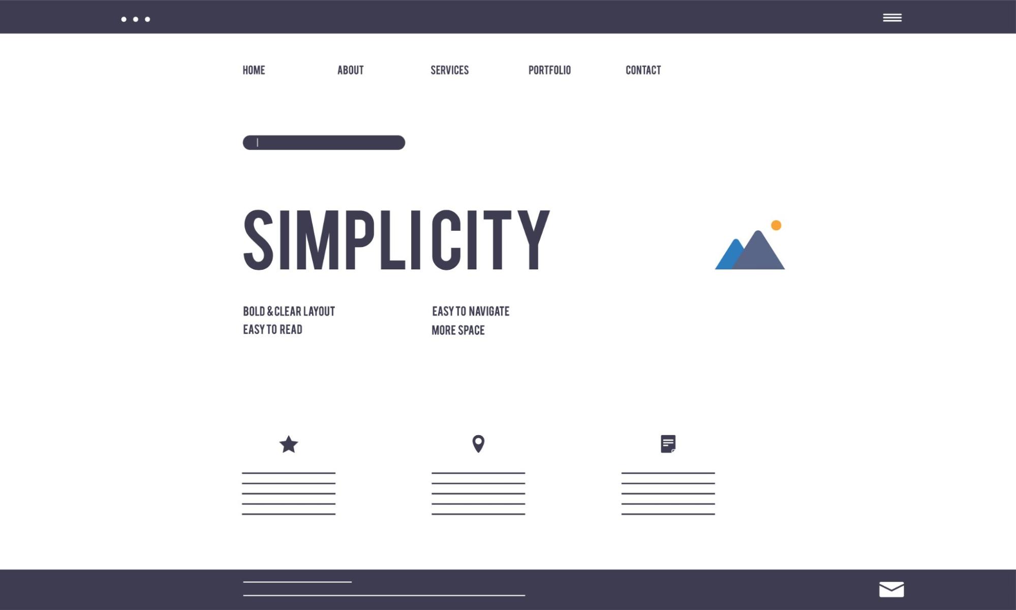
Simple design is a philosophy and practice that emphasizes clarity, ease of use, and efficiency. It strives to create interfaces, products, or experiences that are intuitive and straightforward, allowing users to effortlessly achieve their goals. Simple design aims to remove unnecessary complexity and prioritize functionality, ultimately enhancing user satisfaction and engagement.
Key characteristics of simple design include:
- Clear, direct layouts: Elements are organized in a logical, straightforward way, guiding users seamlessly through the content or interface. The structure is intuitive, minimizing the need for users to search or guess where to find what they need.
- Minimal distractions: Unnecessary graphics, animations, or overly complex design elements are avoided. The focus is on presenting information in a clean, concise manner, ensuring that the content itself is the primary focus, not decorative embellishments.
- User-centric approach: Every design decision is made with the end user in mind. Usability testing and feedback are prioritized to ensure the design aligns with users’ needs and expectations. Aesthetics are important, but they are secondary to creating a design that is functional and user-friendly.
Key Elements of A Simple Website Design
Benefits of Simple Website Designs
Below are more detailed benefits of adopting a simple website design:
- Improved User Experience: Simplified navigation and clear content presentation allow users to find information quickly and efficiently.
- Faster Load Times: By minimizing the use of heavy graphics and complex elements, simple website designs typically result in quicker page loading, which is crucial for retaining visitors and improving SEO rankings.
- Higher Engagement: Clean, uncluttered designs with clear calls-to-action (CTAs) encourage users to interact more with the website.
- Enhanced Aesthetics: A minimalist approach often conveys professionalism and trustworthiness, making the website more appealing to visitors.
- Easier Maintenance: With fewer elements and simpler structures, updates and maintenance become less time-consuming and costly.
- Higher Conversion Rates: A well-designed, focused, and clear website can significantly boost conversion rates. When users can easily find what they are looking for and perform desired actions, such as making a purchase or filling out a form, they are more likely to complete these actions.
15 Brilliant Simple Website Design Examples
Examining brilliant examples of simple website design can provide valuable insights and inspiration for creating your own streamlined, user-friendly site. Our top 15 simple website design examples will showcase how minimalist aesthetics, intuitive navigation, and a focus on essential content can result in highly effective websites:
Bedow
Bedow website
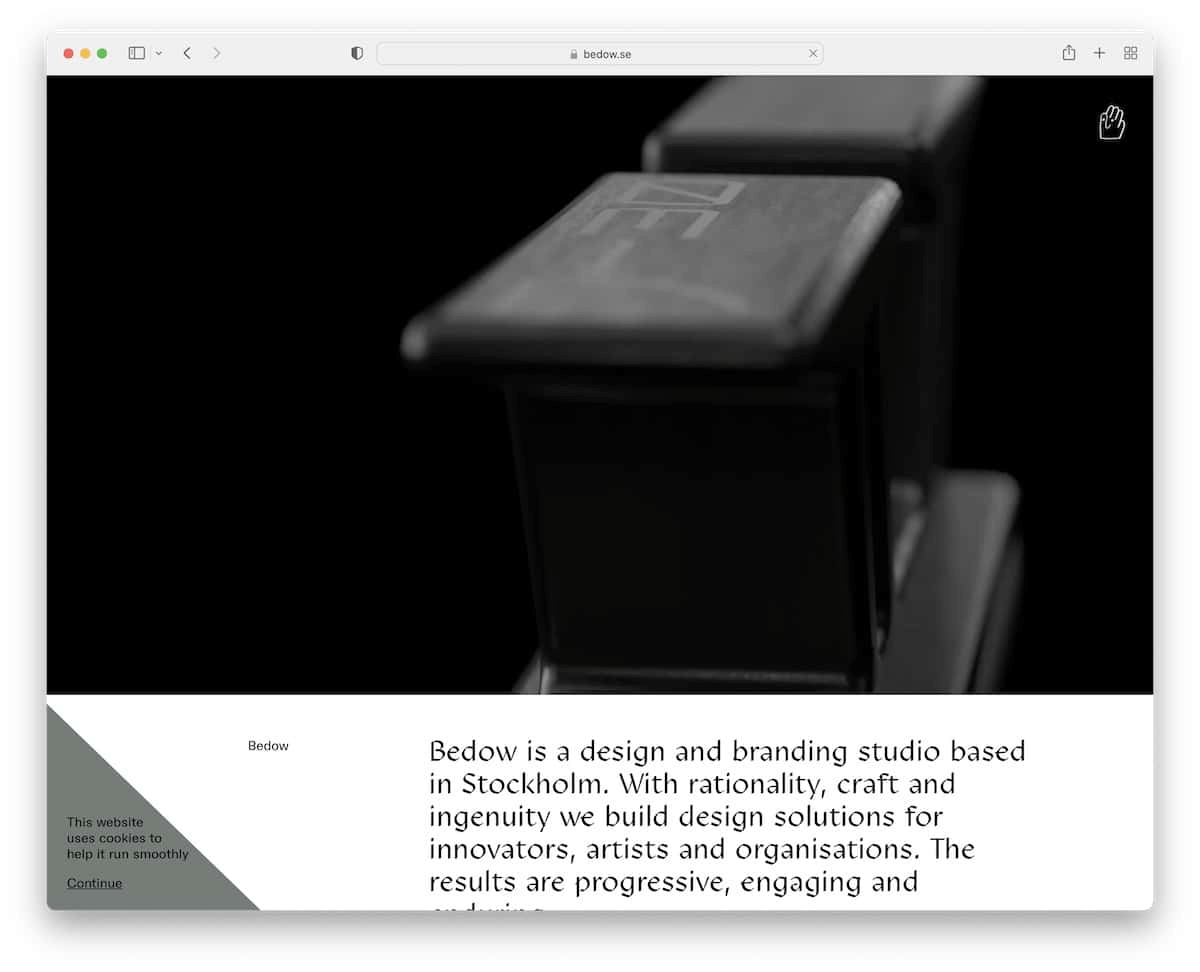
Design: Bedow‘s website features a clean, monochromatic color scheme with a focus on visual content. The homepage greets visitors with striking, high-resolution images of the studio’s work, set against a stark white background. The design is minimal, with ample whitespace that directs the user’s attention to the visual elements and the concise, well-written descriptions.
Strengths: The minimalistic design effectively highlights the portfolio, ensuring that the work takes center stage without unnecessary distractions.
Superthread
Superthread website
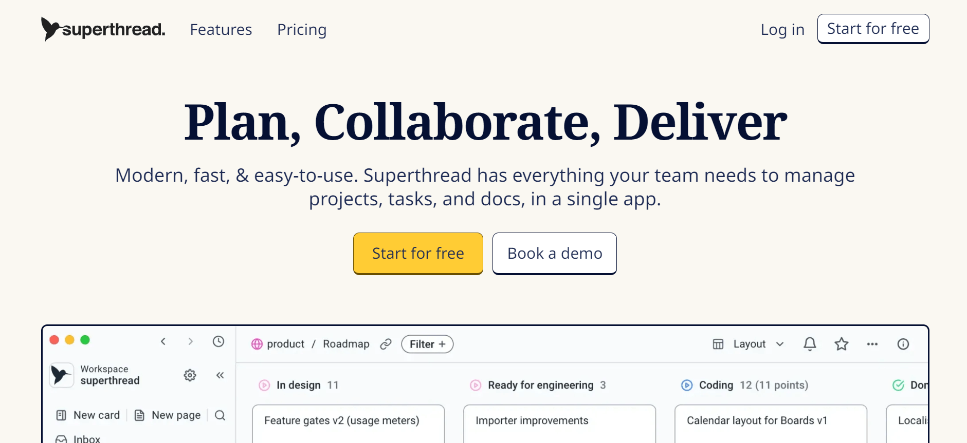
Design: Superthread utilizes a simple layout punctuated by plenty of whitespace and high-quality imagery. The site’s design leverages large, crisp photos that dominate the visual space. Text is minimal and strategically placed to complement the images rather than overwhelm them.
Strengths: The website’s straightforward navigation and clear product presentation make it extremely user-friendly. Its minimalist design prioritizes simplicity, helping users navigate effortlessly and focus on essential elements, improving usability.
Bento
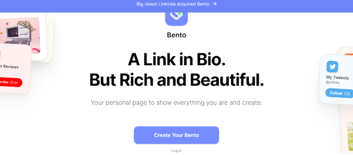
Bento website
Design: Bento‘s website is characterized by its simple, grid-based layout and bright, inviting colors. The site uses a modular grid to organize content, which helps maintain a clean, orderly appearance. The vibrant color scheme is used sparingly, ensuring that it highlights key areas without overwhelming the user.
Strengths: The intuitive navigation and well-organized content make it exceptionally user-friendly and conducive to exploration. Each section is clearly delineated.
ETQ
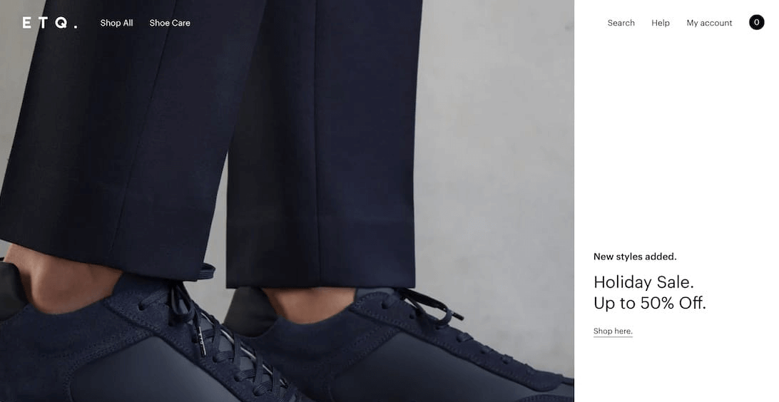
ETQ website
Design: ETQ’s design is sleek and modern, using a minimalist approach with large, high-quality images. The homepage features bold, full-screen photos of the products, with subtle animations that add a dynamic touch. The typography is clean and understated.
Strengths: The site’s simplicity allows the products to stand out, enhancing the shopping experience. By focusing on large images and minimal text, ETQ ensures that the user’s attention remains on the products, which are showcased in a stylish, aspirational manner.
Netil Radio
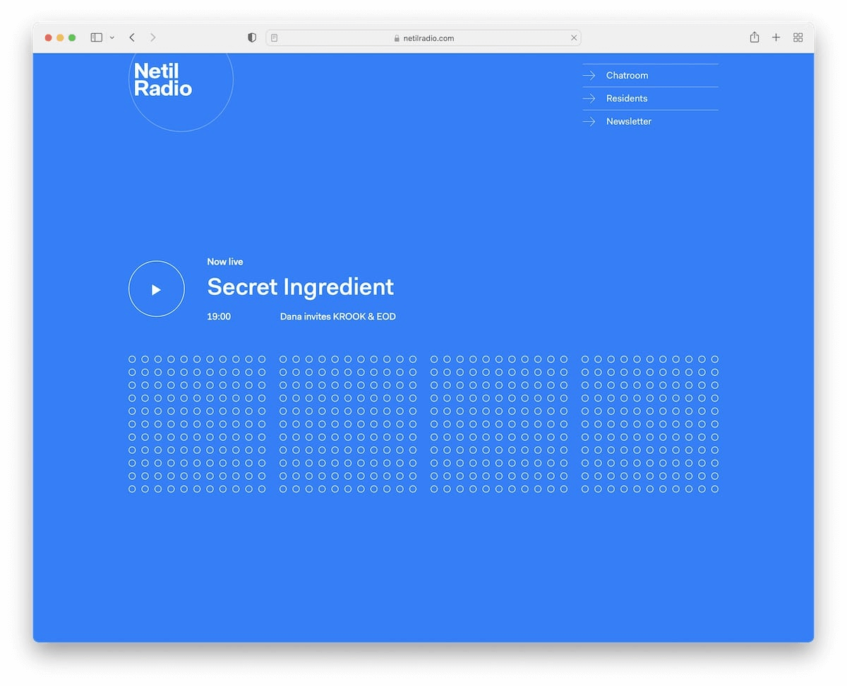
Netil Radio website
Design: Netil Radio’s website embraces a minimalist design, focusing specifically on functionality and user engagement. The design features a blue color scheme with contrasting accents, providing a stylish and contemporary look. The homepage prominently displays the radio stream and upcoming shows, ensuring users have quick access to essential information.
Strengths: The website’s clear layout and focus on essential elements make it easy for users to navigate and interact with.
Welovedaily
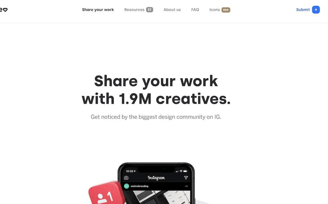
Welovedaily website
Design: Welovedaily employs a simple, elegant design with an emphasis on high-quality visuals and concise content. The homepage features a series of large, stunning images that immediately draw the user in. The navigation is straightforward, with clear labels and intuitive links that guide users through the site effortlessly.
Strengths: The clean design and strategic use of imagery ensure that the content is the star of the show.
Benjamin Hardman
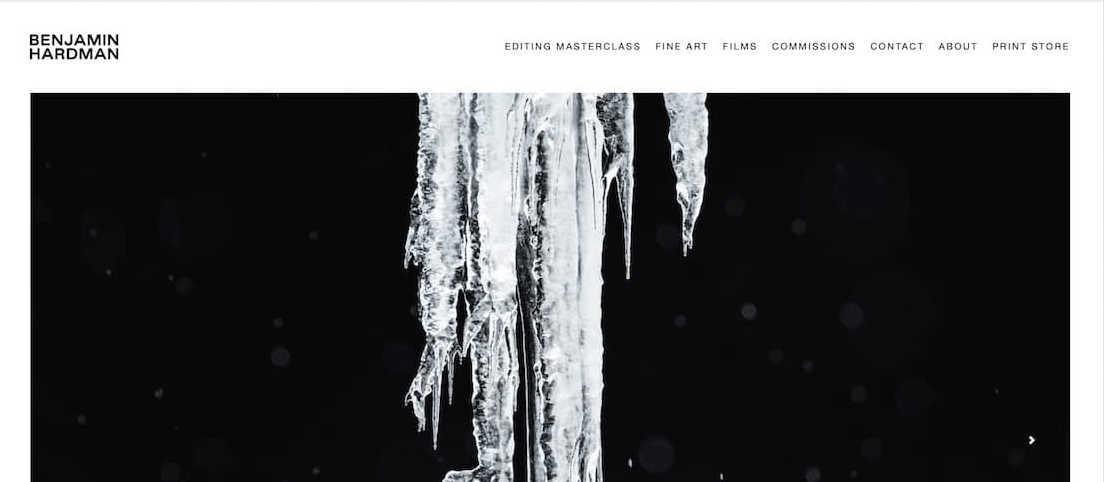
Benjamin Hardman website
Design: Benjamin Hardman’s website showcases his photography in a minimalist layout that emphasizes the beauty of his work. The design is characterized by full-screen images, simple navigation, and a monochromatic color scheme that complements the visual content.
Strengths: The focus on large, high-quality images ensures that the photographs are the primary focus, allowing visitors to appreciate the artistry and detail.
Ollivere
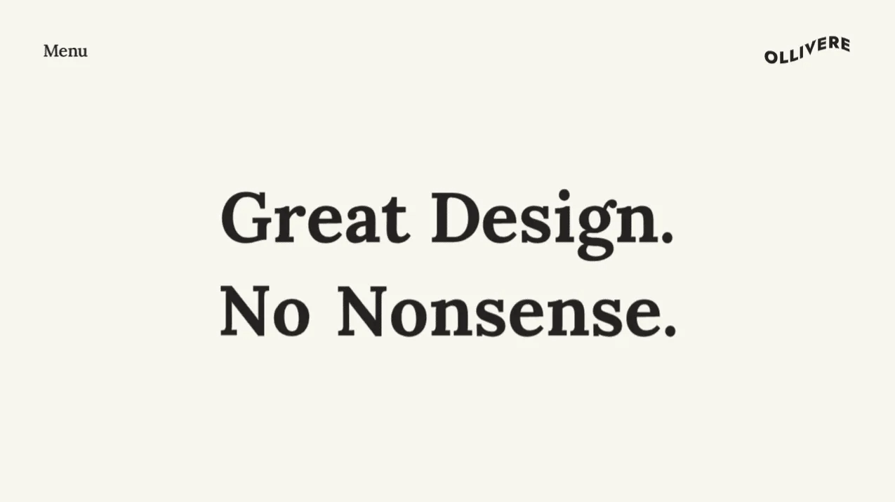
Ollivere website
Design: Ollivere’s website features a clean, minimalist design with a focus on typography and whitespace. The homepage presents information in a straightforward manner, using large, readable fonts and ample spacing between elements.
Strengths: The simplicity of the design ensures that the content is easily digestible, making it easy for users to find what they need.
Doubble
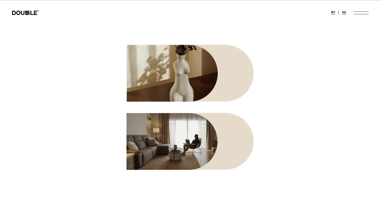
Doubble website
Design: Doubble’s website design is simple yet engaging, with a focus on clear navigation and concise content. The design uses a limited color palette and clean lines to create a modern, professional look.
Strengths: The minimalist design ensures that the site is not cluttered, enhancing the overall user experience.
Melula
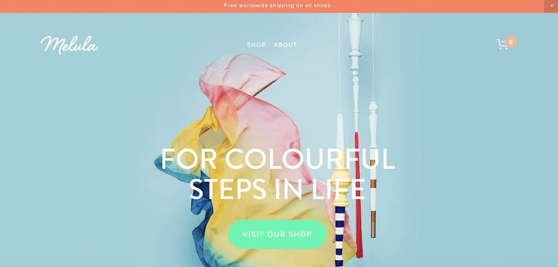
Melula website
Design: Melula’s website features a clean, minimalist design that emphasizes visual storytelling. The homepage uses large images and minimal text to create an engaging narrative that draws users in.
Strengths: The emphasis on visual storytelling ensures that the content is engaging and memorable. The simplicity of the design helps maintain a clear focus on the story, thereby amplifying its overall effectiveness.
Scott Snyder
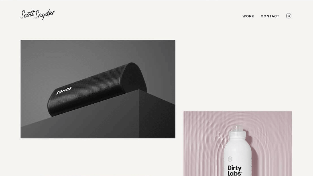
Scott Snyder website
Design: Scott Snyder’s website uses a minimalist design that focuses on his portfolio. It features large images, simple navigation, and a clean, monochromatic color scheme.
Strengths: The focus on large images ensures that the portfolio is the primary focus, allowing visitors to appreciate the quality of the work.
Kerry Lyn
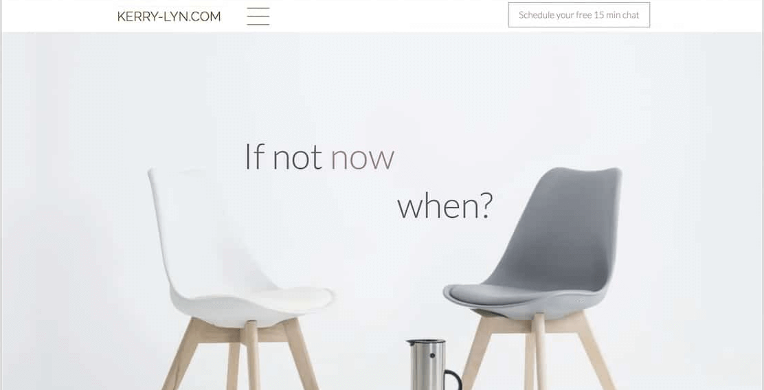
Kerry Lyn website
Design: Kerry Lyn’s website showcases an elegant, minimalist design that prioritizes typography and utilizes whitespace to underscore its sophistication. The homepage presents information clearly and concisely, using large, readable fonts and ample spacing.
Strengths: The simplicity of the design ensures that the content is easily digestible.
Golde
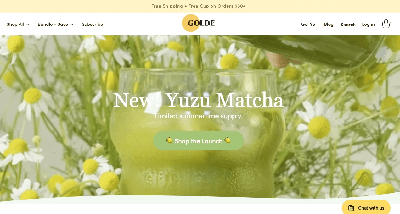
Golde website
Design: Golde’s website employs a minimalist design that emphasizes vibrant colors and high-quality visuals. It is clean and modern, with clear navigation and well-organized content.
Strengths: The use of vibrant colors adds a touch of personality to the site, making it visually appealing. The clear navigation and well-organized content enhance the overall user experience.
Nina’s Illustrations
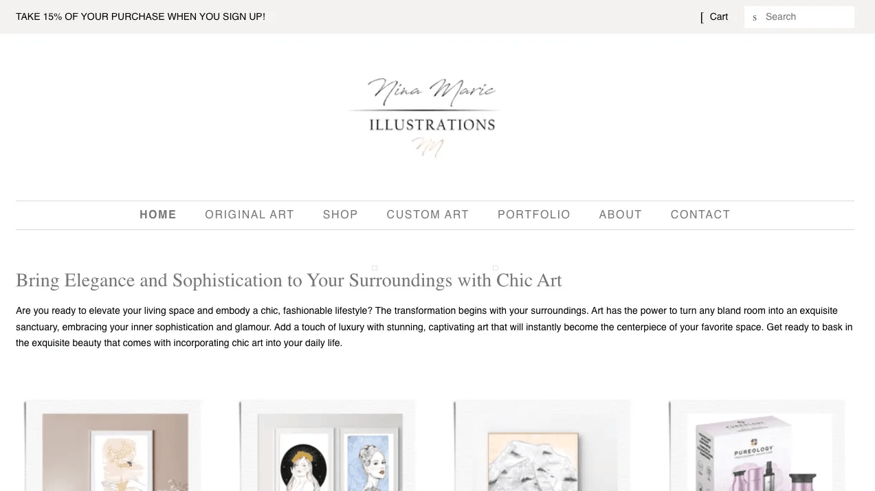
Nina’s Illustrations website
Design: Nina’s Illustrations features a minimalist design with a focus on showcasing her artwork. The site uses large images, simple navigation, and a clean, monochromatic color scheme.
Strengths: The minimalist approach enriches the user experience by ensuring easy navigation and visual appeal throughout.
Arch & Craft
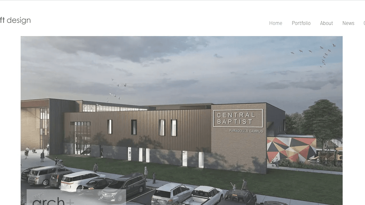
Arch & Craft website
Design: Arch & Craft’s website captivates with its clean, minimalist design that beautifully integrates visual content and typography. The homepage uses large images and minimal text to create an engaging narrative that draws users in.
Strengths: The site’s emphasis on visual content and typography ensures that it is engaging and easy to read.
Key Takeaway
We hope you found these 15 simple website design examples inspiring and informative. Each site demonstrates how minimalist aesthetics, intuitive navigation, and a focus on essential content can create highly effective user experiences:
- Bedow uses a limited color palette to enhance the focus on key content and create a sophisticated, cohesive look.
- Superthread takes advantage of its whitespace and high-quality visuals to show the products.
- A grid-based layout in Bento can provide a clear structure, making the website easy to navigate and visually appealing.
- ETQ effectively showcases products with high-quality imagery and minimalist design.
- Nail Radio’s minimalist design prioritizes functionality, ensuring essential elements are prominently displayed.
- Welovedaily’s emphasis on an elegant, image-focused design to capture user interest.
- Benjamin Hardman’s photography website thrives on a minimalist design that showcases visual content.
- Ollivere emphasizes typography and whitespace to enhance readability.
- Doubble’s successful minimalist design hinges on clear navigation and concise content.
- Melula leverages visual storytelling within a minimalist design to craft a memorable experience.
- Scott Snyder utilizes a minimalist design that prioritizes visual content to effectively showcase his portfolio.
- Kerry Lyn ensures that content takes center stage.
- Golde enhances its minimalist design with vibrant colors.
- Nina Illustration’s minimalist design highlights visual content to showcase artwork, creating an engaging website.
- Arch & Craft blends visual content and typography in a minimalist design.


