


7 mins read
|
06-30-2026
Mastering Cumulative Layout Shift: Boosting User Experiences
Vinh Jacker | 07-24-2023

Have you ever experienced that frustrating moment when you’re casually browsing a website, and suddenly, the page layout starts jumping around like a hyperactive squirrel on a sugar rush? Don’t worry, you’re not alone! We’ve all fallen victim to the annoying Cumulative Layout Shift (CLS) phenomenon on websites. This irritating situation when you’re just about to click a button, but it unexpectedly moves, making you accidentally click on an ad instead.
In this article, we’re going to delve deep into the world of CLS. We’ll explore all aspects related to cumulative layout shift. Let’s start now!
What is cumulative layout shift?
Cumulative Layout Shift (CLS) is a metric used to measure the visual stability of a web page during its loading process. In particular, it quantifies the number of unexpected layout shifts that occur as the page loads and is an essential factor in determining the overall user experience.

Also, web page loading can cause dynamic content elements like images, videos, and ads to change, causing unexpected content shifts and changes in the page’s layout. CLS aims to capture these sudden changes in layout and quantify their impact on the user experience.
What causes cumulative layout shift?
Cumulative layout shift can arise from various factors, with the most prevalent ones being:
-
Images and videos with poor or no dimensions: When images or videos on a web page do not have specified dimensions, the browser may not be able to reserve the necessary space for them, leading to layout shifts when they load
-
Web fonts and asynchronous loading: When a webpage loads, it initially renders the content in a default font. Then, it fetches the desired web font files and restyles the text accordingly. However, the browser doesn’t know the size and shape until the files arrive. This uncertainty creates Cumulative Layout Shift (CLS), where the text occupies less space initially and expands when the web font is applied.
-
Ads, embeds, and iframes: Ads, such as banners, pop-ups, and video ads, can disrupt webpage layouts and impact user experience. They cause content to be pushed aside, resulting in late loading, disrupted flow, and filled voids with other content. Similarly, embeds and iframes add functionality but can cause content rearrangement, making it challenging for users to consume website content consistently.
-
New design elements loading later: If new design elements load after the initial page load, they can cause unexpected shifts in the visual layout, leading to layout instability.
-
Responsive design and media queries: Responsive design uses media queries to detect the screen size of a device and apply specific styles accordingly. These media queries can cause content shifts and layout changes, leading to text jumping to different positions on mobile devices.
-
JavaScript and DOM manipulation: JavaScript can also contribute to CLS through late loading of resources, resulting in layout shifts when scripts and external files take time to load and render. Meanwhile, the Document Object Model (DOM) is the structure used by browsers to render web page content. It can lead to element insertion, removal, and changes that disrupt the page flow and cause unexpected content shifts, contributing to CLS.

Why is cumulative layout shift important?
There are several reasons why cumulative layout shift is essential:
-
Content accessibility. Layout shifts impact users with disabilities and assistive technologies. Therefore, optimizing CLS can create an inclusive, accessible web experience for all users.
-
Search Engine Optimization (SEO). Google prioritizes user experience in search rankings. Websites with poor user experience may be penalized in search results, while optimizing CLS can improve performance, potentially boosting organic traffic.
-
Ad performance. Online advertising layout changes can affect the effectiveness, causing accidental clicks or frustration. So, minimizing CLS ensures consistent display and intentional interaction, potentially improving performance and revenue.
-
Conversion rates and revenue. Positive user experience impacts conversion rates and online revenue. Hence, developers can create an environment that promotes user engagement and increases business goals by reducing CLS.

Read more: Top 9 Reasons To Choose Magento Development Services For Your Store
How is cumulative layout shift measured?
When researching cumulative layout shift, you will most likely come across the terms “impact fraction” and “Distance fraction”. Let us simply explain these two terms to you:
-
Impact fraction measures how unstable elements impact the display area of a web page between two frames. It is calculated by summing the visible area of all unstable elements in the previous frame and the current frame, then dividing by the total area of the visible area.
-
Distance fraction measures the distance an unstable element has moved between two frames. It is calculated by dividing the maximum distance an element has moved (horizontally or vertically) by the largest dimension of the display area (width or height). The result of the distance fraction is also a percentage value.
Layout Shift Score = impact fraction x distance fraction
However, it is difficult for us to find these variables manually. Using tools to calculate would probably be better. Thus, to measure CLS, you can use various tools and methods. Here are a few common approaches:
- Lighthouse: Lighthouse, a performance auditing tool, provides a CLS score as part of its metrics. It quantifies the cumulative layout shift and provides insights into improving it.
- Chrome DevTools: The Performance panel in Chrome DevTools can be used to measure CLS. It provides a detailed breakdown of layout shifts and their impact on the page .Web Vitals JavaScript API: The Web Vitals JavaScript API allows you to measure CLS and other Core Web Vitals metrics programmatically. You can use this API to track and report CLS scores.
- Third-party tools: There are several third-party tools available that can measure CLS and provide insights into improving it. Some examples include GTmetrix, DebugBear, and Cumulative Layout Shift Debugger.

What is a good cumulative layout shift score?
Here’s a breakdown of CLS scores and what they mean:
- Good: 0.1 or less (Indicates minimal layout shifts, providing a smooth user experience) (Suggested by Google )
- Needs Improvement: 0.1 to 0.25 (Some layout shifts are occurring, which can negatively impact user experience)
- Poor: 0.25 or more (Significant layout shifts are happening, leading to a frustrating user experience)
Thus, you should aim for a CLS score of less than 0.1 for a good user experience. A CLS score of less than 0.1 can help to:
- Ensure minimal layout shift during page load without significant
- Prevent sudden jumps and element movements
- Maintain visual continuity
- Prevent usability issues, especially on mobile devices with slower connections or limited processing power.

6 tips to improve cumulative layout shift
Given the significant importance mentioned above, it is imperative that we invest efforts in optimizing the cumulative layout shift. To improve cumulative layout shift, we should take into consideration several key aspects, including:
- Set dimensions for elements
- Preload key resources
- Avoid inserting content dynamically
- Optimize web fonts
- Lazy-load content below the fold
- Ensure responsive design
Let’s deep dive into each aspect!
1. Set dimensions for elements
One effective strategy to reduce CLS is to set dimensions for elements within the web page. This allows the browser to reserve space for them during initial rendering, ensuring accurate page layout calculations and reducing the likelihood of subsequent shifts.

Here are a few key considerations when setting dimensions for elements to improve CLS:
-
Ensure height and width attributes are specified in HTML for proper image allocation.
-
Set explicit dimensions for videos and iframes, including width, height, and CSS padding-bottom for dynamic content allocation.
-
Ensure container elements have predefined dimensions for dynamic content for a stable layout.
-
Ensure visual stability across devices using CSS media queries and layout grids by responsive design.
2. Preload key resources
Preloading key resources early in page rendering improves CLS and user experience by preventing abrupt visual shifts and ensuring correct processing and positioning.
![Preload key resources]](https://cdn2.mageplaza.com/media/blog/cumulative-layout-shift/preload-key-resources.jpg)
Here are some key considerations when implementing preloading techniques:
-
Identify critical resources affecting web page layout through analysis and observing elements.
-
Strategically set HTML attributes by resource hints for efficient resource allocation.
-
Consider lazy loading to improve CLS by deferring non-critical resources’ loading until viewport entry, preventing layout shifts.
-
Test and optimize preloading strategies using tools like PageSpeed Insights for optimal website performance and user experience.
-
To prioritize the early loading of resources, HTML offers preloading attributes such as
rel="preload"for CSS and font files andrel="prefetch"for JavaScript files, which can be added to the<link>and<script>tags in the HTML head section.
3. Avoid inserting content dynamically
One way to improve CLS is to avoid inserting content dynamically, as this can cause unexpected layout changes and contribute to a higher CLS score.

To reduce this issue and improve CLS, it’s recommended to follow certain best practices:
-
Reserve dynamic content space in the layout to prevent sudden shifts. Preload or lazy-load content to ensure content is ready for display without sudden layout changes.
-
Optimize media layout by aspect ratios, reducing layout shifts and ensuring proper space allocation.
-
Prioritize critical content loading for optimal layout stability.
-
Regularly test and monitor your website for CLS.
4. Optimize web fonts
In general, web fonts enable designers and developers to create custom typography, enhancing visual presentation flexibility, but they can introduce layout shifts if not appropriately managed.
These are some tips to optimize web fonts and minimize CLS:
Preload web fonts with the HTML <link> tag’s preload to attribute fetches and prepare them in advance, prioritizing font loading and reducing layout shifts due to font loading delays.
-
Set the
font-displayproperty toswapby font display swap to keep text visible to users before the web font finishes loading. - Optimize font files by using tools for speed and quality. M
-
inimize font variations by using separate font files or system fonts.
-
Improve performance with pre-installed system fonts.
-
Define font sizes and line heights to prevent layout shifts.
- Regularly test and monitor the website’s CLS score, font impact, and optimization effectiveness.
5. Lazy-load content below the fold
Lazy-loading content below the fold is an effective technique to improve your website’s CLS. Besides, implementing lazy loading requires using JavaScript and understanding the specific elements to target.

Here are some suggestions you should consider:
-
mIdentify below-the-fold resources causing layout shifts.
-
Insert lightweight placeholders for resources before lazy-loading, providing visual cues and predefined dimensions.
-
Implement lazy loading to detect visible placeholders, swap with content, and initiate the loading.
-
Address lazy-loaded content issues with alternative content, retrying, and fallback options.
6. Ensure responsive design
One effective strategy to improve CLS is by implementing responsive design techniques. The responsive design focuses on creating webpages that adapt and respond to different screen sizes and devices, providing a consistent and optimized user experience across platforms.

Here are some ways in which responsive design can help improve CLS:
-
The responsive design utilizes fluid grid systems for dynamic content adjustment.
-
The responsive design prioritizes elements, breaks down layouts, and minimizes CLS.
-
Media queries optimize the responsive design by targeting screen sizes and device characteristics.
-
Responsive design optimizes images and media using adaptive and lazy loading techniques.
-
Regular testing and responsive design optimization ensure compatibility across devices and screen sizes.
Read more: 12+ Magento Website Maintenance Tips That You Should Implement Now
Wrap-up
Throughout this article, we have explored CLS causes, impacts, and strategies to reduce it, including optimizing images, using aspect ratios, using media dimensions, loading critical content before non-critical elements, etc.
By implementing these techniques and adopting a proactive approach to web design and development, website owners can reduce CLS, improve user experience, and increase search engine rankings, organic traffic, and retention rates.
However, it is essential to recognize that CLS is an ongoing challenge as websites continuously evolve with the addition of new content, images, and advertisements. So, don’t forget to continuously monitor and measure CLS!
Table of content

Jacker is the Chief Technology Officer (CTO) at Mageplaza, bringing over 10 years of experience in Magento, Shopify, and other eCommerce platforms. With deep technical expertise, he has led numerous successful projects, optimizing and scaling online stores for global brands. Beyond his work in eCommerce development, he is passionate about running and swimming.
Related Post


How to Enable DebugView in GA4 for your Magento 2 store - Mageplaza
Step-by-step guide to enabling GA4 DebugView for Magento 2 merchants — verify your GA4 events are firing correctly before trusting your data.
8 mins read
|
06-09-2026

Table Rate Shipping in eCommerce: A Practical Guide
Master Magento 2 Table Rate Shipping. Learn how to configure an accurate, automated shipping matrix to optimize your checkout and boost sales.
10 mins read
|
06-02-2026
3 mins read
|
05-30-2026

Google Analytics Ecommerce Reports for Magento Merchants: What to track & Tips
A practical guide to GA4 ecommerce reports for Magento merchants, covering what to track, how to read each report, and specific tips to turn data into revenue decisions.
18 mins read
|
05-20-2026
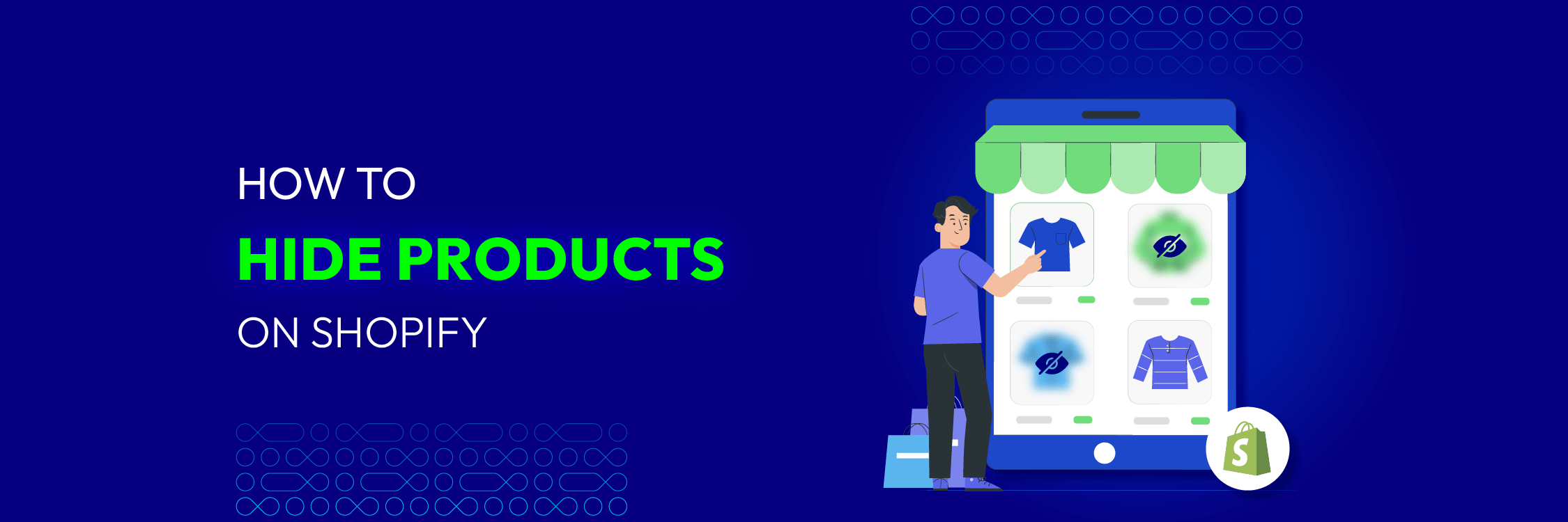
5 Ways to Hide Products on Shopify (2026 Guide)
Explore the best 5 ways to hide products on Shopify. Learn how to manage visibility, protect pricing, and create a tailored shopping experience for buyers.
18 mins read
|
05-16-2026
7 mins read
|
06-30-2026
How to Enable DebugView in GA4 for your Magento 2 store - Mageplaza
Step-by-step guide to enabling GA4 DebugView for Magento 2 merchants — verify your GA4 events are firing correctly before trusting your data.
8 mins read
|
06-09-2026
Table Rate Shipping in eCommerce: A Practical Guide
Master Magento 2 Table Rate Shipping. Learn how to configure an accurate, automated shipping matrix to optimize your checkout and boost sales.
10 mins read
|
06-02-2026
3 mins read
|
05-30-2026
Google Analytics Ecommerce Reports for Magento Merchants: What to track & Tips
A practical guide to GA4 ecommerce reports for Magento merchants, covering what to track, how to read each report, and specific tips to turn data into revenue decisions.
18 mins read
|
05-20-2026
5 Ways to Hide Products on Shopify (2026 Guide)
Explore the best 5 ways to hide products on Shopify. Learn how to manage visibility, protect pricing, and create a tailored shopping experience for buyers.
18 mins read
|
05-16-2026