Explore 20 Best Cafe Web Design Examples in 2024
Summer Nguyen | 08-09-2024
Hey there! Have you ever wondered what makes a cafe’s website look super cool? Well, in 2024, some cafes have amazing websites that not only show yummy food and drinks but also look really delightful and alluring. In this article, we’re going to check out 20 of the best cafe websites and see what makes them so remarkable. Whether you own a cafe or just love looking at cool websites, you’ll discover some great ideas here!
Essential Features of Cafe Web Design
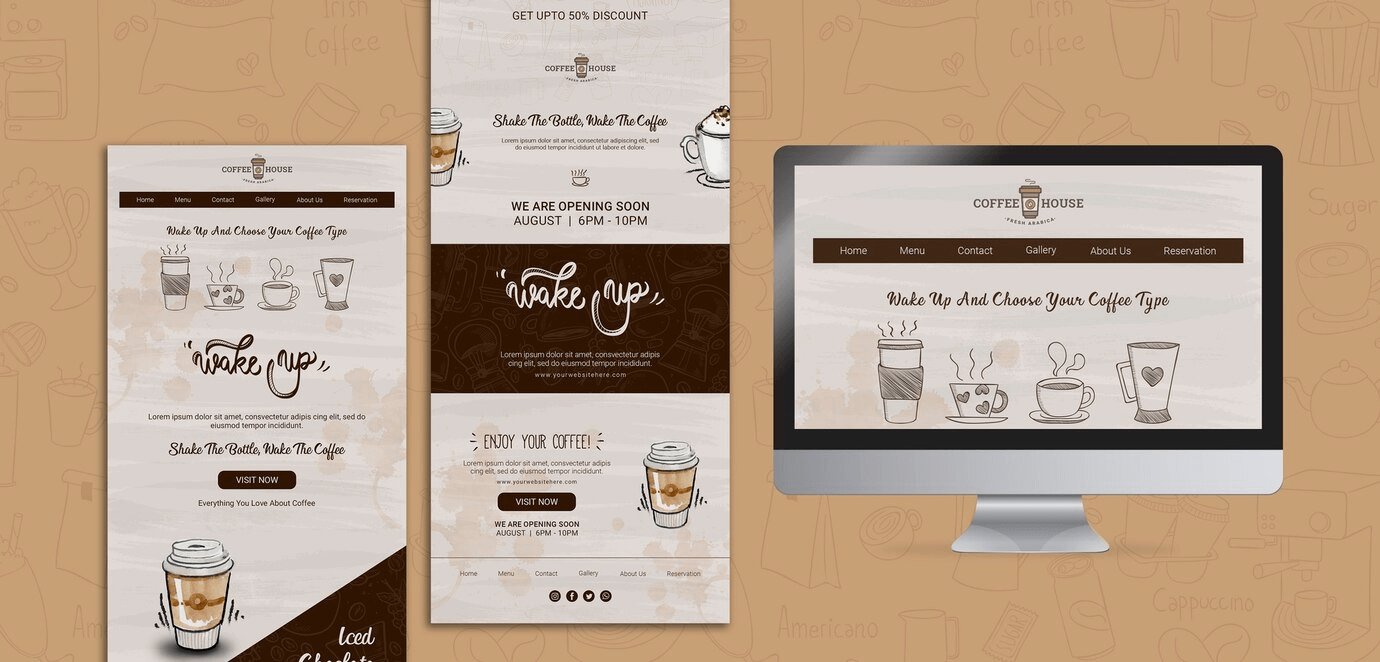
Creating an attractive and applicable website is paramount for any cafe looking to attract and keep customers. An ergonomic website not only displays your offerings but also reflects the ambiance and personality of your cafe. Here are some essential features to include in your cafe’s web design:
Stunning Visuals
Quality images are a must. Use eligible photos that glimpse the nature of your cafe: the cozy seating, the delicious food, and the steaming cups of coffee. Artwork creates the first impression and draws guests in, making them more likely to explore your site and visit in person.
User-Friendly Navigation
Smooth navigation is essential for retaining visitors on your site. Organize your menu, location, and contact information clearly. A simple, instinctive navigation bar helps customers find what they need without hassle. Consider an off-canvas menu to save space and keep the design clean.
Mobile Responsiveness
With many customers browsing on their phones, a responsive design is required. Corroborate your website looks great and functions well on all devices, from desktops to smartphones. This responsiveness improves user experience and raises your search engine ranking.
Online Ordering System
Integrate an online placement system to cater to diligent customers who prefer takeout or delivery. Make it easy for them to browse your menu, customize their orders, and pay online. This convenience can significantly boost both your sales and customer satisfaction.
Engaging Content
Share your story and the inspiration behind your cafe. Blog about your journey, introduce your team, and highlight special events or new menu items. Fascinating content adds a personal touch and helps build a connection with your customers.
Social Media Integration
Connect your social media accounts directly on your website. Infusing your Instagram feed or showcasing content generated by users can make your site dynamic and interactive. Social media integration helps keep your audience engaged and encourages them to follow your updates.
SEO Optimization
Enhance your website’s search engine optimization to draw in more visitors. Use suitable keywords, write compelling meta descriptions, and ensure your site loads quickly. SEO helps potential customers find your cafe when they search for coffee shops in your area.
Customer Reviews and Testimonials
Showcasing positive feedback and accolades helps to establish trust and credibility. Encourage satisfied customers to leave feedback and highlight these testimonials prominently on your site. It reassures new visitors about the quality of your offerings.
Event Calendar
If your cafe entertainers events like live music, poetry readings, or community gatherings, include an event calendar. Keeping your customers informed about upcoming events can increase foot traffic and foster a sense of community.
Clear CTAs
Use precise and compelling CTAs to guide visitors towards preferred actions, whether it’s making a reservation, signing up for a newsletter, or following your social media accounts. Compelling CTAs can drive concentration and modifications.
When combining these paramount qualities into your cafe’s web design, you create a welcoming and efficient online existence that mirrors customers’ experience in your physical location. A stunning website not only attracts new customers but also keeps them coming back for more.
Read more: What Makes A Good Website Design: Features And Principles
20 Best Cafe Web Design Examples
Starbucks
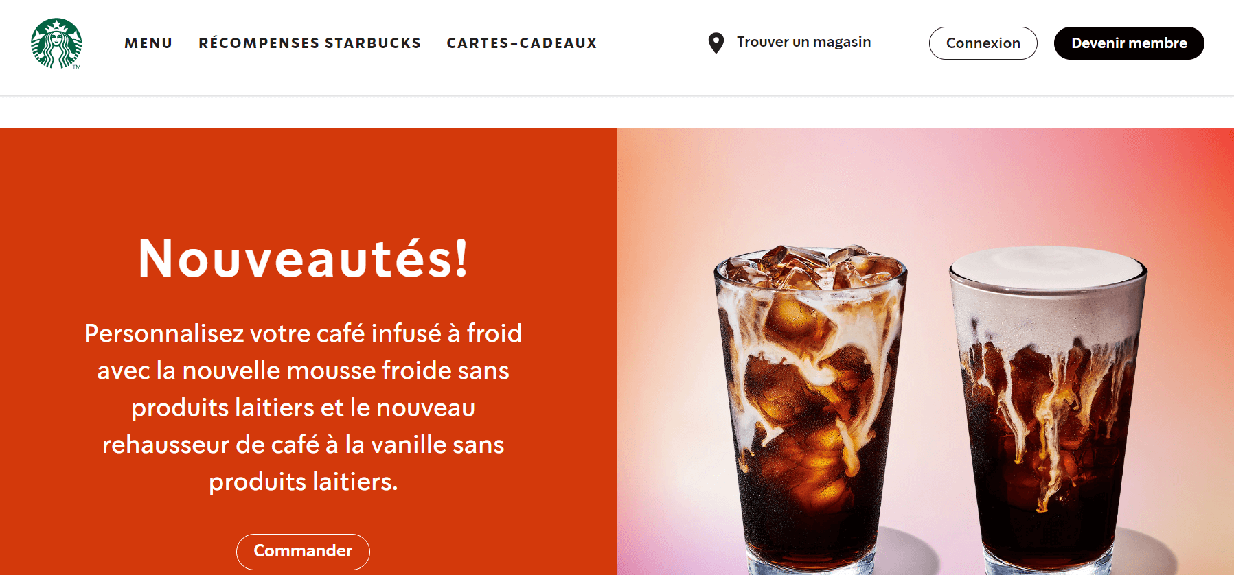
What we enjoy: We can’t resist exploring the website of the world’s most famous coffee shop. Let’s see which strategies are worth implementing.
The navigation menu focuses on essentials — menu, rewards (like buy 10 get 1 free), and gift cards. This prompts you to consider integrating loyalty points to retain customers. Who wouldn’t love a free cup of coffee?
The first screen features Starbucks’ recent updates, while subsequent screens showcase new drinks and food items. Each item is accompanied by enticing descriptions and order buttons to boost sales.
Campos Coffee
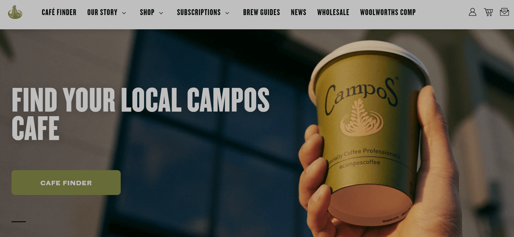
What we like: Campos makes creating an outstanding coffee shop website incredibly easy. It offers everything you need in one package—a user-friendly page builder, hosting, and domain services all included. This means you can focus on designing your site without worrying about the technical details.
Campos truly simplifies the process. Its involuntary interface allows you to build a beautiful website with minimal effort. Besides, if you handle into any issues or have questions, the support team is available around the clock to assist you. With their friendly and responsive help, you can resolve any concerns quickly.
Compass Coffee
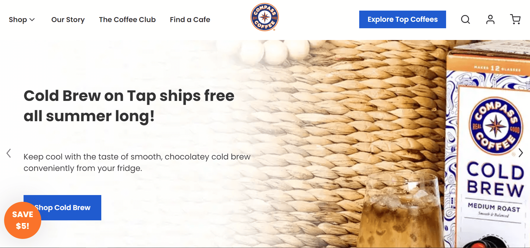
What we like: At first glance, Compass Coffee focuses on selling coffee blends and merchandise. This impression only grows as you scroll down, as everything you see revolves around the benefits of buying coffee and the different types available.
However, you might notice the “Find a Coffee Shop” button in the navigation menu, which directs you to a map featuring coffee shops in Washington and Arlington.
Additionally, the animated gift box icon in the bottom left corner is a nice touch that can spark your interest.
The Wydown
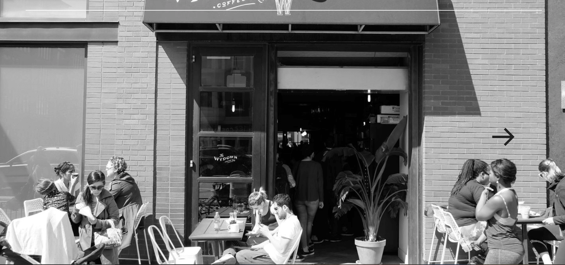
What we like: This website really makes you fall in love with The Wydown’s bruschettas and cookies. They feature these delicious items prominently, enticing you to place an order right away. The photos are so inviting that you can nearly taste the food just by looking at them!
In addition to the savory pictures, the website is very useful. You can easily access The Wydown’s full menu, place orders online, and even check out current job openings if you’re interested in joining their team. The layout is congenial to users and makes it simple to find what you’re looking for.
However, there is one area that could use some improvement: the typography. The text is a bit difficult to read, which can be frustrating for visitors. Making the font clearer and more readable would definitely enhance the overall user experience.
Mokarico
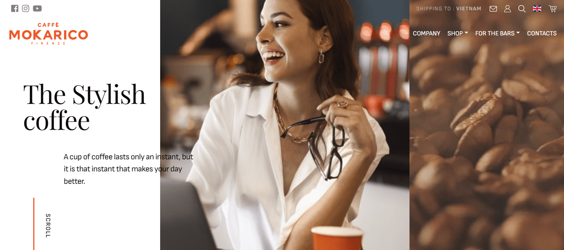
What we like: Mokarico’s website stands out with its unique, minimalist, and elegant design. It is one of the top coffee shop websites, offering a modern look and feel that truly captures the essence of a sophisticated café. The hero section features a stunning layout, with a soft slider on one side and captivating images on the other, immediately drawing visitors in.
This e-commerce site provides a comfortable and efficient shopping experience for customers worldwide. Browsing through the site is a pleasure, thanks to the impressive hover effects on buttons that add a touch of interactivity.
DUA DC COFFEE
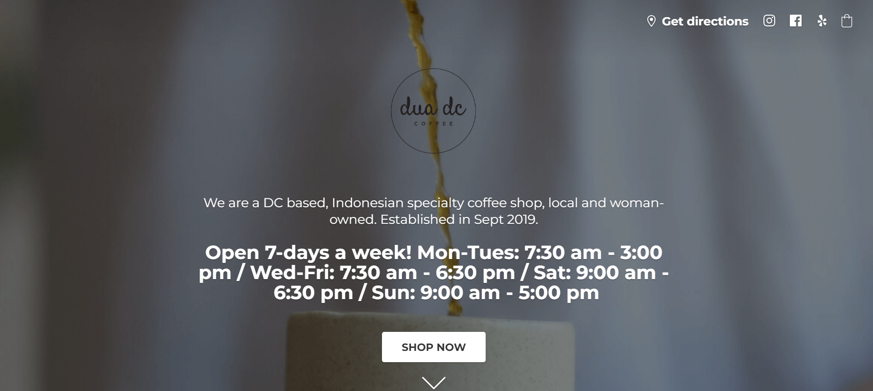
What we like: Dua DC Coffee’s website flashes with its clean, minimalist design, which gives it a fresh and uncluttered look. The simplicity of the design makes it easy to navigate, providing a specific user experience. If you’re uplifted by this method, you can easily imitate it using popular website builders like Wix, GoDaddy, or WordPress CMS.
As you explore the site, you’ll find good organized menus for coffee, food, gifts, and coffee beans. Each menu item is paired with enticing images that make it easy to see what’s on offer. The site also features timely options for placing orders in advance, making it a breeze for customers to get what they want with minimal fuss. Overall, Dua DC Coffee’s website is a great example of how simplicity can enhance both aesthetics and functionality.
Biowilly’s Beans
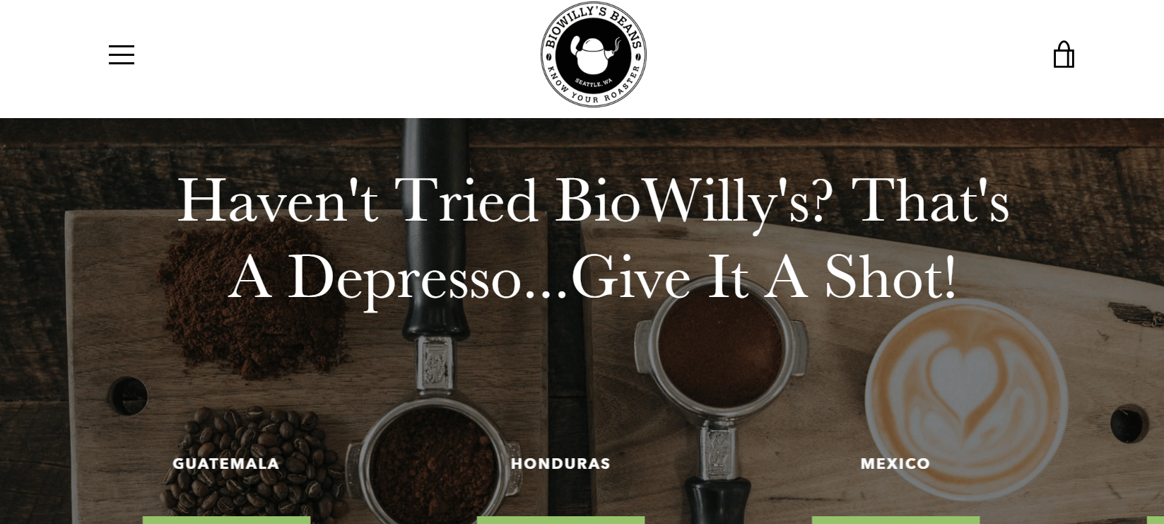
What we like: Most people trust brands that have a website. If you’re in the coffee industry, having a website that displays your brand’s style and personality is essential. Biowilly’s Beans is a unique and engaging coffee shop website that’s sure to inspire coffee entrepreneurs.
The homepage is packed with elements that make the site stand out in the industry. These include testimonials displayed in a slider, brand introductions via video integration, various coffee products in a single-column layout, an off-screen menu, a tidy online store, and more. A great, user-friendly layout complements the valuable content this site offers to every visitor.
Cafe Unido
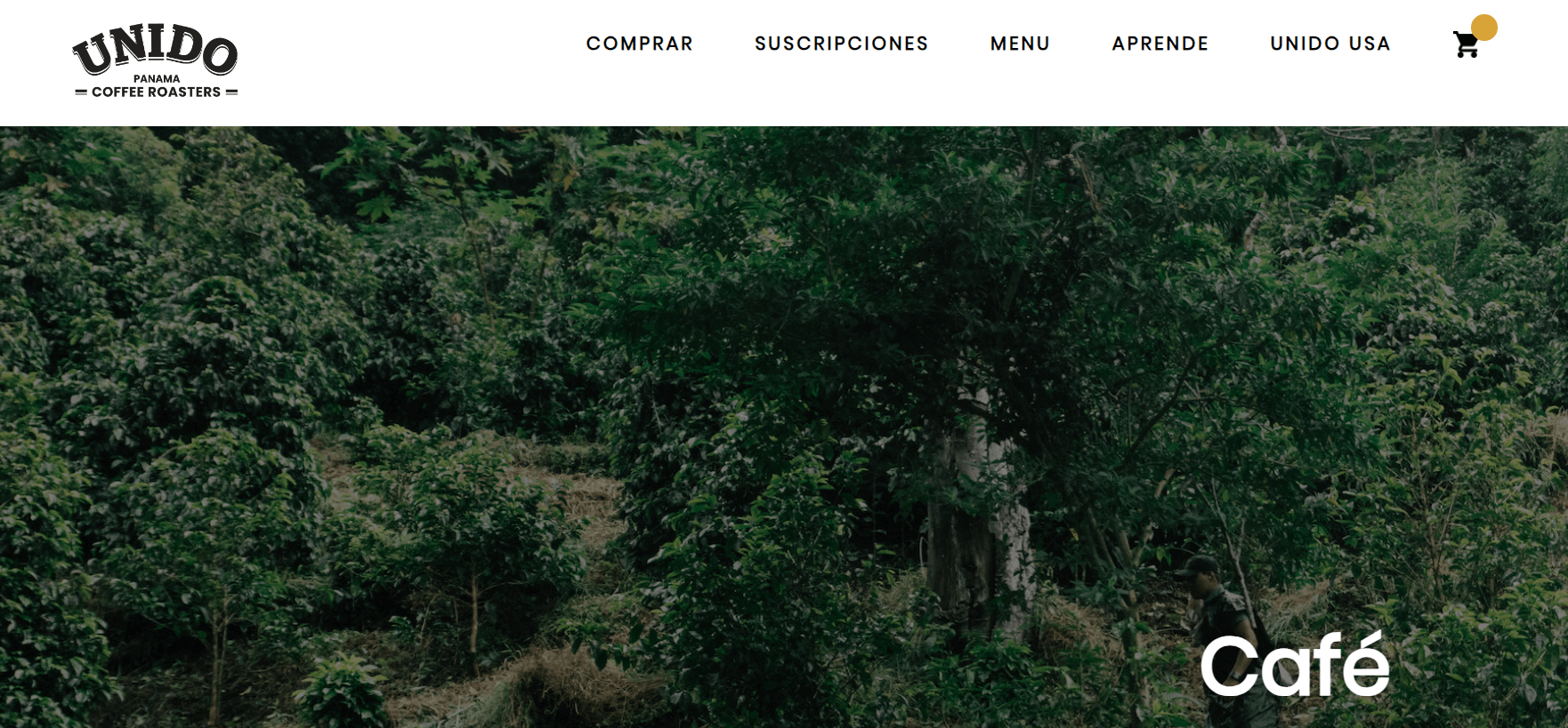
What we like: Unido’s website primarily focuses on selling their Panama blends. If you also offer coffee bags, you can get some ideas on how to boost sales for specific products and exclusive blends. For example, you could incorporate a “Favorites” section or dedicate an entire screen to your premium blends.
Unido also keeps potential café customers in mind by placing the menu and locations right at the top of the page.
Couvee
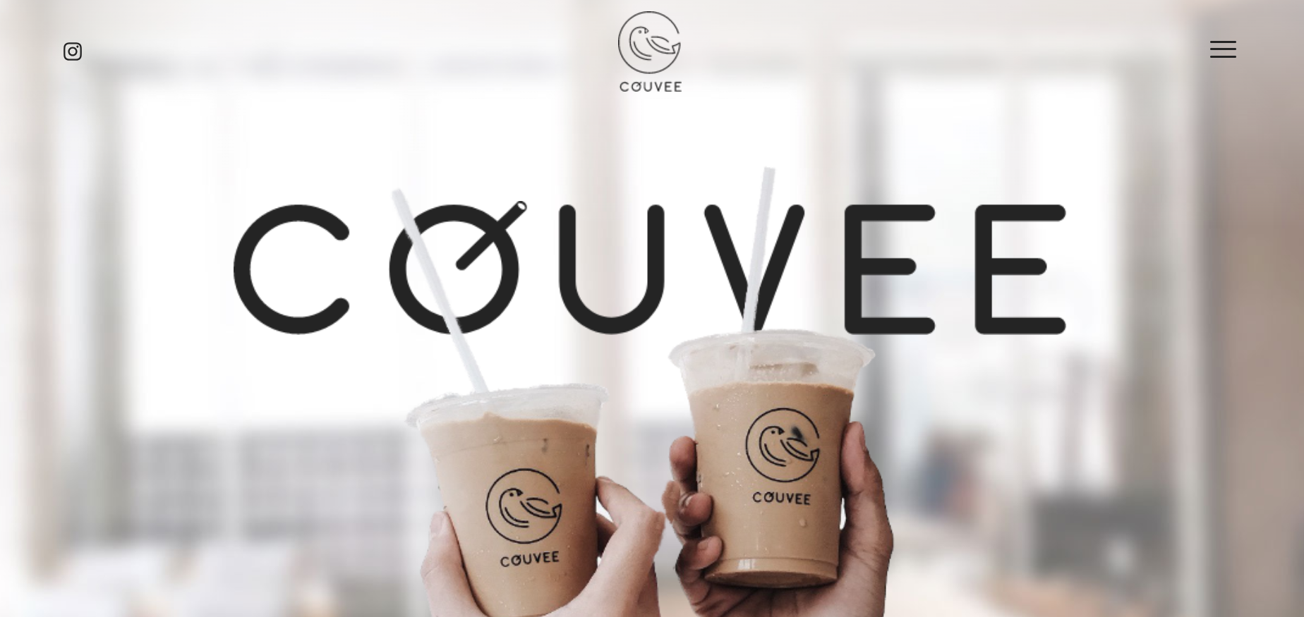
What we like: Featuring bestsellers and high-resolution images on your coffee shop website is always a winning strategy for impressing visitors. Couvee is a great example of a distinctive coffee shop site. The hero section includes a fantastic zoom effect as users scroll down the homepage. Additionally, other elements of the site showcase eye-catching animations. To ensure easy navigation, Couvee makes all other pages readily accessible through an off-canvas menu and a fixed header.
Moreover, it allows users to easily shop for various products in the store. And it doesn’t stop there—the Instagram feed and promotional section also look fantastic.
EMISSARY
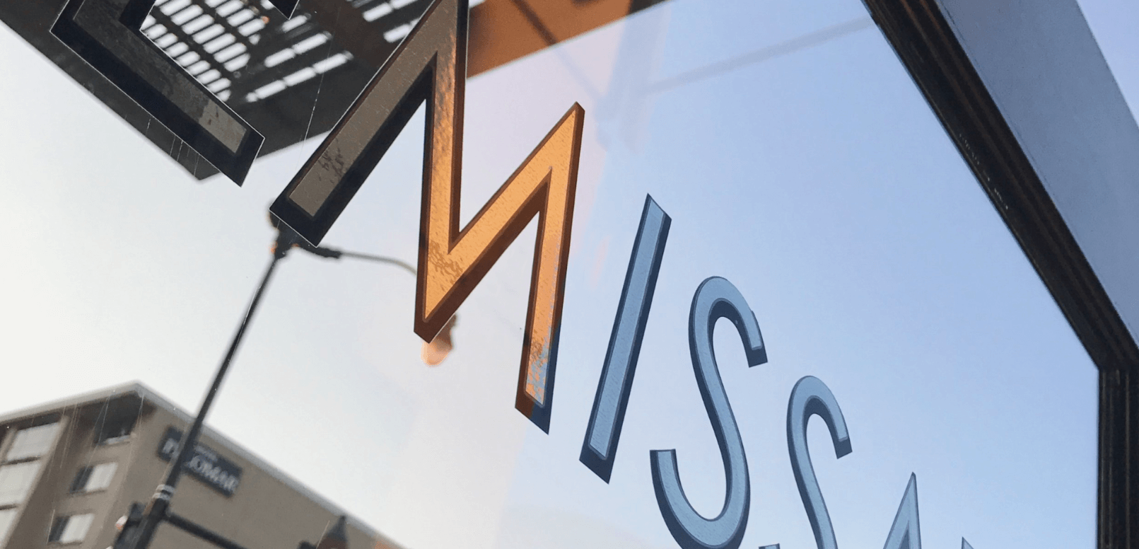
What we like: Emissary’s website is essentially a collection of high-quality photos. Every image on the site is beautifully shot, perfectly capturing the essence of what Emissary offers. Happy customers, refreshing iced lattes, savory burgers, and more all contribute to a premium atmosphere.
Moreover, Emissary prioritizes user experience. You can easily find the menu in the navigation bar and the online ordering buttons below.
KINGSWOOD COFFEE
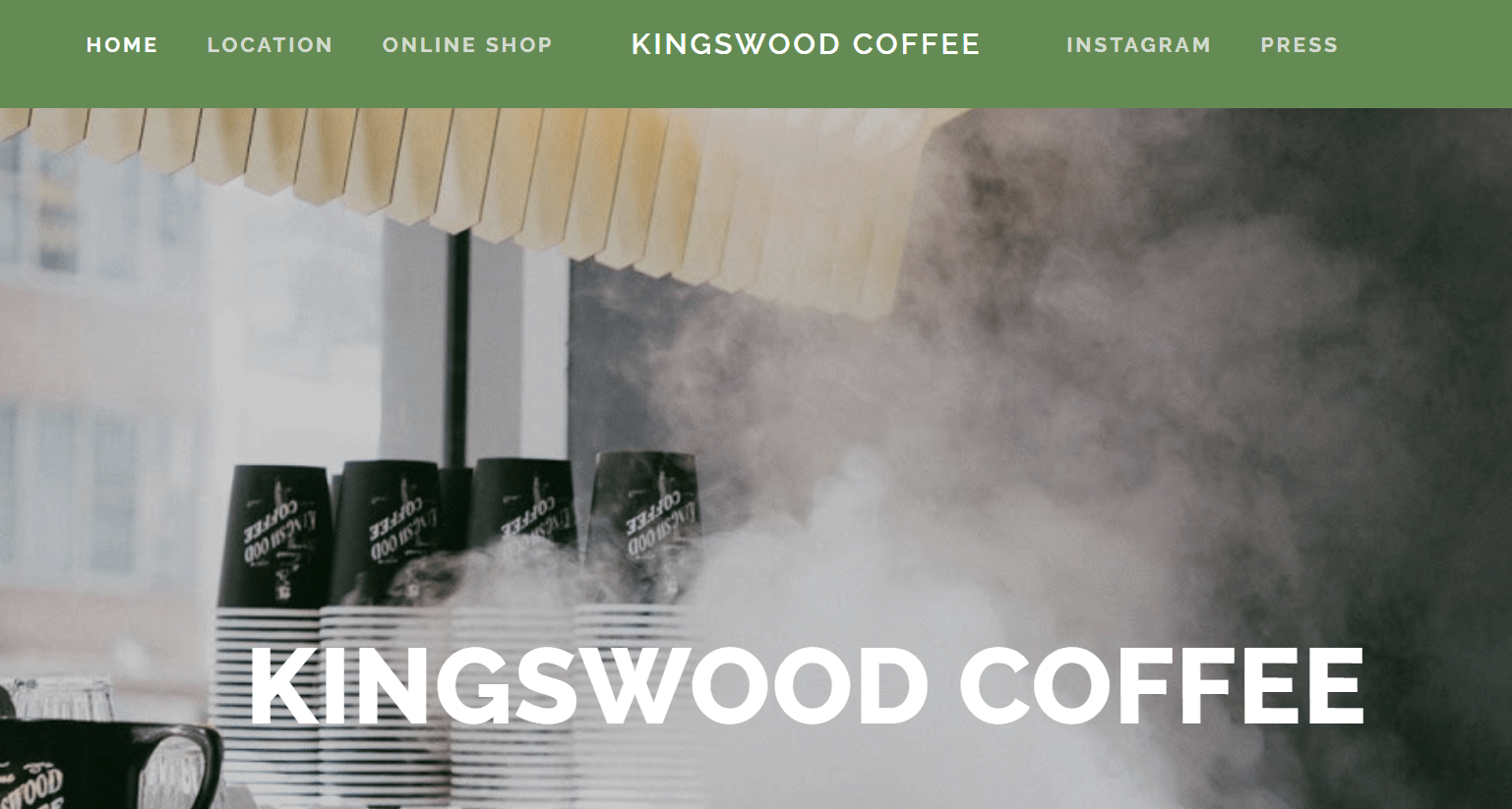
What we like: Kingswood Coffee’s website perfectly blends classic charm with modern simplicity. The main image of a classic steam coffee maker instantly makes you crave a rich Americano with lactose-free milk. The minimalist design is clean and straightforward, making it easy to navigate.
You can quickly find café locations, purchase coffee beans, and explore life at Kingswood by clicking the Instagram button. This social media integration provides a glimpse into the vibrant community and keeps you connected with the latest updates. Overall, Kingswood Coffee’s website captures the essence of a cozy café experience while offering a user-friendly interface.
Rival Bros
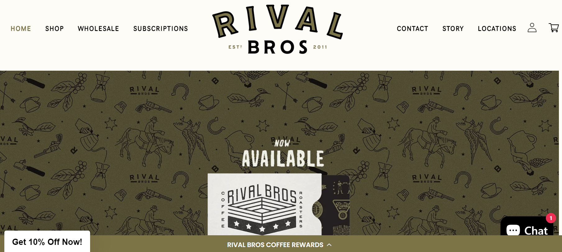
What we like: Rival Bros is an excellent example if you’re searching for a website that combines both wholesale services and a café. From the very first page, you’ll catch that the site effectively highlights its unique selling proposition, ensuring it grabs your attention right away. The design focuses on clarity, with a single screen dedicated to a prominent call-to-action (CTA), which simplifies the user journey and drives engagement.
The website’s minimalist practice keeps everything forthright, using concise copy and impactful images that capture the true essence of the café’s atmosphere. The cohesive design ties together every element, from icons to text and backgrounds, creating a harmonious and visually appealing experience. Whether you’re interested in wholesale opportunities or just want to explore the café’s offerings, Rival Bros manages to deliver a well rounded and engaging online presence.
Rachel’s Coffee House
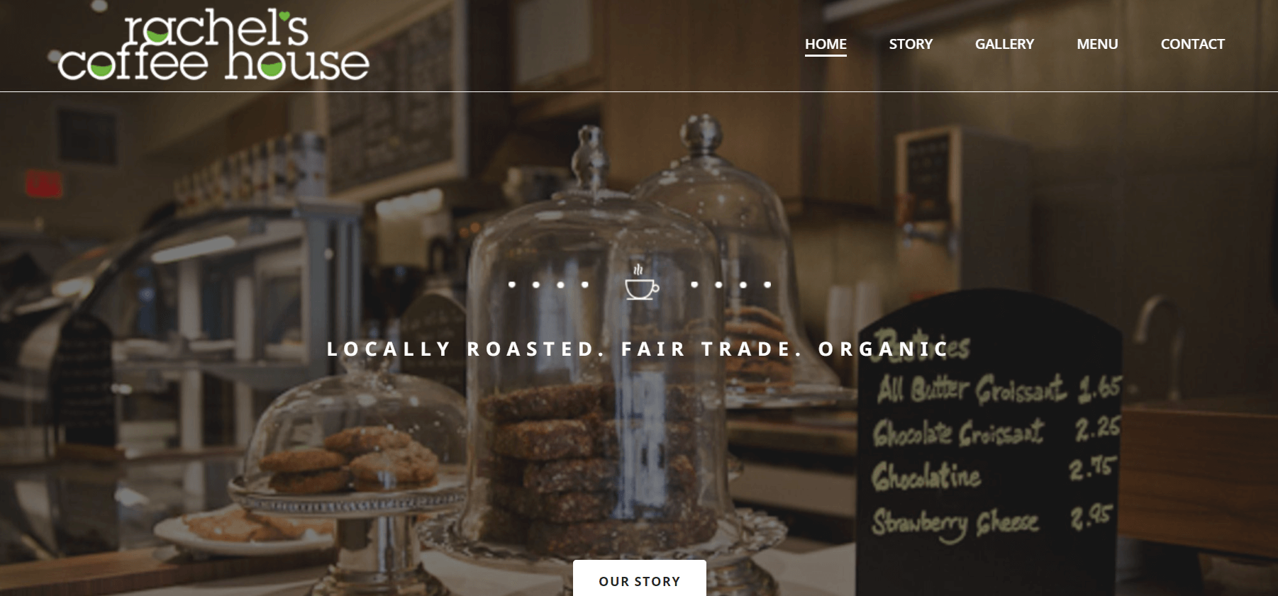
What we like: Rachel’s Coffee House features a cozy and inviting design, creating a soothing, home-like atmosphere. The website uses a palette of beige, brown, and white to achieve this.
It welcomes you with delicious dishes in the main image. Then, it shares Rachel’s story and mission, highlighting the most important points. Finally, you can explore the menu along with photos of the food and drinks.
Manic Coffee
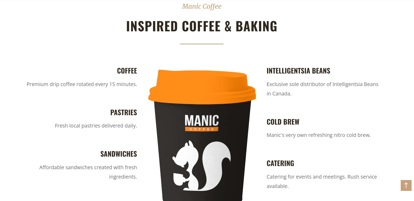
What we like: Manic Coffee’s website stands out with its playful and lively design, thanks to its cheerful logo and bright orange-white color scheme. The site features a fun parallax scrolling effect that adds a sense of depth as you navigate, and it creatively lists its services around a coffee cup, which is both unique and engaging.
In addition to the eye-catching design, the website makes it easy to explore Manic Coffee’s menu directly from the header. Plus, you can join with their vibrant community and stay updated on the latest happenings by following their Instagram page. Overall, Manic Coffee’s website perfectly captures the energetic and welcoming spirit of the café.
JAVA HOUSE
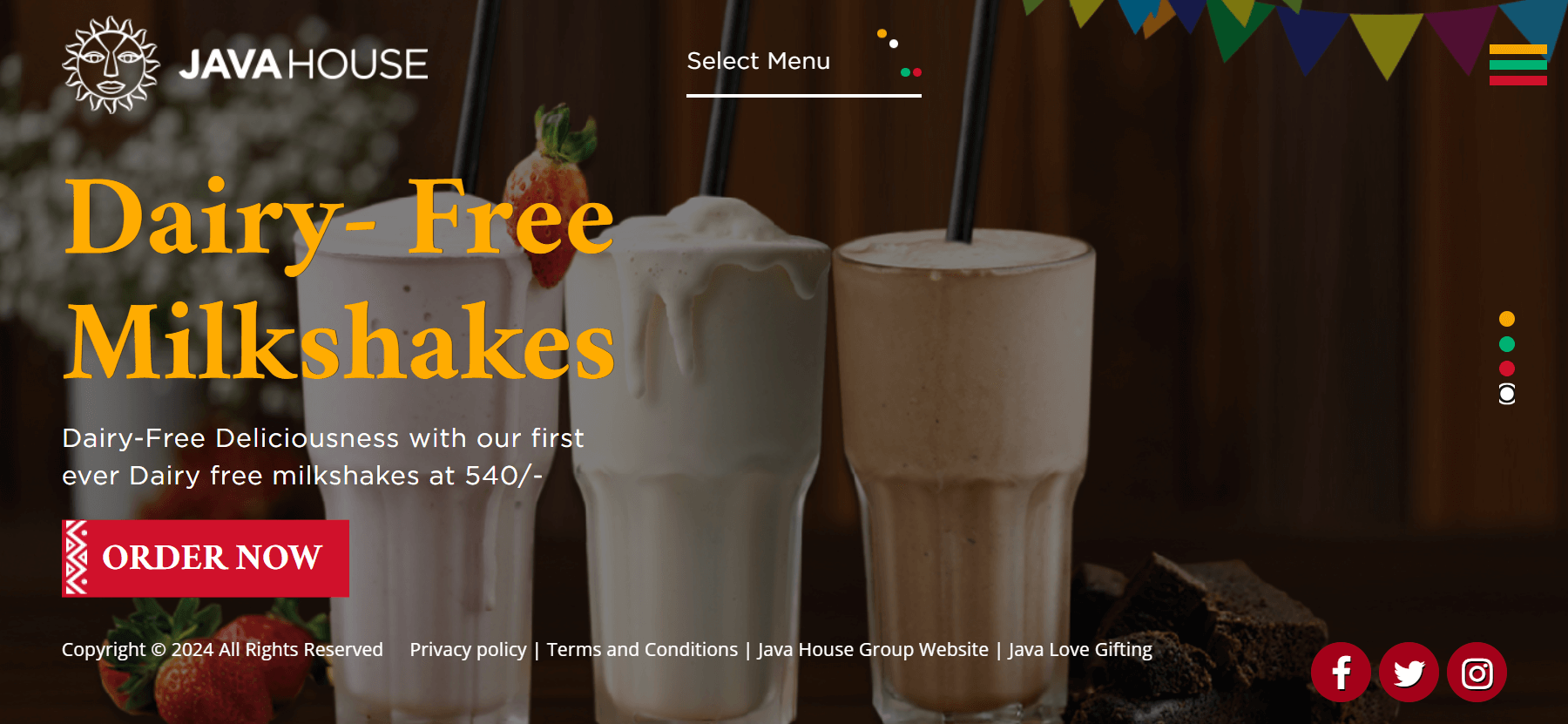
What we like: Experience the African vibe with this vibrant color palette! Java House’s website is simple yet beautifully designed, featuring full-width image sliders. Each image showcases seasonal foods and drinks with a red button prompting you to order.
In the top right corner, there’s a hamburger button to toggle the site’s menu. Similarly, the food and drink menus are displayed at the top center.
Vida e Caffe
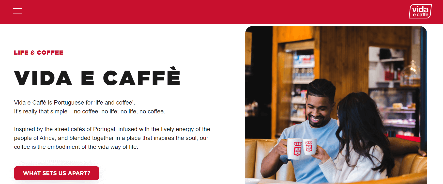
What we like: Vida e Caffe’s website does a fantastic job of showcasing the company’s values and sharing its story with visitors. Beyond that, it effectively promotes its blended coffee online, making it easy for customers to shop directly.
The site boasts a modern and sleek design, characterized by its innovative use of broken and overlapping grids that create visual interest. Incredible images and surfaces combine seamlessly with the vibrant red tones throughout the site, giving it a cohesive and inviting look. This format not only improves the user experience but also adds a touch of sophistication to the brand.
Coffee Bean
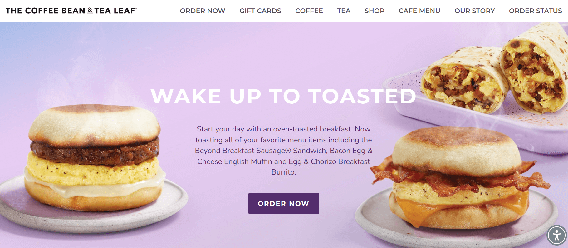
What we like: The parallax scrolling, dynamic backgrounds, full-width images throughout the site, and bold color combinations! Coffee Bean knows how to capture customers’ attention right from the start.
On top of its impressive visuals, Coffee Bean excels in user experience. The website’s intuitive navigation menu ensures that visitors can easily find what they’re looking for, whether it’s the menu, location details, or special promotions. Overall, the site combines stunning design with practicality, making it both visually appealing and user-friendly.
Panther Coffee
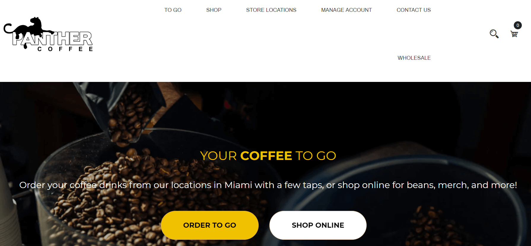
What we like: Panther Coffee brings a fresh perspective! The website features a minimalist and highly stylish design with yellow and white colors. The first screen welcomes both coffee enthusiasts looking to shop online and busy individuals needing takeout. Below, you’ll find coffee options and some merchandise.
The navigation menu caters to all customers—whether you want to explore the menu and locations or shop online.
Coffee Address
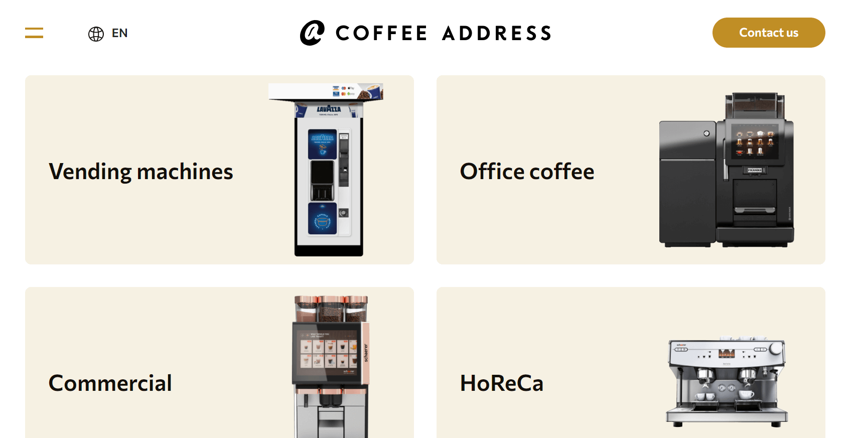
What we like: A café can be a delightful spot to relax and enjoy. So, beyond offering delicious coffee, you should also create a beautiful atmosphere to help people stay calm and relaxed. Additionally, don’t overlook the advantages of having an online presence.
Coffee Address features a stunning homepage for its coffee shop website. It utilizes large, captivating images, elegant white space, smooth scroll animations, and attractive sliders. The coffee offerings are displayed attractively with each item featured in a slider. An off-canvas menu is also included to help visitors navigate the site easily. Additionally, the social media icons in the footer are set up to connect to helpful pages. The site also highlights a fantastic display of various vending machines for business needs.
Equator Coffees
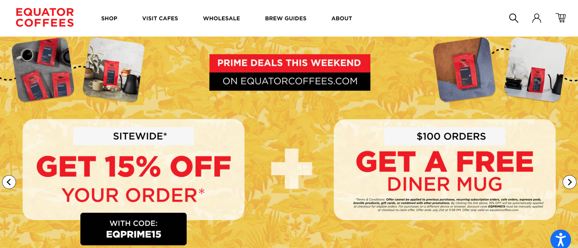
What we like: The user interface of your website is a paramount aspect of your online presence. Therefore, you should invest effort into designing both the homepage and the rest of the site. For example, Equator Coffees features an impressive hero section. Specifically, the white headline and main CTA stand out against a red image background.
The store section is also striking, with an animated background that appears as users scroll through the site. Equator Coffees also offers an excellent gift set for shoppers, providing coffee lovers with a great deal. Additionally, the site showcases a beautiful limited edition of their holiday products with another appealing section. The website uses a fantastic slider to display multiple products at once, highlighting a variety of offerings.
Summary
Wow, wasn’t that fun? We saw some really amazing cafe websites that have all sorts of cool stuff like big, bright pictures, easy-to-use menus, and even places to order coffee online! Having a great website can really help a cafe get more customers and make people want to visit. So, if you ever think about making a website for a cafe, remember these awesome examples we looked at. They show how you can make a website that’s not only super cool but also really helpful for people who love coffee. Happy web designing!

