

7 mins read
|
06-30-2026
13 Examples of Bad Website Design in 2025
Vinh Jacker | 07-19-2023
Users may stay on a website longer, investigate it more thoroughly, and eventually become devoted clients if it is visually appealing and easy to use. A bad website design, on the other hand, might quickly drive visitors away, leaving them frustrated, perplexed, and reluctant to return.
In this post, we’ll explore bad website design by looking at 13 instances highlighting typical errors and flaws. By analyzing these examples, we aim to emphasize the significance of sound web design principles and offer insightful advice on how these websites can be enhanced to improve user experience and produce better outcomes.
In the course of our investigation, we will find a variety of design faults, such as cluttered layouts, perplexing navigation, an overabundance of adverts, bad color schemes, antiquated aesthetics, and more. We intend to increase awareness of the damaging effects these errors can have on a website’s functionality and reputation by bringing them to light.
What is A Bad Website Design?

A bad website design can significantly impact user experience negatively, leading to frustration, and confusion, and ultimately driving visitors away. Conversely, a good website design provides a user-friendly, efficient, and enjoyable experience, encouraging visitors to stay longer and engage more deeply. Here’s a comparison between the characteristics of bad and good website design:
| Aspect | Bad Website Design | Good Website Design |
|---|---|---|
| Navigation | Confusing navigation menus, lack clear structure, making it hard for users to find what they need. | Intuitive and straightforward navigation that guides users to the information they need quickly and easily. |
| Load Time | Slow loading times due to unoptimized images or excessive use of scripts lead to user impatience and site abandonment. | Fast loading times, with optimized images and minimal use of heavy scripts, ensure users stay engaged. |
| Content Clarity | Overcrowded with content, lacking clear headings, and difficult to read due to poor font choices or text sizing. | Well-organized content with clear headings, easily readable fonts, and appropriate text sizes, enhancing user comprehension and engagement. |
| Visual Design | Cluttered layouts, inconsistent fonts, and color schemes that are harsh on the eyes or convey an unprofessional image. | Clean, attractive layout with consistent branding, easy-to-read fonts, and a color scheme that enhances readability and user experience. |
| Responsiveness | Non-responsive design that looks bad or doesn’t function well on mobile devices, alienating a significant portion of web traffic. | Responsive design that adjusts seamlessly to different screen sizes, ensuring a positive user experience across all devices. |
| Accessibility | Lack of accessibility features for users with disabilities, such as poor contrast, no keyboard navigation, and missing alt text for images. | Accessible to all users, including those with disabilities, featuring high contrast, keyboard navigability, and descriptive alt text for images. |
| User Interaction | Unintuitive user interfaces with confusing or hidden interactive elements, lead to user frustration. | Clear and intuitive user interfaces that facilitate interaction, with evident clickable elements and feedback for user actions. |
| SEO and Content | Poorly optimized for search engines, with scant content, missing meta tags, and ineffective use of keywords, leading to low search visibility. | Well-optimized for search engines, featuring rich content with appropriate use of keywords, meta tags, and structured data, enhancing visibility. |
| Consistency | Inconsistent design elements and layout across different pages, create a disjointed and confusing user experience. | Consistent design elements and layout throughout the site, providing a cohesive and professional user experience. |
| Error Handling | Unhelpful error messages (or none at all) when things go wrong, leaving users confused and unsure of what to do next. | Informative error messages help users recover from errors, guiding them on how to proceed or navigate back. |
Understanding these differences can help designers and developers create more effective, user-friendly, and successful websites.
Reasons For A Bad Website Design And Solutions
A bad website design might result from a variety of issues. Let’s look at a few of the typical offenders:
Lack Of Direction And Poor Navigation
A website should effortlessly direct people through its information so they may quickly and easily locate what they’re looking for.
Lack of direction might lead to an unorganized layout, uneven menus, or misleading labeling, making it challenging for consumers to use the site successfully. The user experience can be better by putting logical page hierarchies, intuitive navigation menus, and obvious calls to action in place.
To fix issues related to lack of direction on a website, implementing a series of design and structural improvements is essential. Here’s how to enhance user experience through better website organization and navigation:
-
Structure Content Clearly: Organize content into logical categories and use descriptive headings.
-
Simplify Navigation: Create an easy-to-use menu with a limited number of items and consistent placement.
-
Prominent CTAs: Use action-oriented language for CTAs and make them stand out with design.
-
Descriptive Link Text: Replace vague phrases like “click here” with descriptive link and button labels.
-
Use Consistent Terminology: Maintain uniform language across your site for familiarity.
-
Implement Search Functionality: Add a search bar to help users find information quickly.
-
Breadcrumb Navigation: Include breadcrumb trails for easy backtracking within the site.
-
Footer Links: Utilize the footer for additional navigation to important pages.
-
User Testing: Conduct tests to identify usability issues and areas for improvement.
Undesirable Or Overpowering Color Selection
Users’ perceptions of and interactions with websites are significantly influenced by color. An uncoordinated color scheme or clashing colors might make the site difficult to read or visually unpleasant.

Similarly, extremely vivid or saturated color schemes might overwhelm users and divert their attention from the primary message. When choosing colors for a website, it’s crucial to balance aesthetically pleasing appearance and readability. To address issues with color schemes on websites and enhance user experience through balanced and effective color choices, follow these guidelines:
-
Use a Consistent Color Palette: Choose a limited set of colors that reflect your brand and use them consistently across your website.
-
Balance Color Saturation: Avoid overly vivid or saturated colors that can be overwhelming; opt for a balanced approach that complements the site’s content.
-
Ensure Readability: Select color combinations that offer high contrast, particularly for text, to ensure readability for all users, including those with visual impairments.
-
Employ Color Psychology: Understand the psychological effects of colors and choose those that align with the message and tone you want to convey.
-
Highlight Key Elements: Use color to draw attention to key elements like CTAs, but do so sparingly to avoid diluting their impact.
Insufficiently Responsive Design
Websites need to adjust to different screen sizes and resolutions because mobile devices are so common. A lack of responsiveness on smaller devices can cause distorted layouts, misplaced objects, and challenging-to-use interfaces.

A website will deliver a smooth user experience across various devices if it embraces responsive design principles and uses methods like fluid grids, flexible pictures, and media queries. To ensure your website is optimally responsive across all devices, addressing common issues related to non-responsive design, consider these actionable solutions:
-
Adopt Fluid Grid Layouts: Use fluid grids that proportionally adjust the layout elements based on screen size, rather than fixed-width layouts.
-
Implement Flexible Images: Ensure images are scalable, either through CSS or by setting their max-width to 100% to prevent them from exceeding their containing element.
-
Utilize Media Queries: Apply media queries in CSS to apply different styles based on the device’s screen size, resolution, and orientation.
-
Prioritize Mobile-First Design: Start your design process with mobile devices in mind to ensure content and navigation are optimized for smaller screens from the beginning.
-
Test on Multiple Devices: Regularly test your website’s responsiveness on various devices and browsers to identify and correct any issues.
-
Optimize Touch Targets: Make sure buttons and links are easy to tap on touchscreen devices by increasing their size and spacing.
-
Simplify Navigation for Small Screens: Implement a responsive menu (like a hamburger menu) that’s easy to use on mobile devices.
-
Limit the Use of Text Input: Reduce the need for extensive text input, which can be cumbersome on mobile devices.
-
Ensure Fast Loading Times: Optimize site performance for mobile devices, considering they may have slower internet connections.
Leave Usability Out
A website’s usability focuses on ensuring it is simple to use and intuitive. Users may have frustrating encounters as a result of disregarding usability principles.
Some examples of bad usability include broken links, perplexing navigation, unclear labeling, complex forms, and slowly loaded pages. Enhancing usability requires user testing, establishing clear navigation paths, streamlining interactions, and optimizing site performance.

To enhance a website’s usability and create a more intuitive and user-friendly experience, consider implementing the following solutions:
-
Use Clear Labeling: Employ descriptive labels for navigation links and buttons, making it obvious what action they will perform.
-
Optimize Forms: Streamline forms by reducing the number of fields, providing clear instructions, and using field validation to prevent errors.
-
Fix Broken Links: Regularly check and repair any broken links within your site to prevent user frustration and ensure a smooth browsing experience.
-
Implement Clear CTAs: Place clear and compelling calls-to-action (CTAs) throughout your site, guiding users toward desired actions.
Long Loading Times For Websites
Websites that take a long time to load are quite annoying to users. When a website takes too long to load, users may give up and look for quicker alternatives. Slow loading speeds - a reason for bad website design can be caused by several things, including large graphics, heavy usage of scripts or plugins, uncompressed files, and ineffective server optimization.
To address and improve long loading times for websites, ensuring a faster and more efficient user experience, follow these strategic solutions:
-
Minify HTML, CSS, and JavaScript: Remove unnecessary characters (e.g., whitespace, comments) from code files to decrease their size.
-
Enable Browser Caching: Set up browser caching to store frequently accessed resources on the user’s device, reducing loading times on subsequent visits.
-
Use a Content Delivery Network (CDN): Distribute your content across multiple, geographically diverse servers to reduce latency by loading resources from a server closest to the user.
-
Reduce HTTP Requests: Combine files where possible (e.g., CSS and JavaScript) to decrease the number of server requests needed to load a page.
-
Utilize Lazy Loading: Delay the loading of non-critical resources at page load, such as images below the fold, until they are needed.
-
Optimize Server Response Time: Evaluate your hosting solution and server configuration for any performance bottlenecks and consider upgrading if necessary.
Being Overly Crowded With Objects Or Words
A crowded website confuses users and takes their attention away from the intended information or actions is another sign of bad website design. Users find it difficult to concentrate on the website’s key features when there are too many elements, too much content, or crowded layouts.
The site can be made more visually appealing and user-friendly by taking a minimalist approach, utilizing lots of white space, organizing layouts, and prioritizing the hierarchy of information.
To address and improve websites that are overly crowded with objects or words, making them more visually appealing and user-friendly, consider these strategic solutions:
-
Embrace Minimalism: Adopt a minimalist design approach, focusing on essential elements to avoid overwhelming users.
-
Increase White Space: Use ample white space (or negative space) around and between elements to improve readability and focus.
-
Organize Layouts: Structure your pages with clear, logical layouts that guide users’ eyes through the content effectively.
-
Prioritize Content Hierarchy: Establish a clear hierarchy of information, using size, color, and placement to highlight the most important content.
-
Simplify Navigation: Streamline navigation menus to include only the most necessary items, making it easier for users to find what they need.
-
Limit Font Varieties: Use a limited number of font styles and sizes to maintain a clean, cohesive look across your site.
-
Use Graphics and Icons Wisely: Incorporate graphics and icons sparingly and purposefully to support content without overcrowding.
Unfinished Website Design
An unfinished or neglected website leaves a negative impression on users and is also a bad website design. Placeholder content, broken links, or incomplete sections convey a lack of attention to detail and can erode trust.
To address and rectify an unfinished website design, ensuring a polished and professional online presence, focus on these key actions:
-
Regular Updates and Maintenance: Schedule routine checks to update content, fix bugs, and implement new features, keeping the website current and functional.
-
Fix Broken Links and Remove Placeholders: Regularly scan for and repair broken links, and replace any placeholder text or images with final content to eliminate signs of incompletion.
-
Ensure Consistency Across Pages: Verify that all website pages maintain consistent design elements, navigation, and content layout to present a cohesive user experience.
Disregard Security
Website security is essential to protect user data and uphold credibility. Users disregarding security precautions may be vulnerable to malware infections, phishing scams, or data breaches.
To protect user data and uphold a secure online environment, it’s essential to implement SSL certificates, use strong authentication methods, update software and plugins, and frequently check for vulnerabilities.
By taking into account these aspects and implementing best practices, website designers and owners may improve the effectiveness of their online presence overall, instill visitors with confidence, and create a great user experience.
E-commerce Solution Provider
Over 119,000 global clients have achieved their goals with Mageplaza's help. It's your opportunity to do the same now!
Get Started
Examples Of Bad Website Designs
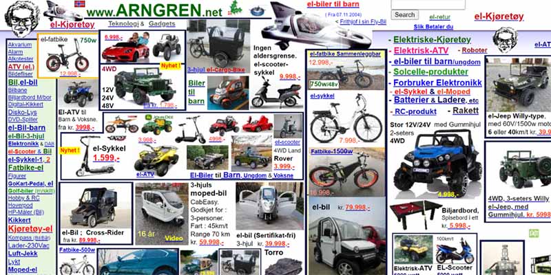
Arngren
For those who think grid-based structures are faultless, this clearly illustrates what may happen if you don’t have skilled developers handling them.
Arngren’s website is a complete mess. Even if the data is organized using a grid and some cells have clear borders, this does not solve the problem. Usability, readability, and user experience are all terrible.
Running websites with a lot of content is challenging. You must support spacing, layout, and formatting as well. Evidently, the author is unaware of that. Arngren is, therefore, among the worst websites on the internet.
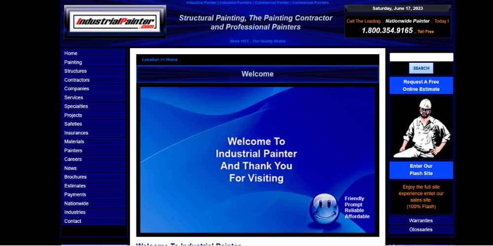
Industrial Painter
You could assume that we are moving in the right direction after looking at our next poor website sample. You are mistaken once more. Although interfaces modeled to Joomla were common a decade ago, they are now unfashionable.
The problem is that this outmoded design makes it difficult to use websites on screens as small as cell phones and phablets, in addition to big computers. The design is consistent at all times. The contrast ratio is low, and the font size is not adjusted for small displays. Even while you can get information, this is not the quality you would expect from a contemporary website.
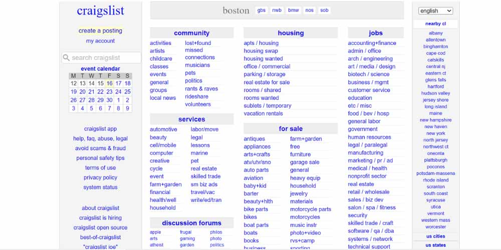
Craigslist
The internet has seen Craigslist for years. We all hold Craig Newmark in high regard because he was the pioneer in introducing classified ad websites, which gave rise to all internet directories and platforms for information overflow. Even though it has a simple look, this website is among the worst.
So what are the primary shortcomings?
A three-column style that uses a traditional fixed grid system and is difficult to navigate. Poor usability: Finding the information takes a long time. Only clickable mobile versions are available. There are no visual signals at all.
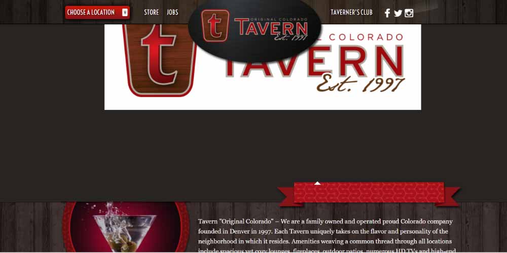
Tavern
The fact that they remain in the past, like this official page of a Colorado-based restaurant trapped in 2013, is one of the key reasons internet properties turn into poor websites. The style is antiquated. The strong, expressive typeface and certain abrasive textures are among its more attractive qualities, but overall it leaves a bad impression.
It fails to establish credibility and trust, which is a deal-breaker. The website’s inability to be responsive or mobile-friendly is another severe problem. Although it would appear that this rigid, boxy structure looks fine on mobile devices, it doesn’t. The corporation suffers a huge market share loss.
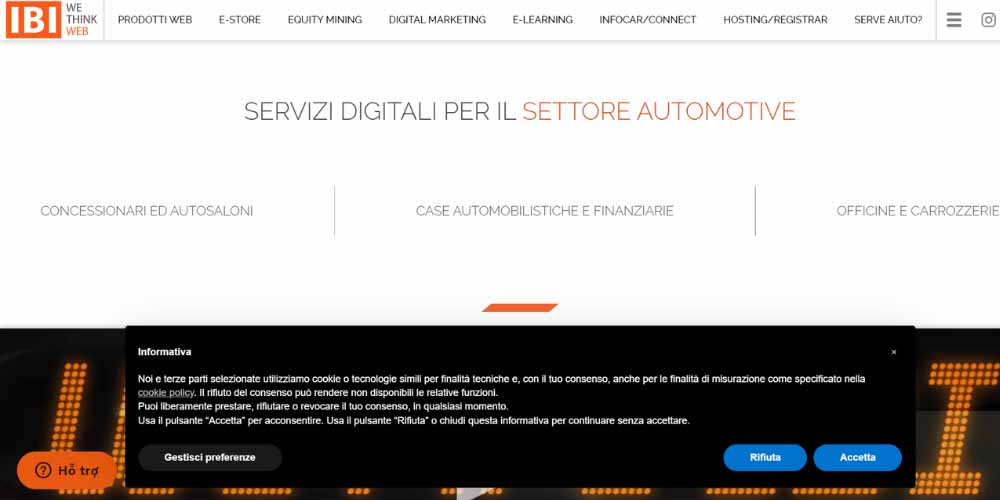
IBI
The official website of IBI almost deserves the label “good website.” Some factors, though, prevent it from being given this title.
The header contains a video to start. Despite the glitch effect, which immediately draws attention, everything is ruined. The problem is that, for accessibility reasons, it is not advised to possess. Additionally, it has no information. It is merely a nice diversion.
Second, there is no hierarchy of information. The next place to look? You must lead users if you want to move them down the marketing funnel. However, users are left to their own devices here. Finally, using a full-screen layout requires consideration. You must constantly walk from the left to the right side of the room.
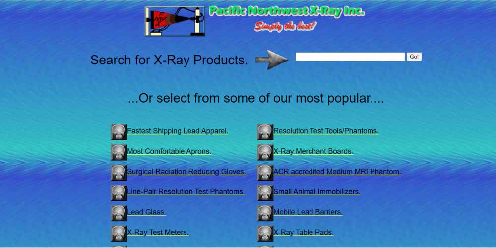
PNWX
The official website of Pacific Northwest X-Ray Inc., PNWX, features a current catalog. It is a genuine website that appears to be very much alive. Even though it is from 1997, a respectable age, it does not inspire any awe. The truth is that even the best website designers in the world cannot save your reputation if you have a terrible website.
The webpage discourages rather than draws visitors in, despite having a search field, categories, navigation, and some helpful links. The only solution is completely redesigning the site while enhancing user experience, SEO, performance, and accessibility.
MIT Center
Universities’ and governments’ websites are well-known for being out-of-date or employing design strategies that not everyone can fully comprehend or accept. A good illustration of that is the MIT Center’s official website.
Although some eccentric people might find it incredible owing to the unconventional solutions, it can be a significant difficulty for the general public, who have short attention spans and a need to acquire information as quickly as possible.
This website’s primary fault is the excessive use of parallax. The latter is an effective technique for producing a captivating user experience. But immense power also entails great responsibility. Additionally, you risk having a lousy website and a bad customer experience when you go overboard.

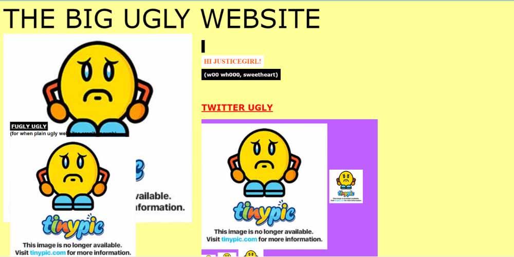
The Big Ugly Website
The nameplate, once more, is self-explanatory. The project focuses on some extreme design options that were purposefully implemented so that you can understand how bad choices based on antiquated patterns may ruin everything.
This page has a two-column layout fixed to the left, poor color schemes, a lack of respect for the order of the information, excessive use of visual elements, and simple links as content. Suppose you believe it to be a joke. Yes, both websites are complete jokes. Unbelievably, there are still websites that resemble one another. Check out the following spooky website illustration.
Apptivation
One of the web companies that creates applications for customers is called Apptivation. Since there is fierce competition in this market, you cannot afford to appear old. Apptivation, on the other hand, appears to not follow trends at all. Thus, this is not the case. The architecture is utterly antiquated.
Furthermore, it is totally prohibited to advertise your services using gadget mockups in 2014. Both the first and overall impressions are damaged. Any online portfolio might become a poor website by ignoring contemporary trends.

IMDb
Despite being a well-liked resource for movie information, IMDb’s website might appear busy due to the abundance of banners, advertising, and other promotional materials. The layout can be confusing because so many things are clamoring for your attention. Users could be deterred from getting the desired movie information by the advertisements and busy design.

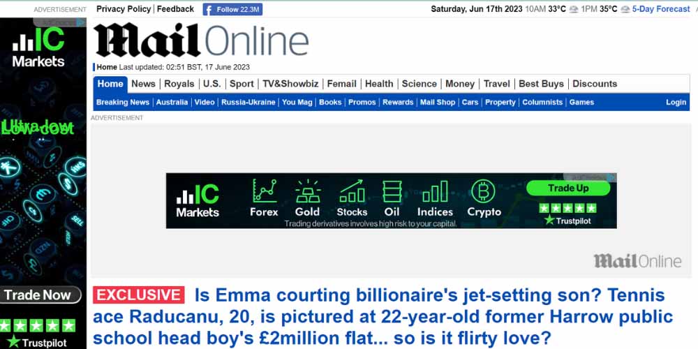
The Daily Mail
Because of how frequently advertising is used on the Daily Mail website, users may experience a cluttered and disorienting browsing environment. Users may find it challenging to read articles or move around the website easily.
This is because of the abundance of advertisements, banners, and pop-ups. Because there are so many visual components, page load times may be impacted, and user engagement may suffer.
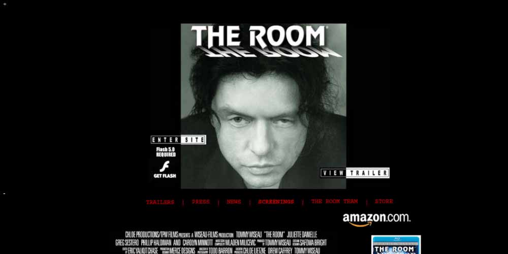
The Room
The layout of The Room website is disorganized, with text, buttons, and graphics covering one another. Navigating and understanding the content is challenging due to the content’s disorganization visually and the uneven design decisions. It may be difficult to obtain particular information on the movie due to the overuse of aspects that can confuse users.
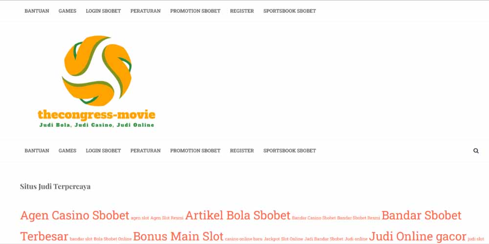
The Congress Movie
The Congress movie’s website has an illegible and disorganized layout. It is visually overpowering because it uses numerous fonts, brilliant colors, and overlapping elements. Finding pertinent information about the movie is challenging due to the poor user experience and lack of a clear structure and easy navigation.
Leverage an Efficient Website Design that Convert with Expert’s Help
Engaging a professional web design firm can be a wise investment if you lack the knowledge or time to alter the style of your website. These experts have the skills and experience to evaluate your current design, spot potential problems, and implement effective fixes.
They can help you stay on top of the most recent design trends, ensure best practices are followed, and build a visually beautiful, user-friendly website that complements your brand and supports your company’s objectives.
Consider Mageplaza development service because:
-
Knowledge and Experience: With almost ten years of combined experience, our devoted developers deeply understand creating and modifying Magento & Shopify solutions and extensions.
-
Customized Solutions: Each company is different. We create specialized E-commerce solutions to improve your productivity, profitability, and customer pleasure.
-
Detailed Services: We provide various Magento & Shopify development options, such as Shopify development and customization and Magento web development in the UK and the US.
-
Flexible Pricing: Forget about worrying about your budget; we have various website development options tailored to your requirements.
-
Quality Control and Assurance: We focus on quality control and assurance, ensuring that all projects adhere to the highest standards through stringent testing procedures.
Conclusion
In conclusion, these 13 examples of bad website designs shed light on the importance of practical design principles and user-centric approaches. From cluttered layouts and poor navigation to outdated aesthetics and overwhelming visuals, these websites showcase common pitfalls that hinder user experience and engagement.
Keep in mind that a well-designed website improves its visual appeal, usability, navigation, and user experience. Users should be able to obtain information, interact with the material, and perform the needed tasks easily and intuitively.
Website owners can make an excellent first impression, establish credibility, and clearly convey their message to visitors by prioritizing user experience. By following our tips, you can significantly improve your bad website design.
Table of content

Jacker is the Chief Technology Officer (CTO) at Mageplaza, bringing over 10 years of experience in Magento, Shopify, and other eCommerce platforms. With deep technical expertise, he has led numerous successful projects, optimizing and scaling online stores for global brands. Beyond his work in eCommerce development, he is passionate about running and swimming.
Related Post


How to Enable DebugView in GA4 for your Magento 2 store - Mageplaza
Step-by-step guide to enabling GA4 DebugView for Magento 2 merchants — verify your GA4 events are firing correctly before trusting your data.
8 mins read
|
06-09-2026

Table Rate Shipping in eCommerce: A Practical Guide
Master Magento 2 Table Rate Shipping. Learn how to configure an accurate, automated shipping matrix to optimize your checkout and boost sales.
10 mins read
|
06-02-2026
3 mins read
|
05-30-2026

Google Analytics Ecommerce Reports for Magento Merchants: What to track & Tips
A practical guide to GA4 ecommerce reports for Magento merchants, covering what to track, how to read each report, and specific tips to turn data into revenue decisions.
18 mins read
|
05-20-2026

5 Ways to Hide Products on Shopify (2026 Guide)
Explore the best 5 ways to hide products on Shopify. Learn how to manage visibility, protect pricing, and create a tailored shopping experience for buyers.
18 mins read
|
05-16-2026
7 mins read
|
06-30-2026
How to Enable DebugView in GA4 for your Magento 2 store - Mageplaza
Step-by-step guide to enabling GA4 DebugView for Magento 2 merchants — verify your GA4 events are firing correctly before trusting your data.
8 mins read
|
06-09-2026
Table Rate Shipping in eCommerce: A Practical Guide
Master Magento 2 Table Rate Shipping. Learn how to configure an accurate, automated shipping matrix to optimize your checkout and boost sales.
10 mins read
|
06-02-2026
3 mins read
|
05-30-2026
Google Analytics Ecommerce Reports for Magento Merchants: What to track & Tips
A practical guide to GA4 ecommerce reports for Magento merchants, covering what to track, how to read each report, and specific tips to turn data into revenue decisions.
18 mins read
|
05-20-2026
5 Ways to Hide Products on Shopify (2026 Guide)
Explore the best 5 ways to hide products on Shopify. Learn how to manage visibility, protect pricing, and create a tailored shopping experience for buyers.
18 mins read
|
05-16-2026