
3 mins read
|
06-30-2026
One Page Checkout vs Multi Step Checkout: Which Is Better?
Vinh Jacker
|
03-17-2025


Creating an amazing user experience is an effective method to increase customer conversion and expand your online stores. Besides the UX/UI factors such as visual design, interactive design, information architecture, etc., eCommerce checkout is also a point that you should invest in. It can be said that checkout becomes one of the most important steps among other shopping activities. It is not easy to lead a shopper to your checkout page anyway, but not until this step, does real drama happen. A smooth checkout process from the beginning to the end is a “blessing”; in contrast, difficulties in completing checkout forms, hidden costs, terribly long pages, trust issues, and other tiny factors can cause cart abandonment.
So, between two common types of checkout pages - One page checkout vs Multi page checkout, which is better? Let’s discover the answer by comparing the pros and cons of each model in this article. We write it in a neutral corner that focuses on convenience and speed during online payment to help you choose the best option for your store.
What is One Page Checkout?
One-page checkout is a streamlined online payment processing method where all the steps required to complete a purchase are condensed onto a single page. This is the core of the single page vs multi-step checkout comparison.
Ordinarily, online purchases involve navigating through multiple pages for shipping, payment, and item review. However, with a one-page checkout, our buying process ensures quick and easy completion. No more back-and-forth between pages, everything we need is right there. We can input shipping info, select payment methods, and review our items - all in one view. It makes a simple and efficient way to shop online.
Not only does this payment process make the transaction quicker and more straightforward, but it also potentially reduces customers’ cart abandonment. From that, we can enhance user experience and increase conversion rates for our online businesses.
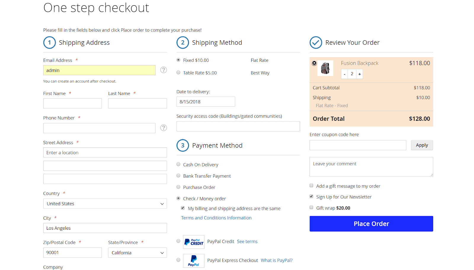
One Page Checkout Pros
-
Minimize steps and clicks: One-page checkout offers a simpler, faster, and more convenient option as all order information is displayed on a single page.
-
Mobile-friendly: One-page checkout is often more compatible with mobile devices, ensuring a smoother experience.
-
Increase conversion rate: Conversion rate is greatly influenced by payment speed. If the transaction takes too much time to pay, customers may lose patience and give up the idea of purchasing.
-
Appear to be easy: As all the must-have checkout steps are already shown on the page with the button Place Order, customers know exactly what they have to do to complete the checkout process. The clean and neat design of checkout fields makes buyers think that the whole process will not take much time to finish.
-
No distraction: Customers are kept on one single page only. All additional information and steps can be completed right on the checkout page. For example, buyers can read and check terms and conditions, select the gift wrap option, leave gift messages, review orders, leave order comments, register for newsletters, and apply coupon codes right on this checkout page.
One Page Checkout Cons
-
Limit the amount of data that is collected by website analytics: The one-page checkout process eliminates multiple steps, which makes it challenging to track funnel data and determine when customers leave the purchase process. Specifically, with the multi-step checkout process, the website analytics tool can follow the customers through every step and determine precisely when they quit the process.
-
Over information: Although the purpose of a one-page checkout is to streamline the process, it can also work against you if you need to provide too much information. Thus, you should make sure this strategy would be effective for your store before trying to fit everything onto a single page. The thing you want is for your customers to buy your product, not quit at the most crucial point in the buying cycle.
-
Slow site speed: Your website’s load time may increase if you force a lot of information to fit on a single page. Recall that because online shopping is typically quicker and more convenient than in-store shopping, consumers are more likely to turn to it. However, a sluggish checkout process may be sufficient to drive away a prospective buyer who is looking for the same goods elsewhere.
What is Multi Step Checkout?
A multi-page checkout is a conventional method used in online shopping where the checkout process is divided across several pages or steps. Instead of condensing all the necessary information onto a single page, customers navigate through multiple pages to complete their purchases.
Let’s take Kylie Comestic as an example!
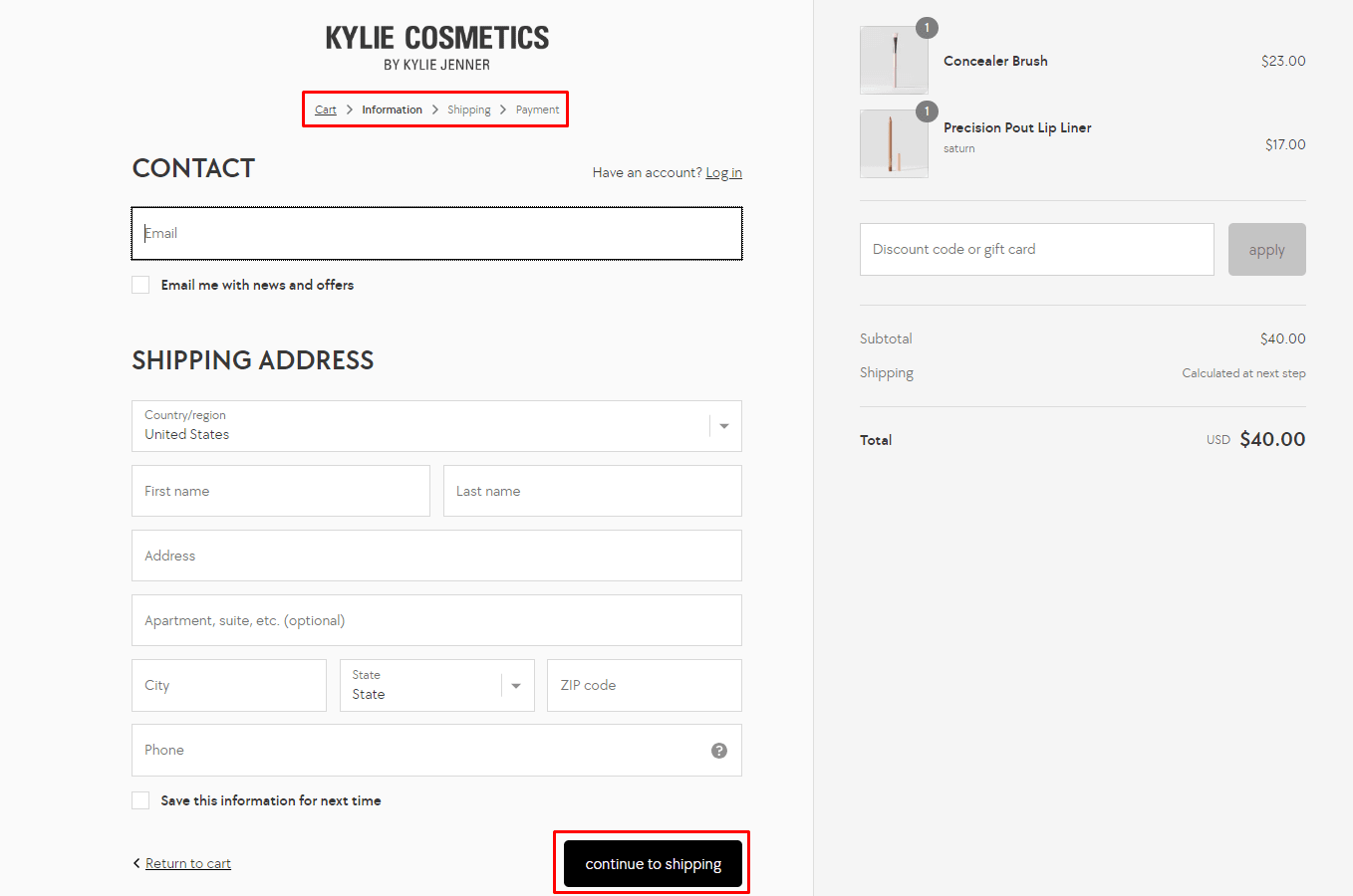
Typically, each step focuses on specific details such as shipping information, payment method, order review, and confirmation. Customers progress through these sequential pages, entering required details before advancing to the next step.
While multi-page checkouts offer a more structured approach, allowing users to navigate through each stage systematically, they might result in a longer checkout process compared to a one-page checkout. However, we can provide more detailed guidance, clearer segmentation of information, and additional opportunities for our businesses to showcase promotional offers or relevant information at each stage of the checkout process.
Multi Step Checkout Pros
While one-page checkouts offer a streamlined experience, multi-step checkouts provide several advantages that can’t be overlooked:
-
Clear segmentation of information: Multi-step checkout offers additional guidance for customers who may feel more comfortable navigating through distinct stages. It allows users to focus on one aspect at a time, reducing stress and confusion.
-
Promotion role: Multi-step checkouts present opportunities for businesses to showcase promotional offers or relevant information at each stage, potentially increasing sales and engagement.
-
Reduce information overload: By presenting information in smaller, more digestible chunks, multi-step checkout makes customers less confused before much of the information that they need to read.
-
Data collection: Multi-step checkouts facilitate improved data collection. Analytics tools can track user behavior through each stage, identifying potential drop-off points and enabling businesses to optimize the checkout flow for increased conversions.
Multi Step Checkout Cons
While a multi-step checkout might allow for more detailed information collection and order customization, it can also negatively impact the following:
-
Higher rate of shopping cart abandonment: This is because customers may feel overwhelmed or frustrated by the number of steps required to complete a purchase, which can result in a less user-friendly experience. Additionally, each step in the process presents an opportunity for the customer to reconsider their decision, potentially leading to a loss of sales.
-
Time-consuming: In today’s fast-paced world, customers expect quick and efficient transactions. If your checkout process is perceived as too lengthy or complicated, customers might opt to shop elsewhere, where the checkout experience is more streamlined.
One Page Checkout vs Multi Step Checkout: Comparison Summary
1. Conversion rate
One-page checkout usually leads to higher conversion rates because of its simplicity and speed. Multi-step checkout may convert better for certain audiences or complex products where more guidance is helpful.
2. Clicks
You must click more than once to complete your purchase when using a multi-step checkout process. This implies that there’s a greater likelihood of customers leaving before making their purchase.
In contrast, a one-page checkout requires fewer clicks. The checkout and shopping cart pages are all that customers need to visit to finish their transactions. So users can easily add items to their carts and complete their purchases.
3. Speed of page loading
If everything is on one page, loading times might increase. Therefore, some impatient customers might abandon their online shopping carts.
When you use multi-step, the checkout pages may load quickly because customers can finish the process in stages.
4. Checkout time
The checkout process on one page is quicker than the checkout process requiring multiple steps. This is a result of users only seeing one page with all of the options. Instead of having to navigate to another page, users can modify any information they require there.
When using a multi-step checkout process, users must go back and forth to update any information. Before they can reenter their information, they must wait for the next step to load. This may take some time, and occasionally it causes customers to give up on their shopping carts.
5. Data Analysis
You can increase the conversion rate by tracking the point at which customers leave your website by implementing a multi-step checkout process.
However, because the analytics solution depends on multiple checkout steps, it may be more difficult to collect this data if an online business only offers a single-page checkout.
8 Examples of One Page Checkout and Multiple Step Checkout
Examples of One-Page Checkout
1. Under Armour
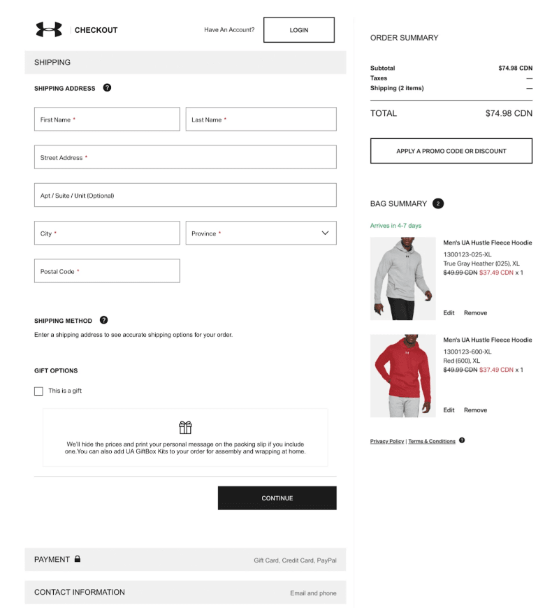
Under Armour’s one-page checkout is a solid example of how to keep things simple and effective.
Everything you need—order summary, shipping info, cart details, and terms—is right there on one page. You don’t have to click through multiple steps, which saves time and keeps things clear. There’s even a gift option built into the flow, so it’s easy to add without any extra hassle.
It’s clean, and quick and makes checking out feel easy.
2. Amazon
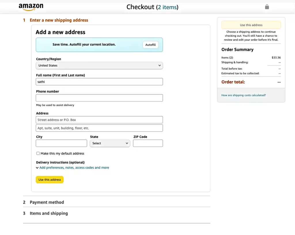
Progress indicators are super helpful in both multi-step and one-page checkouts — and Amazon does this really well.
Their checkout breaks things down into clear sections, like shipping and payment, and only opens each part once the one before it’s done. This helps shoppers stay focused and not feel overwhelmed.
It also makes the process feel easier and more organized. By the end, customers have a full view of what they’re doing, which builds confidence and makes them more likely to complete the purchase.
Amazon shows that a clear, step-by-step layout can lead to smoother checkouts and more conversions.
3. Crocs
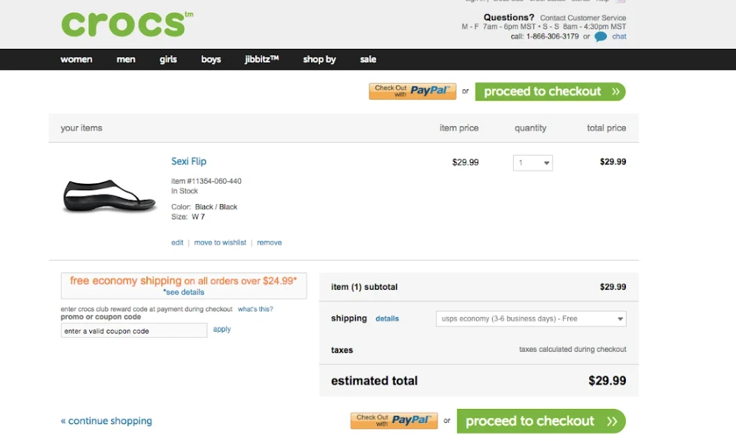
What makes the Crocs checkout stand out is how it keeps things simple without leaving anything out.
You get all the key info you need—like a clear order summary, a free shipping note, and big, easy-to-spot checkout buttons—but it never feels crowded or messy. The important stuff is front and center, while the extra details are there but don’t get in the way.
It’s a great example of smart, user-friendly design. Crocs shows that you don’t need anything fancy—just a clean layout and good organization to make checkout feel easy and stress-free.
4. Casper
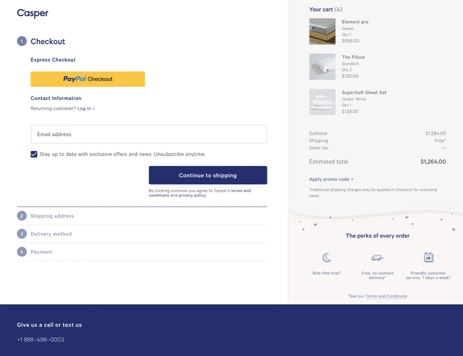
Casper’s one-page checkout fits their brand really well—clean, simple, and easy to use.
All the important info is on one page, so there’s no need to click around or deal with multiple steps. It feels smooth and trustworthy, which matters a lot when people are buying higher-priced items like mattresses.
For those in a rush, Casper also includes PayPal Express Checkout right at the top. It’s a great way to speed things up without losing the full experience. Overall, it’s a checkout that feels fast, clear, and built with the customer in mind.
Examples of Multiple Step Checkout
5. Forge & Foster

Forge & Foster, the UK watch brand, offers a checkout that’s simple, smooth, and fits their stylish vibe. Built on Shopify, their multi-step checkout starts with express options like Shop Pay, Google Pay, and PayPal — perfect for shoppers who want a quick checkout. Even though it’s not a one-page flow, each step is easy to follow, keeping things clear and focused. It’s a solid example of how international eCommerce brands can keep things fast and user-friendly while still reflecting their brand’s look and feel.
6. Etsy
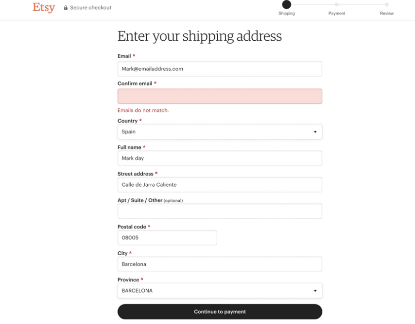
Etsy’s checkout is built with its global, handmade-focused audience in mind.
The cart works as a smart starting point, sending shoppers into the right checkout flow based on how they want to pay—whether that’s express checkout, pay-later options, or standard card payments. This flexibility helps meet different shopping habits and boosts conversion.
Inside the multi-step checkout, Etsy includes a progress bar and security badge at the top. These little touches help users feel safe and know exactly where they are in the process.
When it’s time to enter details, the forms are simple, clean, and distraction-free—making it easy to get through checkout without stress.
7. Glossier
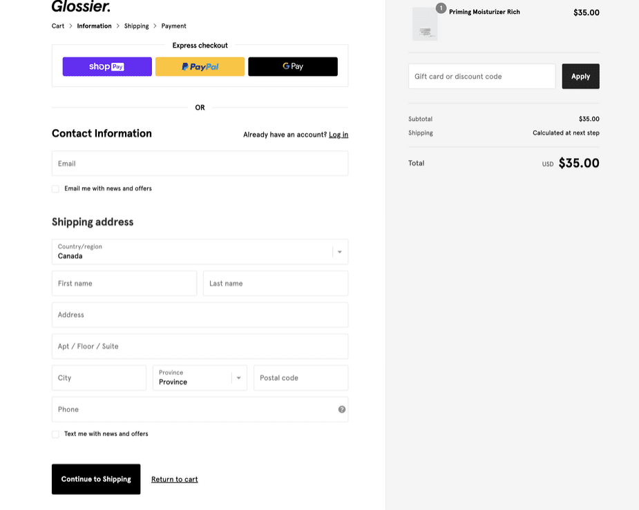
Glossier’s multi-page checkout is clean, simple, and easy to use—just like the rest of their brand.
Shoppers can log in or sign up for marketing updates, but nothing feels overwhelming thanks to the minimalist design. One of the best parts is the navigation: every step includes clear “Continue to Shipping” and “Return to Cart” links. That means shoppers can move back or forward anytime without losing progress or leaving the checkout.
It’s a well-balanced flow that keeps things flexible while guiding users toward the finish line.
Apple
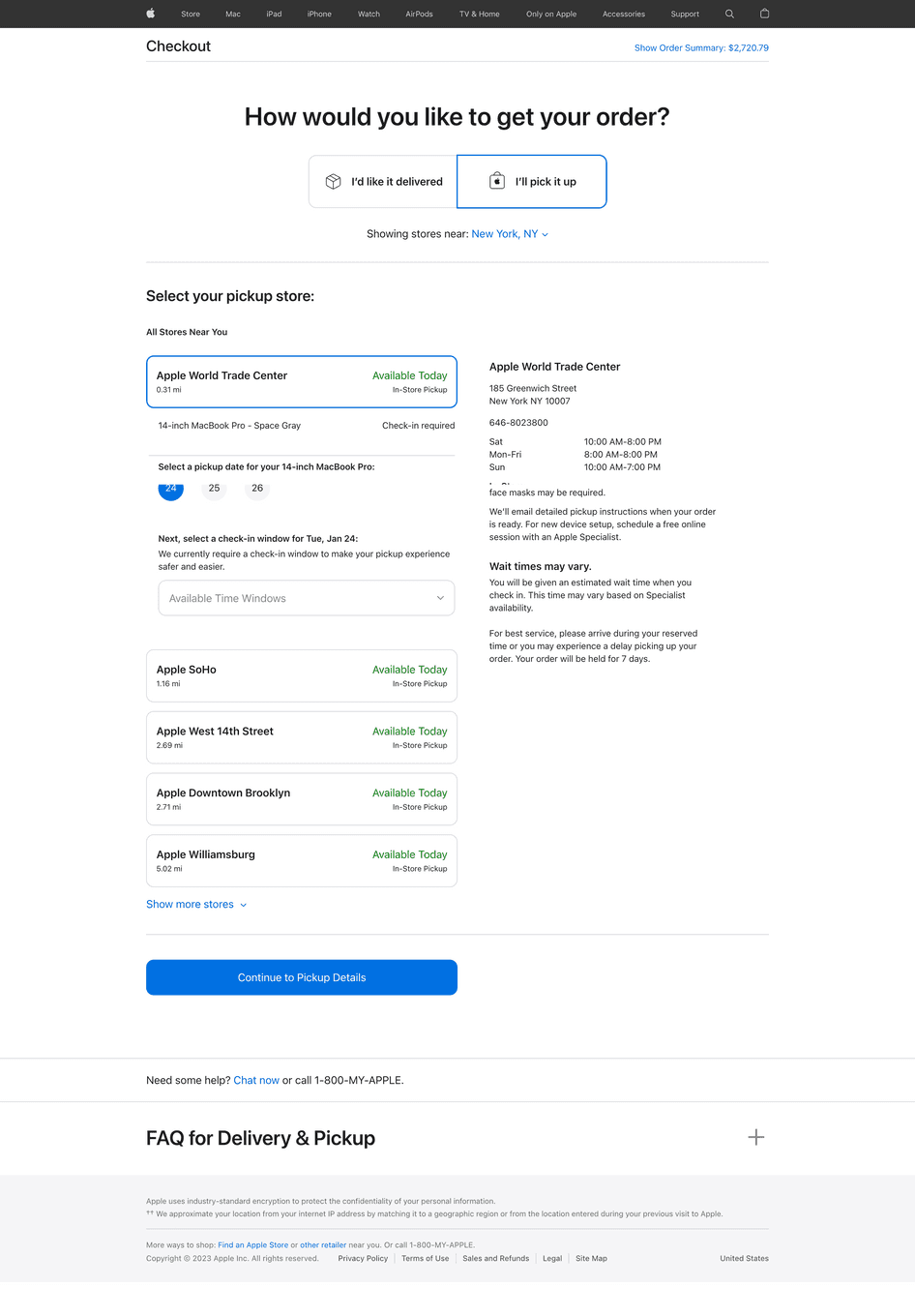
Apple delivers a checkout experience that perfectly reflects its brand—minimalist, refined, and user-first. While it doesn’t rely on a visible progress bar, the multi-step flow is seamless and guided, helping customers move from one stage to the next without confusion.
On the delivery screen, the interface offers clearly labeled tabs for in-store pickup vs. home delivery, keeping the options simple and organized. Going a step further, Apple allows shoppers to choose specific pickup time slots, adding a layer of convenience that aligns with its premium, customer-centric service model.
Which is Better?
To select the best option for yours, you should base your buyers’ shopping behaviors. Having a better understanding of your target customers and conducting an efficient A/B test will provide you with good fundamentals to build up your checkout page.
Consider a hybrid approach, incorporating elements of both types, to create a customized checkout experience that maximizes conversions and customer satisfaction. Besides, you can refer to some suggestions below to choose which type of checkout pages are suitable.
One-page checkout will fit with:
- Digital products: For digital products, a one-page checkout is especially helpful as it typically requires less information from the customer. For example, you won’t require a shipping method or address.
- Recurring clientele: The one-page checkout process is acceptable if the majority of your sales are from loyal customers who have user accounts on your eCommerce website. In this situation, the customer’s information is already saved on the site, saving them from having to fill out all the forms again. In B2B sales, this can frequently be the case.
Multi-step checkout processes would be a better option when purchasing high-end products or when it requires careful consideration. However, to take advantage of this option, we highly recommend allowing shoppers to review the fields they’re filling out before moving on to the next phases of checking out. It will make them feel more confident as they can see the required information before finalizing their orders.
Table of content

Jacker is the Chief Technology Officer (CTO) at Mageplaza, bringing over 10 years of experience in Magento, Shopify, and other eCommerce platforms. With deep technical expertise, he has led numerous successful projects, optimizing and scaling online stores for global brands. Beyond his work in eCommerce development, he is passionate about running and swimming.
Related Post

How to Enable DebugView in GA4 for your Magento 2 store - Mageplaza
Step-by-step guide to enabling GA4 DebugView for Magento 2 merchants — verify your GA4 events are firing correctly before trusting your data.
8 mins read
|
06-09-2026
Table Rate Shipping in eCommerce: A Practical Guide
Master Magento 2 Table Rate Shipping. Learn how to configure an accurate, automated shipping matrix to optimize your checkout and boost sales.
10 mins read
|
06-02-2026
3 mins read
|
05-30-2026
Google Analytics Ecommerce Reports for Magento Merchants: What to track & Tips
A practical guide to GA4 ecommerce reports for Magento merchants, covering what to track, how to read each report, and specific tips to turn data into revenue decisions.
18 mins read
|
05-20-2026
5 Ways to Hide Products on Shopify (2026 Guide)
Explore the best 5 ways to hide products on Shopify. Learn how to manage visibility, protect pricing, and create a tailored shopping experience for buyers.
18 mins read
|
05-16-2026
3 mins read
|
06-30-2026
How to Enable DebugView in GA4 for your Magento 2 store - Mageplaza
Step-by-step guide to enabling GA4 DebugView for Magento 2 merchants — verify your GA4 events are firing correctly before trusting your data.
8 mins read
|
06-09-2026
Table Rate Shipping in eCommerce: A Practical Guide
Master Magento 2 Table Rate Shipping. Learn how to configure an accurate, automated shipping matrix to optimize your checkout and boost sales.
10 mins read
|
06-02-2026
3 mins read
|
05-30-2026
Google Analytics Ecommerce Reports for Magento Merchants: What to track & Tips
A practical guide to GA4 ecommerce reports for Magento merchants, covering what to track, how to read each report, and specific tips to turn data into revenue decisions.
18 mins read
|
05-20-2026
5 Ways to Hide Products on Shopify (2026 Guide)
Explore the best 5 ways to hide products on Shopify. Learn how to manage visibility, protect pricing, and create a tailored shopping experience for buyers.
18 mins read
|
05-16-2026