


2 mins read
|
10-30-2026
How to Design Gift Cards: Tips, Ideas & Examples
Vinh Jacker
|
08-20-2026


Source
Source
Source
Source
Source
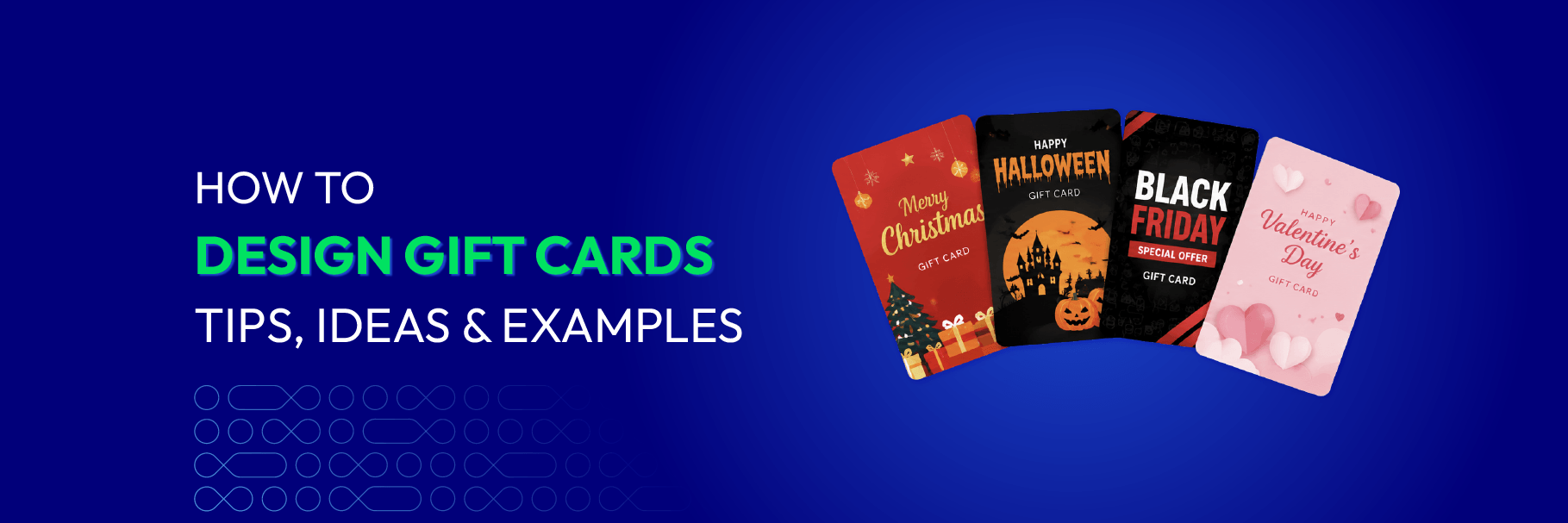
A gift card is store credit wearing a costume. Get the costume wrong and it reads as a coupon; get it right and the recipient forgets they’re holding a payment instrument at all.
Gift cards were the second most popular gift of the 2025 holiday season, with U.S. shoppers spending around $29 billion on them (NRF) — our gift card statistics guide breaks the numbers down further. Most merchants treat the design as an afterthought anyway, a logo dropped onto a stock background five minutes before launch. That gap is the opportunity.
This guide covers what to include, how to build a gift voucher template step by step, real examples from brands that clearly didn’t treat their gift voucher design as an afterthought, and the mistakes that quietly undercut an otherwise good design.
What makes a good gift card design?
A good gift card does two things at once: it looks like a gift, and it still works as a functional document. Most designs fail by overcorrecting for one at the expense of the other, all decoration and no findable code, or all code and no personality.
What actually needs to be on there:
- Brand identity: logo, colors, typography
- Gift value: a fixed amount or a customizable range
- Occasion or message: “Happy Birthday”, “Merry Christmas”, “Thank You”
- Recipient info: especially for personalized digital cards
- Personal message: space for the sender’s own words
- Gift card code: easy to find when redeeming
- Barcode or QR code: lets the code be scanned instead of typed, especially useful for physical or in-store redemption
- Redemption info: only what’s essential
- Card dimensions: 3.375 x 2.125 in (85.6 x 54 mm) for physical cards, the standard credit-card size; roughly 600–800 x 400–500 px for digital cards
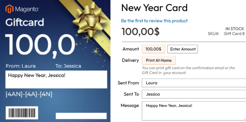
Not every item on that list deserves the same visual weight, though. Occasion and value should win the first glance; code and redemption details just need to be findable on the second one.
Step-by-step: Design your own gift voucher template
Follow these detailed steps based on the official configuration process:
Step 1: Start with a clear design intention
Before opening the editor, define the emotional direction and style of the template:
- Is it elegant and minimal?
- Bold and urgent for flash sales?
- Warm and festive (Christmas, New Year) or playful (Birthday, Valentine)?
💡 Tip: This intention will guide every design decision that follows — colors, imagery, and typography.
Step 2: Set the design foundation
Go to Mageplaza > Gift Card > Manage Templates → Create New Template.
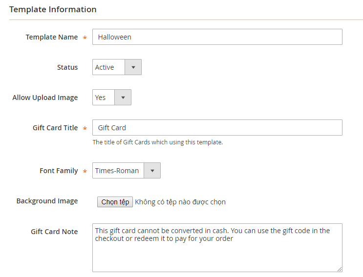
When filling in the Template Information section, treat every field as a strategic design decision:
- Template Name & Gift Card Title: Choose names that clearly express the mood and theme (e.g. “Midnight Halloween”, “Golden Christmas”).
- Allow Upload Image: Enable this option so customers can personalize the card with their own photos. However, design a clear and well-defined image area so their photos still feel integrated into the overall layout.
- Font Family: With limited options available, select the font intentionally based on the emotion you want to convey.
- Background Image: This is one of the strongest visual elements. A high-quality background sets the entire atmosphere of the card. Only leave it blank if you are aiming for a minimalist style.
- Gift Card Note: Keep the content short, concise, and consistent with the overall tone of the design.
Step 3: Build the visual hierarchy
You can choose one of two approaches to construct the layout:
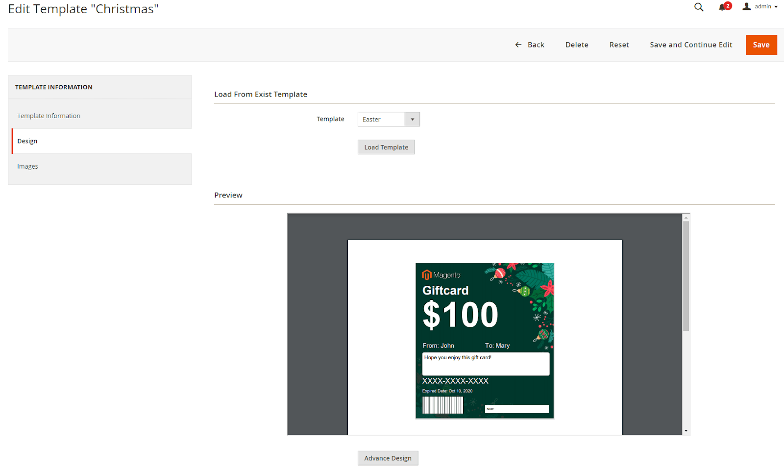
- Load From Existing Template: Start quickly from a proven structure and then refine it. This method is especially useful when you want consistency across a full seasonal collection.
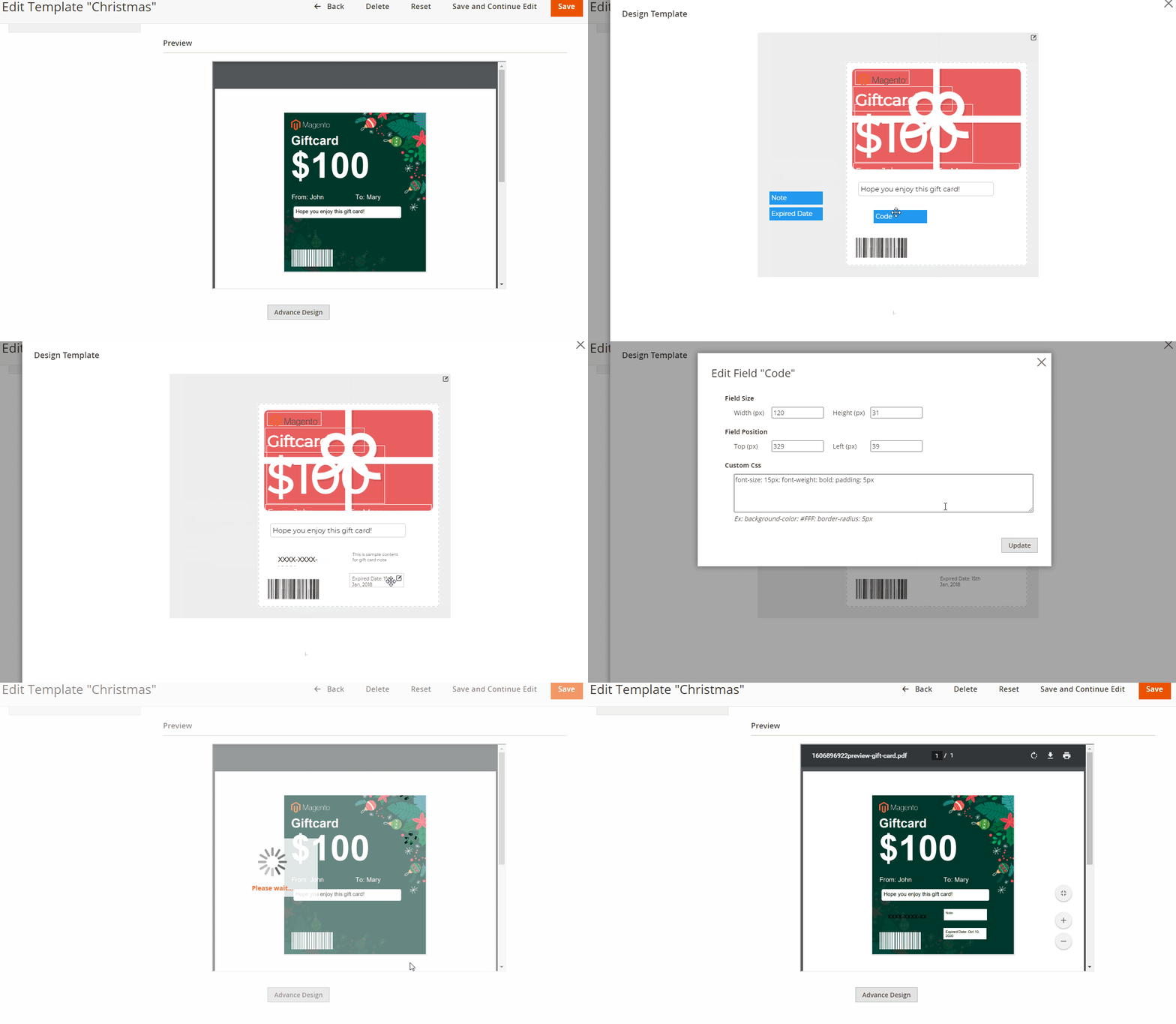
- Drag-and-Drop + Custom CSS: This is the core of creating a distinctive design:
- Order elements by visual priority: logo and card value front and center, then title, then message area, then code last.
- Use negative space on purpose. Don’t fill every corner just because you can.
- Custom CSS lets you fine-tune padding, margin, contrast, borders, and box-shadow, the details that separate a template from a good template.
Step 4: Check with Live Preview
Preview the card the way a customer actually will, don’t judge it purely from the editor with placeholder text. Pay close attention to contrast between text color and background, the value and the code both need to stay legible even at a smaller size, not just on your monitor at full zoom.
Step 5: Save the template and apply it to products
Click Save or Save and Continue Edit. Once saved, the template shows up as a selectable option when you configure the Gift Card Product in your Catalog.
Gift card design best practices
Keep it simple: Gift cards are small visual assets. Product descriptions, promo copy, terms, multiple CTAs, and decoration together overwhelm the space fast. Prioritize what the recipient needs most.
Make important text easy to read: Avoid small text on busy backgrounds; use sufficient contrast or a cleaner area of the image. WebAIM’s contrast checker is a quick benchmark. The gift amount, recipient name, and code should never require effort to read.
Leave enough white space: It doesn’t mean a white background, just room to breathe. Separating message, value, and redemption info makes the card easier to scan and more premium.
Don’t let the code dominate: It’s functional information, not the first thing someone should see. Let the message, imagery, or value lead; keep the code accessible but secondary.
Design for the recipient, not just the buyer: The buyer picks the card, but the recipient experiences it. Think about the moment they open it, on email, on a downloaded card, or in print, and make it feel like a gift, not a coupon.
Create reusable templates: Build a small library around your most common occasions:
Everyday → Birthday → Thank You → Christmas → Valentine’s Day → Corporate
Update images or messages per campaign without rebuilding the layout.
Gift card design ideas for different occasions
No single design works for every situation. Occasion, audience, and campaign purpose should drive the visual direction.
Christmas gift card design ideas
Concept: warm, elevated, unmistakably festive.
Key elements: deep red, pine green, and gold; light snowflake or pine motifs; elegant typography. A strong Christmas gift voucher template performs even better paired with Gift Wrap at checkout.
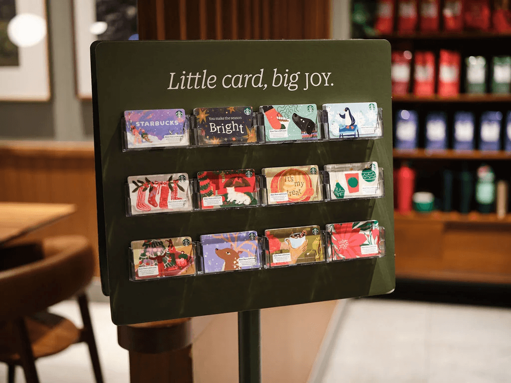
Starbucks Holiday Cards: Nearly 2,000 different holiday card designs have shipped since the program launched in 2001, none of them reused. During the 2025 holiday season, Starbucks projected roughly 1 in 5 Americans would receive a Starbucks Card, with over $60 million loaded onto cards on December 24 alone (Starbucks). The logo and core brand palette stay constant, the seasonal artwork is what changes every year, on purpose. This kind of seasonal reuse is exactly the strategy covered in our guide on gift cards in marketing strategies.
Black Friday gift card design ideas
Concept: urgency and high contrast.
Key elements: black and red, a message like “Limited Time” or “Biggest Deal”, a clean layout that puts the value front and center.
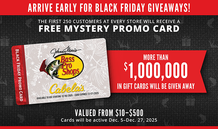
Bass Pro Shops & Cabela’s Mystery Gift Card: Not every Black Friday gift card needs a fixed value to feel exciting. The first 250 shoppers at participating Bass Pro Shops and Cabela’s stores receive a “mystery” gift card worth anywhere from $10 to $500, turning a simple in-store promo card into a genuine incentive to show up early (Hunt4Freebies). It’s a reminder that urgency and value don’t have to come from discount messaging alone, uncertainty about the amount does some of that work too.
Halloween gift card design ideas
Concept: playful with a touch of spooky.
Key elements: dark background, orange-purple accents, a light pumpkin or bat icon, type that’s bold but still friendly.
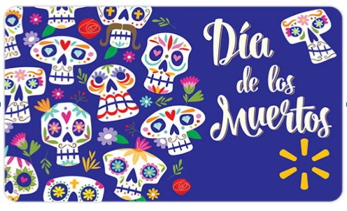
Walmart Día de los Muertos Gift Card: Not every Halloween-season design needs pumpkins and ghosts. Walmart’s own catalog includes a “Blue Skulls Dia de los Muertos” gift card, sugar-skull illustration on a blue palette that reads festive rather than frightening.
Learn more: Halloween Marketing Ideas for Ecommerce Stores
Valentine’s Day gift card design ideas
Concept: soft, emotional, personal.
Key elements: pastel pink or gentle neutral tones, flowing type for the message area, generous white space. This is the occasion where a photo upload does the most emotional work, so it’s worth encouraging.
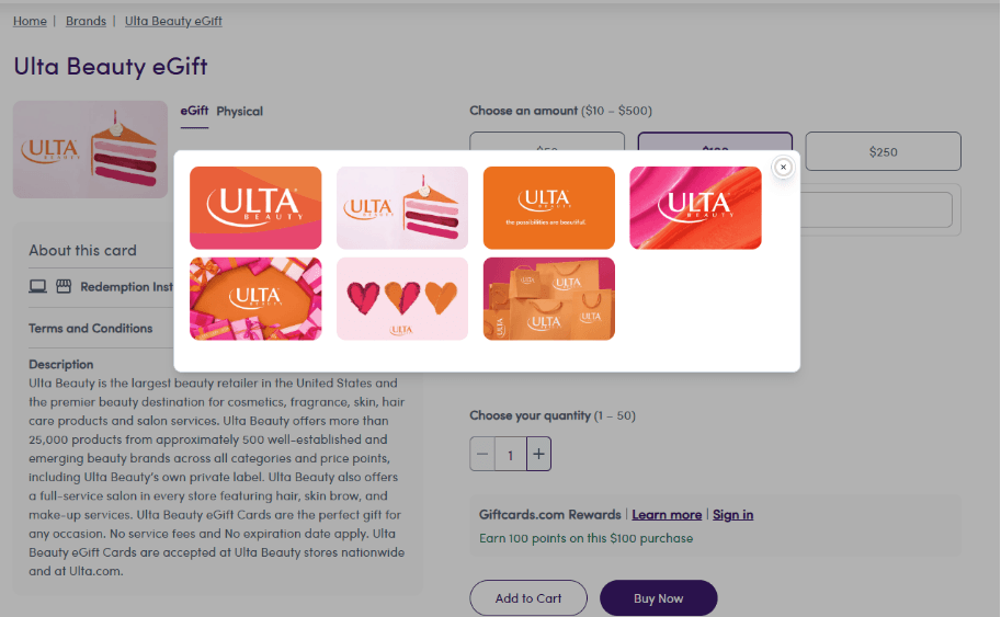
Ulta Beauty Gift Cards: Rather than one generic layout, Ulta Beauty lets shoppers choose from several distinct gift card designs and pair the card with a customizable message, so a beauty-focused Valentine’s gift can look and feel different from one bought for a birthday or the holidays without changing what’s actually being purchased.
Birthday gift card design ideas
Concept: flexible, personal, tone matched to the recipient.
Key elements: confetti, balloons, cakes, bright colors, personalized photos, recipient names. If your system allows photo uploads, birthdays are the ideal use case, a personal photo makes even a simple amount feel more thoughtful.
Corporate gift card design ideas
Concept: restrained and intentional over decorative.
Key elements: clean layout, company logo, brand colors, minimal illustration, premium type, clear value, short appreciation message. Vary the message by purpose, not the visual style, “Thank you for your great work” for employees, “Thank you for being a valued partner” for clients, “Season’s Greetings from [Brand]” for holiday gifting.
Customer appreciation gift card ideas
Concept: relationship-building rather than occasion-driven.
Key elements: strong brand identity, minimal imagery, a clear value, simple redemption info. A simple “Thank you, here’s $20 toward your next purchase” is enough, there’s no occasion to decorate around, so let the design stay quiet.
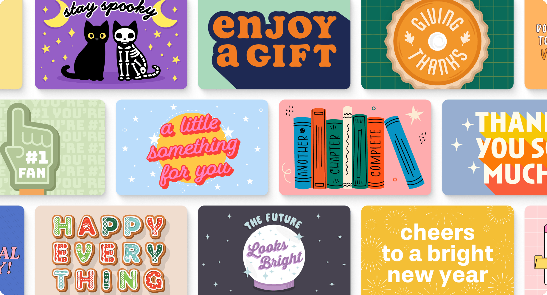
Giftogram Appreciation Categories: Giftogram treats appreciation as its own design category, not a holiday template with the message swapped out, expanding its catalog with dedicated sets for Spot Rewards, Survey Response Incentives, and Sales Awards alongside Thank You and Appreciation.
How to get more out of a good design
A gift card design doesn’t live in just one place, the same artwork gets seen at several different moments, and each one comes with its own constraints.
Template thumbnail
Before anyone buys, they’re scanning a small, often cropped preview on the product listing page, where fine detail and small text disappear first. Lead with a strong silhouette and color palette that reads instantly,even shrunk down. Feature top templates with Banner Slider.
Email delivery
For digital gift cards, the design usually arrives inside an email, sitting next to subject lines, preview text, and other inbox clutter. Keep the message and value legible on their own. See our guide on configuring gift card delivery in Magento 2.
The moment it’s opened
This is the emotional peak, the personal message, sender’s name, and occasion artwork all land at once. Test the layout on an actual phone screen, not just the editor. More on personalization in our gift cards in marketing strategies guide.
Redemption
By checkout, the design has done its emotional job, now the code and redemption info need to be fast to find and simple to use. Keep the code secondary but scannable, and pair with One Step Checkout. Numbers on this in our gift card statistics roundup.
Reuse and refine your core templates across these touchpoints instead of rebuilding from zero each season, see our full playbook on how to create and sell a gift voucher for the holiday shopping season. Recipients typically spend beyond the card’s face value, and most holiday gift cards get used within the first few months, so a strong design keeps paying off well past the sale.
Common gift card design mistakes to avoid
Even a well-intentioned gift voucher design can quietly undercut itself. Watch out for these:
-
Overcrowding the layout: Cramming in promo copy, terms and conditions, or multiple CTAs alongside the core elements makes the card feel like an ad, not a gift.
-
Low contrast between text and background: A gift value or code that’s hard to read against a busy image is a functional failure, not just an aesthetic one.
-
Treating the code as decoration: Oversized codes or codes placed dead-center compete with the message and value for attention instead of staying secondary.
-
Ignoring how the card is actually viewed: A design that only looks good at full zoom in the editor can break down on a phone screen or a printed card, where a customer might zoom out or view it under different lighting.
-
Reusing one layout for every occasion: A single generic template stretched across Christmas, birthdays, and corporate gifting rarely feels intentional for any of them.
-
Skipping the redemption details: Missing or unclear redemption info (where to enter the code, whether it expires) creates friction right when the recipient is ready to use the card.
FAQs
What information is legally required on a gift card?
Rules vary by country and state, but common ones include no short expiration date, no early dormancy fees, and clear disclosure of any fees that do apply. Check the regulations for where you sell.
What size should a gift card be?
Physical: standard credit-card size, 3.375 x 2.125 in (85.6 x 54 mm), with about 0.125 in of bleed. Digital: no fixed standard, but a landscape image around 600–800 x 400–500 px works well.
Can I design a gift card in Canva or Photoshop?
Yes. Canva is faster with ready-made templates; Photoshop gives more control for print-ready files and precise bleed. Export at the dimensions your platform expects.
What if a customer uploads a low-quality photo?
Keep the photo area a defined size with a subtle frame so a grainy image doesn’t carry the whole card, and set a minimum resolution requirement at upload.
How many gift card templates do I actually need?
Fewer than it feels like. A handful for your most common occasions, plus one or two seasonal designs, covers most demand.
What’s the difference between a digital and physical gift card?
Digital cards prioritize readability on mobile and email. Physical cards need print dimensions, resolution, and accurate color reproduction.
Should every holiday have a different design?
Not necessarily, you can reuse a layout while changing imagery and colors. Major occasions often justify dedicated designs when gift cards are part of a bigger campaign.
Can Magento 2 customers upload their own gift card images?
Yes, with Mageplaza Gift Card, merchants can enable photo uploads per template, and customers pick a template or upload a photo on the product page.
Final thoughts
A good gift card isn’t just a place to display a value and code, it should feel like something worth giving.
Start with the recipient and occasion, build a clear hierarchy, keep the design recognizable to your brand, and leave room for personalization. For big campaigns, adapt imagery and messaging so the card feels part of the wider customer experience. Our holiday marketing hacks guide covers how gift cards fit into that broader Q4 calendar.
Once a design works, turn it into a reusable template rather than starting over each time. Mageplaza Gift Card provides pre-made holiday templates, drag-and-drop tools, custom images, personalization, and digital and physical options to make that practical.
Table of content

Jacker is the Chief Technology Officer (CTO) at Mageplaza, bringing over 10 years of experience in Magento, Shopify, and other eCommerce platforms. With deep technical expertise, he has led numerous successful projects, optimizing and scaling online stores for global brands. Beyond his work in eCommerce development, he is passionate about running and swimming.
Related Post

15 mins read
|
09-30-2026
16 mins read
|
08-30-2026
5 mins read
|
07-30-2026
7 mins read
|
06-30-2026

How to Enable DebugView in GA4 for your Magento 2 store - Mageplaza
Step-by-step guide to enabling GA4 DebugView for Magento 2 merchants — verify your GA4 events are firing correctly before trusting your data.
8 mins read
|
06-09-2026
2 mins read
|
10-30-2026
15 mins read
|
09-30-2026
16 mins read
|
08-30-2026
5 mins read
|
07-30-2026
7 mins read
|
06-30-2026
How to Enable DebugView in GA4 for your Magento 2 store - Mageplaza
Step-by-step guide to enabling GA4 DebugView for Magento 2 merchants — verify your GA4 events are firing correctly before trusting your data.
8 mins read
|
06-09-2026