


7 mins read
|
06-30-2026
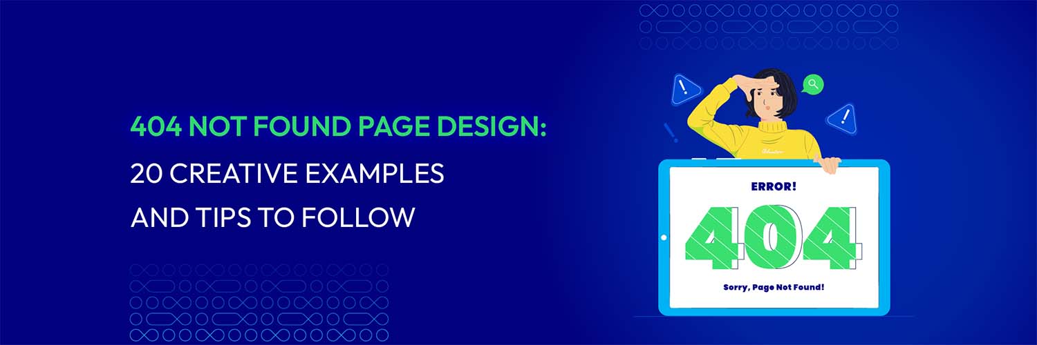
404 Not Found Page Design: 20 Creative Examples And Tips To Follow
Vinh Jacker | 07-27-2023
Have you ever typed in a URL only to stumble upon a 404 Not Found error page? It’s a frustrating experience for any user, and can even lead to them leaving your website altogether.
However, a good 404 Not Found page design can turn a negative experience into a positive one.
In this blog post, we’ll explore 20 creative examples of 404 Not Found page designs to inspire your design efforts. We’ll also share tips when designing your 404 page, such as keeping it simple and playing with humor.
By the end of this post, you’ll better understand what makes an incredible 404 page and be equipped with helpful tips to create one that delights your users. Now, let’s get started!
Read more: WordPress 404 Not Found Nginx: Meaning & How To Resolve Issues?
What does page “404 Not Found” mean?
In simple terms, a 404 Not Found error tells you that the page you want access to does not exist. It is a landing page that no one wants to be met with. This error occurs when a website’s server cannot locate the page you are trying to reach via a hyperlink or a URL.
In these cases, any link to a non-existent page or a link with a typo in the URL is a dead or broken link.
It is essential to understand that this error is not always your fault. In fact, a 404 not found page can be caused by a user mistyping a word in the URL, misspelled backlinks, or deleted sites that result in broken links.
A good 404 error page should reassure your visitor that everything will be alright even when things aren’t going as planned. It will direct the visitor back to the working section of your website. It will also inform users that the browser and server are both working well, but the resource you are trying to access on the server is not.
Elements of effective 404 Not Found page design
Your 404 Not Found page design may vary depending on your brand identity. However, including these 5 must-have elements in your 404 error page will do wonders for the user experience:
An error message
The message on the 404 page should be clear and concise, informing the user that the page they are trying to access cannot be found. Using technical jargon or complex terminology unnecessarily confuses and frustrates the user.
You need your user to immediately realize they’ve arrived at an error page. A short and simple message like “The page you’re looking for doesn’t exist.” or “We couldn’t find the page you were looking for.” will work just fine.
And one thing to remember, limit the character count because you do not want Google to crawl the material on your website.
Brand look and feel
An effective 404 Not Found page design will match the look and feel of your brand. For many users, a 404 page may be their first interaction with a brand, which leaves a lingering bad impression.
User-friendly navigation
Navigation helps guide the user toward finding the content they originally sought. When a user lands on a 404 error page, it’s usually because they have entered a URL that does not exist or clicked on a broken link.
This can be a frustrating experience for the user, and they may be tempted to leave the website altogether.

Integrating user-friendly navigation on the 404 error page provides the user with more options for accessing the material they were looking for.
Helpful content or links to relevant pages
By including some quality materials in your 404 Not Found page design, you can direct lost visitors to something more intriguing.
Call to action
As mentioned above, a 404 error page also serves as a landing page, so don’t forget to take advantage of that!
By including some call-to-action buttons, such as a download or a search box, you are helping users find a way out. A CTA also gives users a sense of control over their experience.
Visual elements
A 404 Not Found page design may not stand out without interesting visual elements.
Make the 404 Not Found page design more engaging and visually appealing by incorporating graphic elements. Graphics, photos, or animations that serve to express the content and make the page stand out could be included.
20 Creative 404 Not Found Page Examples
The 404 error page is a part of the website that no brand wants its users to find. However, it needs to be there so the brand doesn’t lose potential customers when broken links occur.
Many clever 404 error pages tap into the humor and hide some “Easter Eggs” that make the users crack up when stumbling upon the page. Others use spectacular designs or games to help relieve users’ disappointment. Here are some creative 404 Not Found page designs that will inspire you!
Figma
Figma’s 404 error page is a great example of how to create a user-friendly and engaging experience.
The page features a clear message, “The page you are looking for can’t be found, “ informing the user about their wrong path. It also provides helpful information and guidance.
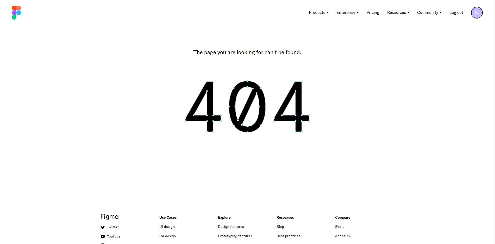
The page’s highlight is the huge 404 text displayed in vectors that you can modify to your heart’s content. Using the vectors, Figma has created a strong brand consistency and kept users entertained.
Mailchimp
The 404 Not Found page design of Mailchimp will somehow crack you up. As a reminder, Mailchimp’s website is all about branding and personality, making its 404 error page perfectly mirror the brand’s identity.
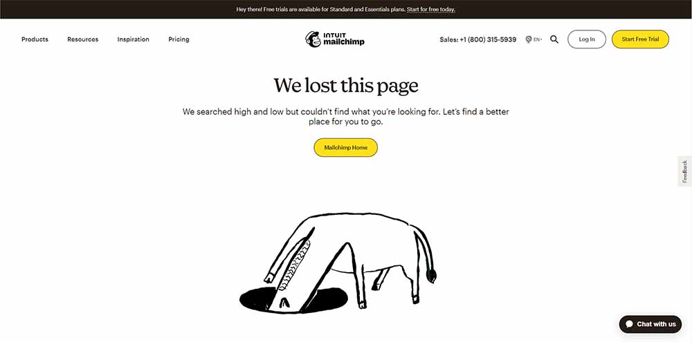
In its 404 page, Mailchimp briefly explains why they couldn’t find the page the user was looking for with a short message “We lost this page”. Using a seemingly naive illustration of a donkey putting its head in a hole is a clever way to say “I’m lost.”
The page also includes a clear navigation option that helps the user find their way back to the main website.
Lego
If you are a lego enthusiast, you might be no stranger to its website. But have you ever encountered its 404 error page? You will probably not want to get mad.
![]()
Lego has created a 404 Not Found page design that is both on-brand and functional, turning an annoying user experience into a sales opportunity.
The overall design was simple, exuding the brand’s personality. The horrified expression of the lego man, as opposed to the brand tagline “everything is STILL AWESOME,” is a plus for this design.
Marvel
Marvel has several variants of their 404 pages, all of which are (of course) based around the MCU. The 404 Not Found page design below is just one of the interesting ones.
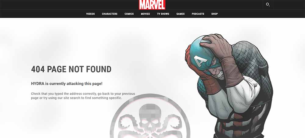
This version of the 404 error page of Marvel features a character from the MCU. Marvel has done an excellent job referencing its movie on the error page.
The page also provides watchers with some solutions and helps them navigate to the working parts of the website. A search bar on the top right corner of the page also helps users search for an alternative.
20th Century Studios
20th Century Studios really knows how to inspire users when you get a URL wrong. Its 404 error page uses a movie reference and great branding.
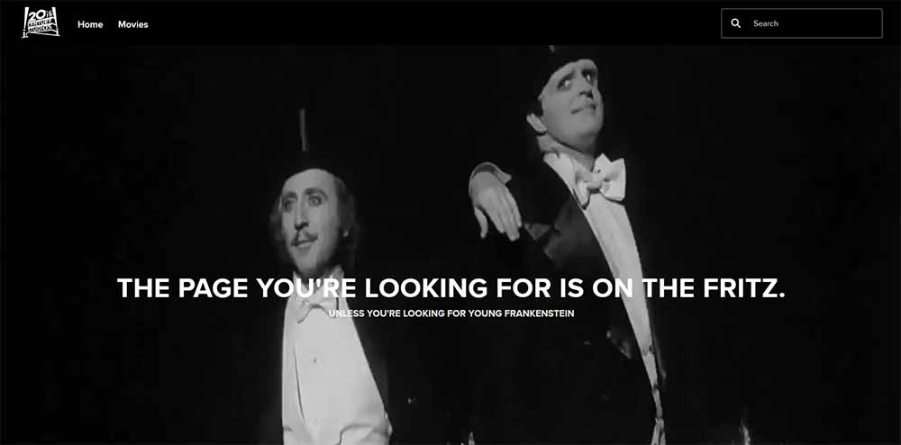
The page design includes a background with an iconic scene from the movie and a quote. The white caption on the nostalgic background is a good way to maintain readability. There’s also a search box on the top right corner of the page to prompt users to look for other movies.
Tripadvisor
Tripadvisor has a humorous way of displaying its 404 Not Found error. The error message has a friendly tone and refers to the brand’s personality.
It’s just the page that’s been lost, not the user’s luggage. It’s a fun way to communicate with the users and raise a smile on user’s face.
The engaging animating luggage is a good way to remind users to go on holiday while waiting for the error to be fixed. The 404 error page also provides clear guidance for the users to get back to planning their trips with a range of options.
The New Yorker
The New Yorker has acquired a reputation for its cartoons and prominent journalism. By tapping into its strength, its 404 Not Found page design features one of the journal’s artists’ artworks. And it works exceptionally well.
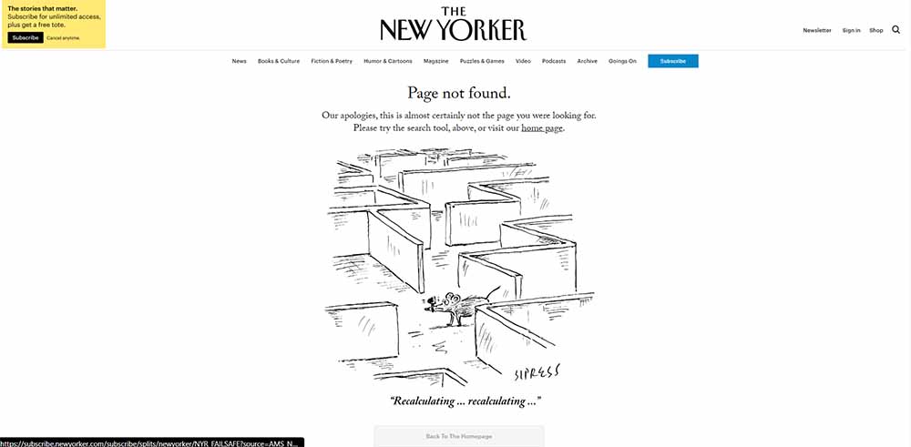
Its 404 page seamlessly merges with the rest of the website and the brand personality. The short error message “Page not found” and the brand’s apologies help relieve the user’s frustration.
The page also encourages readers to go to the homepage or look for other actions with the search bar at the top right corner.
Pixar
What would be your reaction when stumbling on Pixar’s 404 error page? The brand knows it all too well. By featuring the character Sadness from the movie Inside Out (2015), Pixar straightforwardly demonstrates your expression.
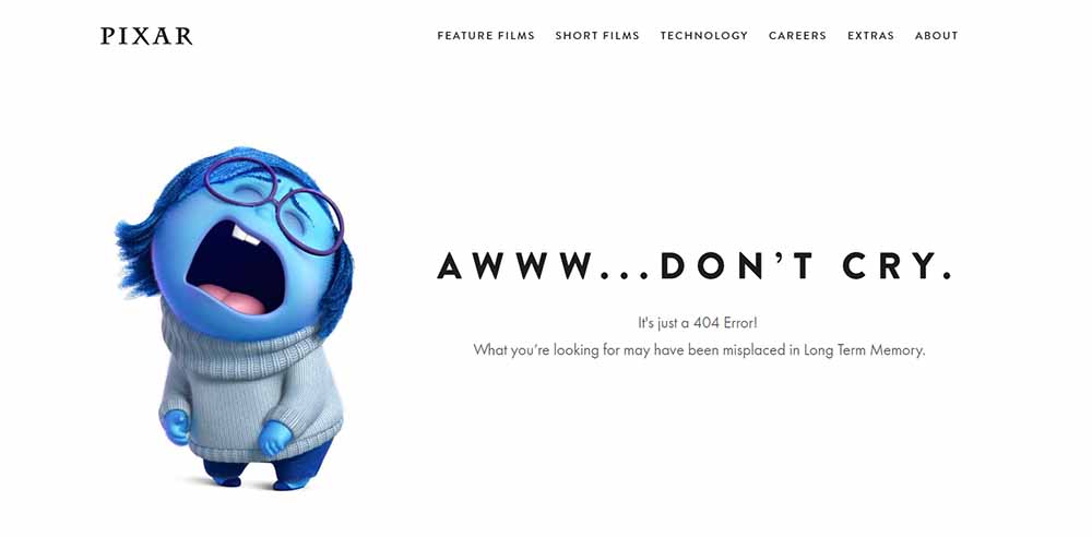
The error message plays a little with humor and makes users, conversely, crack up. The “Aww… Don’t cry. It’s just a 404 error!” may make you think about your life a bit. Pixar has done a great job of designing a 404 error page that blends well with the brand personality.
Netflix
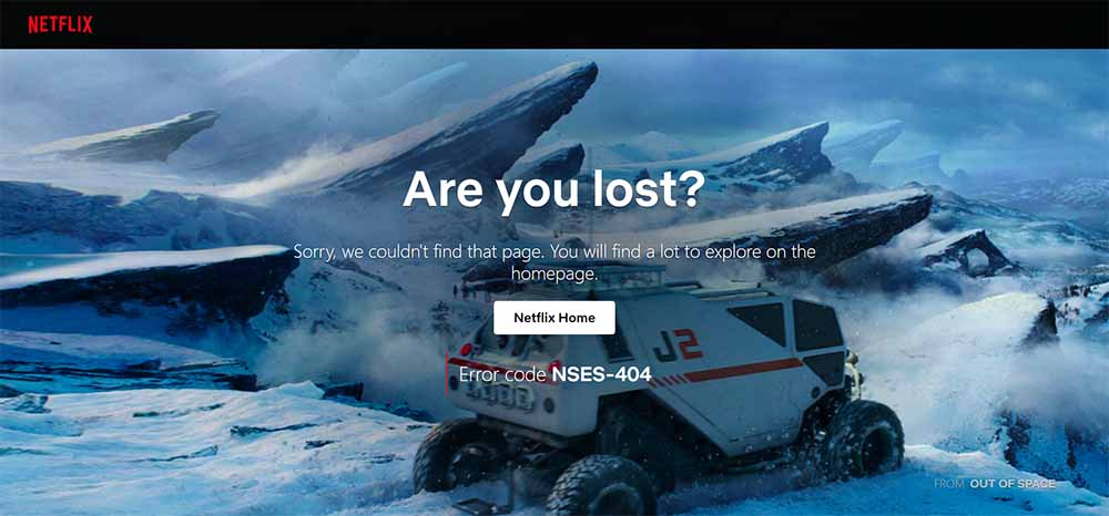
Netflix has a whole batch of content to make its 404 page, and it went for the movie “Lost in space”. With a simple error message “Are you lost?” and a scene from the movie, Netflix has piqued user’s interest. It also guides user back to the homepage to explore more movies.
Hubspot
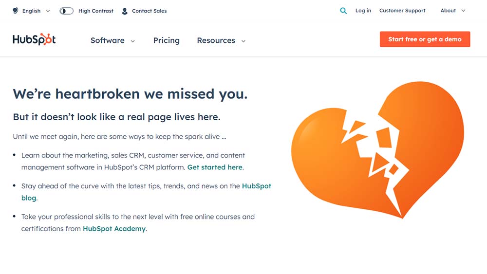
Clever web text has been a strong suit of Hubspot, and it’s still true for its 404 page design. Featuring a broken heart, which is a perfect fit for their brand voice, Hubspot expressed its pain of a missed contact. They also provide guidance for the users with redirect links and a search box.
Slack
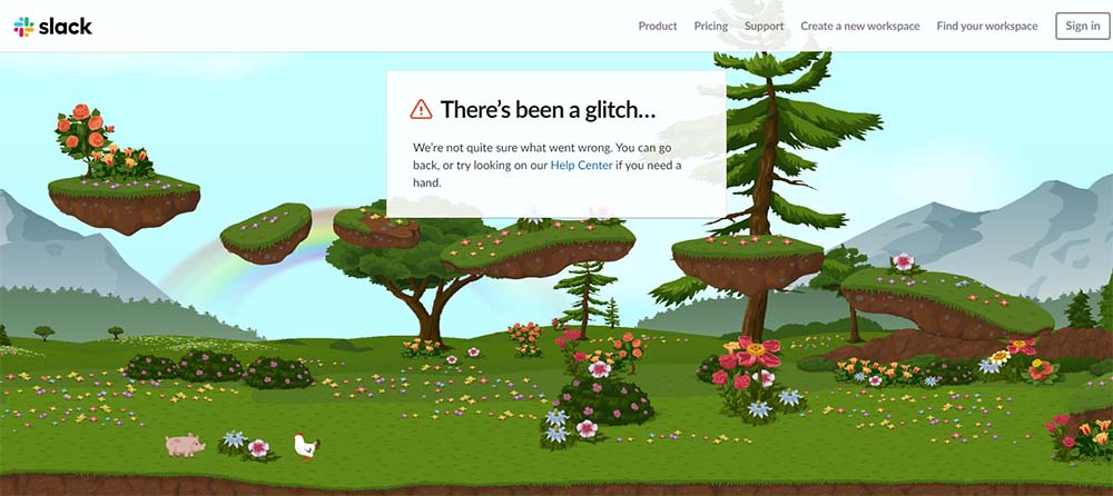
Slack has made its 404 error page more delightful and interesting for users who took the wrong path. The calm and beautiful illustration on its 404 error page helps relieve user’s frustration. The error message “There’s been a glitch…” is also what makes Slack’s 404 page stand out.
Mantra Labs
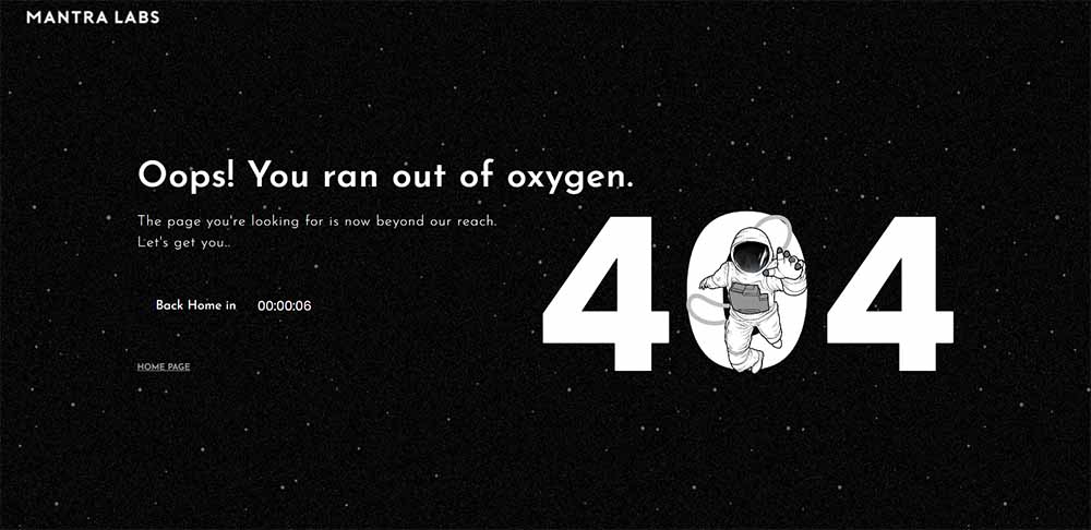
The 404 error page of Mantra Labs will give you a “outer space” vibe. The humorous error message “Oops! You ran out of oxygen” will definitely raise a smile. They also provide user a navigation to their home page with a creative countdown clock.
Kualo
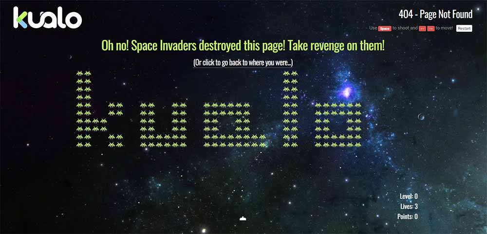
Kualo is a web hosting company that has a one-of-a-kind 404 error page. Inspired by the Kualo-themed game Space Invaders, its 404 page has a way to entertain users. This interactive game will help ease the user’s frustration and stay at the page for a little while.
Airbnb
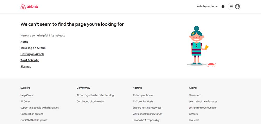
The 404 Not Found page design of Airbnb is simple yet delightful. Featuring a girl unluckily dropping her ice cream is a way to make users smile even when they’re confused by the error. Airbnb also guides users through relevant links that help them get back on the working sites.
GitHub
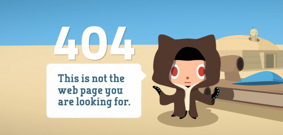
You might expect a tech wizardry 404 error page design from GitHub, but it has something completely different. With a illustration of a Star Wars parody boosted by a clever parallax effect as you move your mouse.
Bret Victor
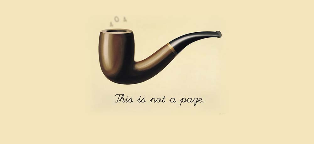
Bret Victor’s 404 error page is inspired by the iconic painting of René Magritte, The Treachery of Images. The picture provokes a difficult philosophical question that piques users’ curiosity.
Bit.ly
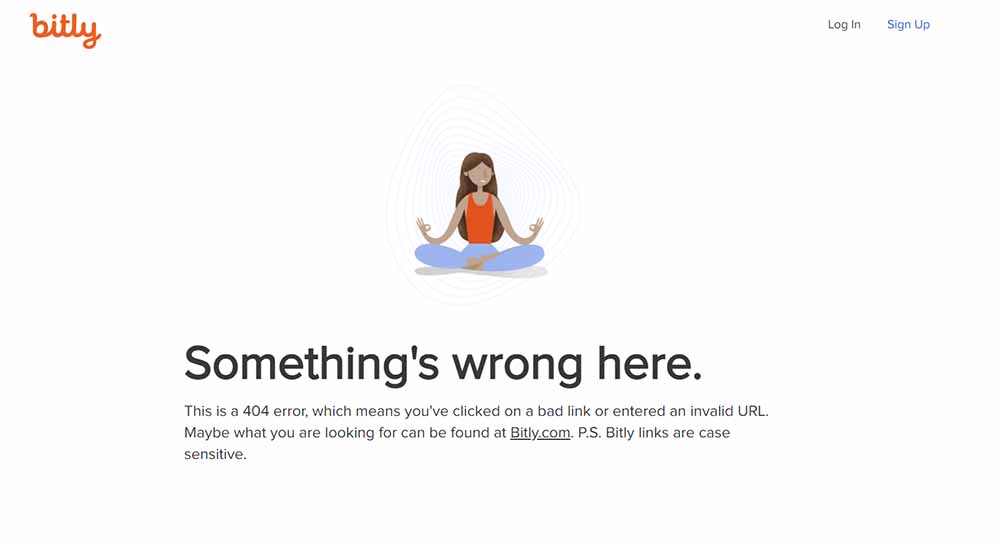
With a simple illustration of a woman meditating, Bit.ly suggests users remain calm even when there’s a 404 error. They also explained why the error occurs and guide users to the right direction.
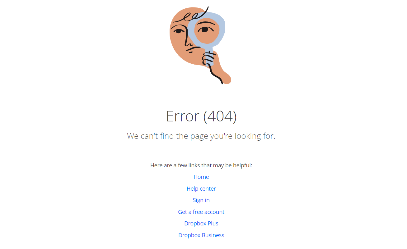
DropBox
The simple 404 error page design of DropBox is adorned with a quirky illustration. DropBox also provides users with links to guide them to the working parts of the website.
InVision
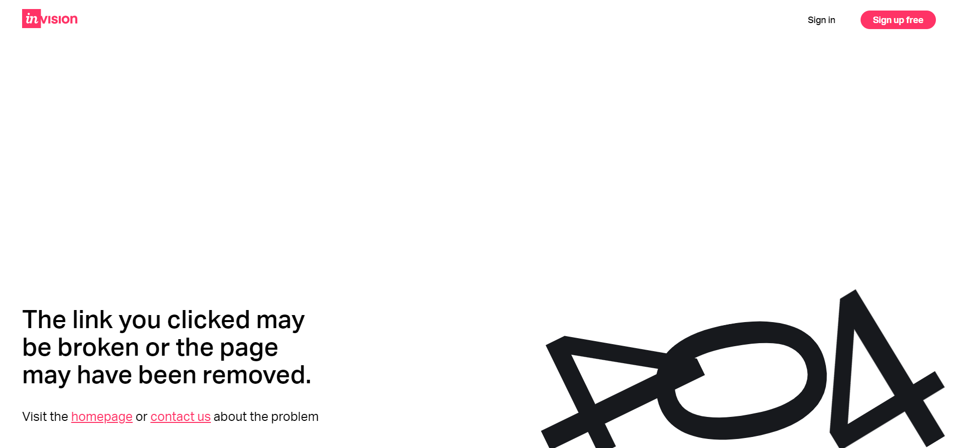
Although InVision’s 404 error page is simple, its illustration delivers a great experience. The illustration also depicts the broken link, which makes the error page more appealing to users. To get users back on track, they provide them with links to the homepage and contact the team.
Dribbble
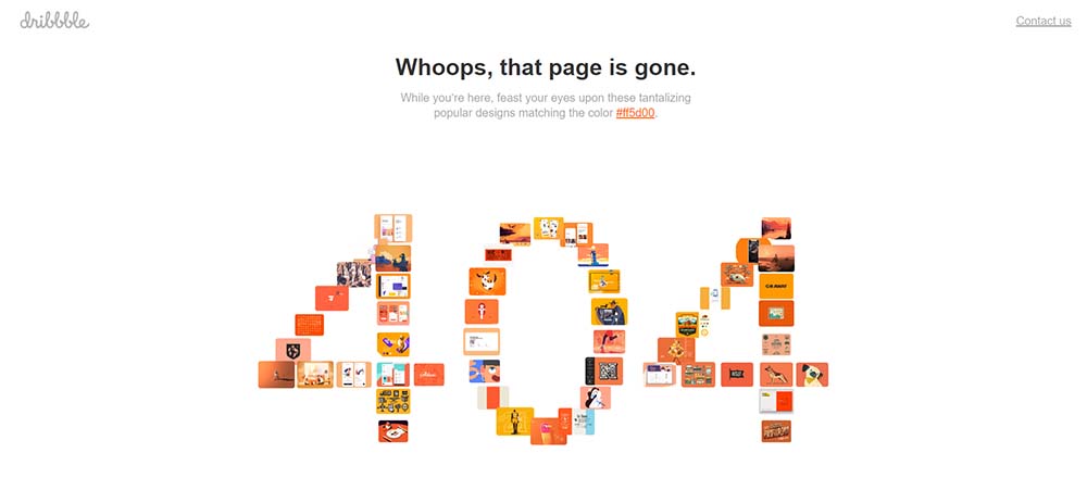
Living up to its reputation, Dribbble always has the coolest designs in the world. Its 404 error page is no exception. With the unique animated 404 illustration, which is combined by multiple designs, its 404 error page helps lift users out of boredom.
6 tips to create a user-friendly 404 not found page design
An appealing 404 page lets you connect with visitors and create a fantastic user experience. The homepage represents your brand personality which should be continued into the 404 Not Found page design.
Here are some pro tips to help you make the most of your 404 error page. Note them down and keep them in mind for your next project!
Keep it simple
No one wants to encounter an error page packed with words or links. So keeping it short and simple will help cool the users down. Avoid cluttered designs or complicated layouts that may confuse the user.
A simple 404 Not Found page design can maintain the clarity of the message conveyed to users. A clean 404 error page can also help improve the page’s load time, which keeps the user engaged during frustrating moments.
Keep branding consistent
Consistent branding contributes to the brand’s identity and makes it more recognizable to the user. When the 404 error page has the same branding as the rest of the website, the user is more likely to identify the brand and feel comforted that they are still on the same website.
Consistent branding is a good practice because it creates a professional and cohesive user experience. Websites paying attention to their brand consistency are more likely to increase their trustworthiness.
Provide clear navigation
Include clear navigation options on the 404 page to guide the user toward finding the content they were initially looking for. This could include links to popular pages on the website or a search bar to help the user find specific content.
For example, when a page is moved, allow the user to search for the page or its content by introducing a search box.
Turn the error into an opportunity
Stumbling on a 404 error page is an intimidating experience for users. You don’t want to further confuse your users but give them the opportunity instead. As mentioned before, giving users back a sense of control over the experience by designing a search bar is a great way to do that.
According to gamification principles, users want to feel like they are making progress, so take advantage of that! You will nudge users in the right direction by designing a 404 error page that allows users to progress to other parts of the website.
Play with humor (when appropriate)
Sprinkle some humor into your 404 Nor Found page design is a good way to bring smiles to users’ faces. As encountering an error frustrates the users, it is essential to convert that confusion into satisfaction through humor.
However, consider playing with humor, as it can conversely hurt your website. Take the 404 Not Found page design of Bluegg as an example. The page features a hilarious video of a laughing goat to entertain users when they are met with a 404 error. Unfortunately, this video gained a lot of views, which is not ideal for a 404 error page, so the team has to “retire the goat.”
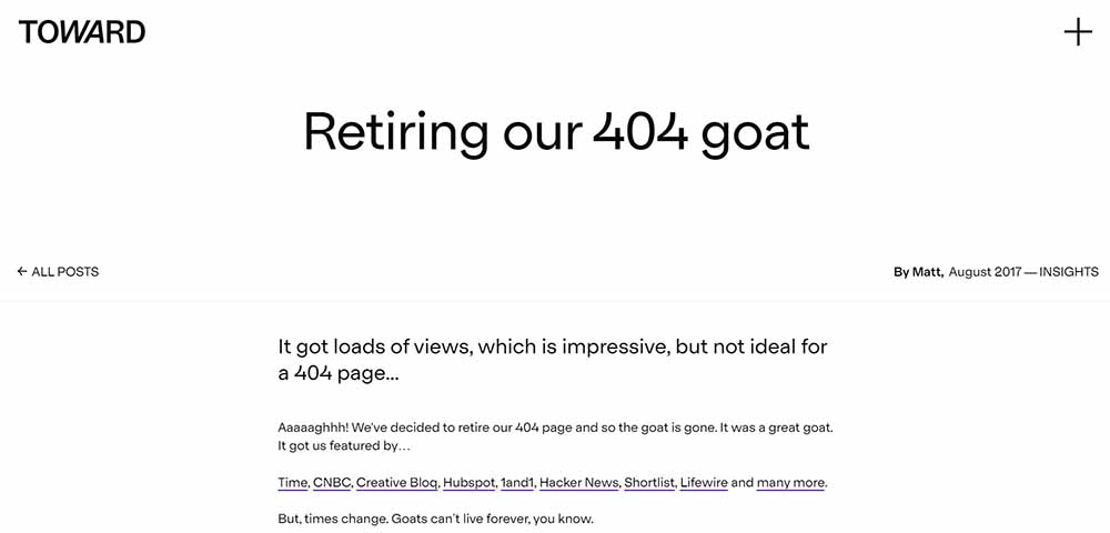
This is a leading example of how to play with humor strategically and timely. By adding humor to your 404 page design will raise a smile and keep users delighted and surprised, even.
Share your latest offer
A typical 404 page provides users with few to no options: return to the homepage or abandon the site. There is still so much untapped potential. Consider your website’s main goal.
If your website aims to sell products, book a schedule, or gain subscribers, 404 error page allows you to do that. Take a look at the 404 Not Found page design by eBay.
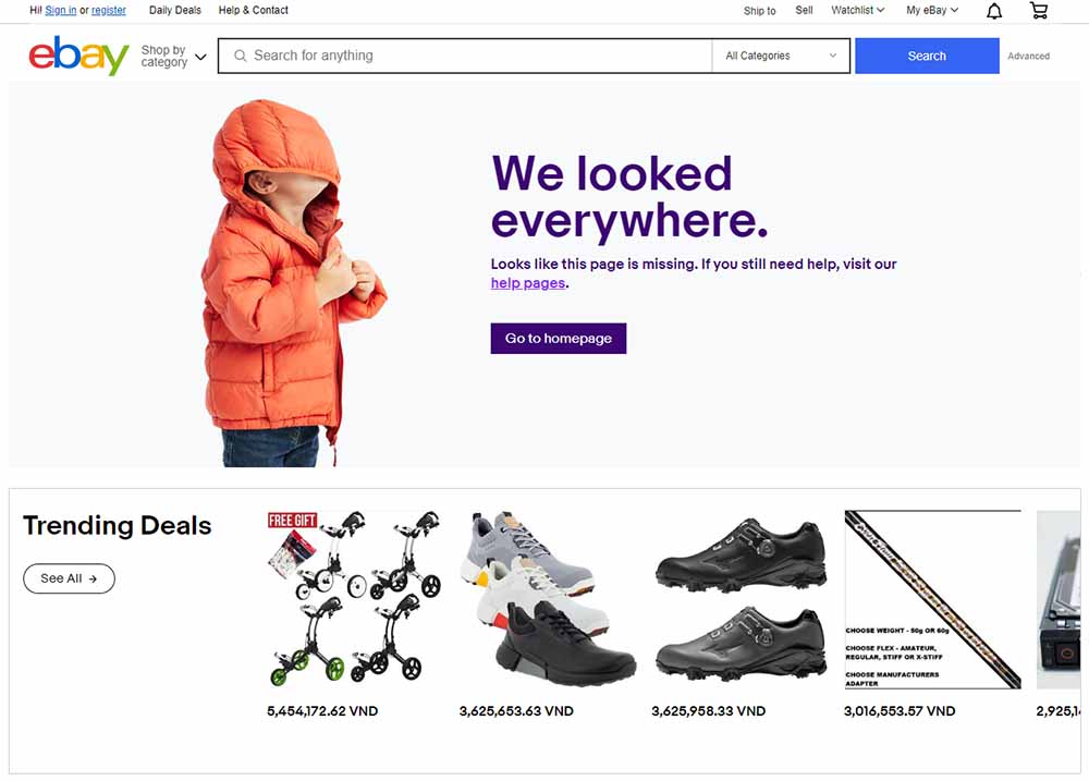
By tapping into the website’s goal, which is selling products, eBay has created a successful 404 error page. They offer users trending deals on the error page to keep users engaged and take action. It is a smart way to achieve your business goals.
Wrapping up
The 404 Not Found page is a crucial part of any website, and it must be designed in a user-friendly and consistent manner with the overall brand identity. You may develop a 404 page that not only alerts the user that the page they are looking for cannot be found but also provides helpful information.
A well-designed 404 page can help to improve the user experience, reduce frustration, and reinforce the brand’s identity. By following the tips and examples given in this blog, you can keep your users engaged and create a great user experience.
Table of content

Jacker is the Chief Technology Officer (CTO) at Mageplaza, bringing over 10 years of experience in Magento, Shopify, and other eCommerce platforms. With deep technical expertise, he has led numerous successful projects, optimizing and scaling online stores for global brands. Beyond his work in eCommerce development, he is passionate about running and swimming.
Related Post


How to Enable DebugView in GA4 for your Magento 2 store - Mageplaza
Step-by-step guide to enabling GA4 DebugView for Magento 2 merchants — verify your GA4 events are firing correctly before trusting your data.
8 mins read
|
06-09-2026

Table Rate Shipping in eCommerce: A Practical Guide
Master Magento 2 Table Rate Shipping. Learn how to configure an accurate, automated shipping matrix to optimize your checkout and boost sales.
10 mins read
|
06-02-2026
3 mins read
|
05-30-2026

Google Analytics Ecommerce Reports for Magento Merchants: What to track & Tips
A practical guide to GA4 ecommerce reports for Magento merchants, covering what to track, how to read each report, and specific tips to turn data into revenue decisions.
18 mins read
|
05-20-2026
5 Ways to Hide Products on Shopify (2026 Guide)
Explore the best 5 ways to hide products on Shopify. Learn how to manage visibility, protect pricing, and create a tailored shopping experience for buyers.
18 mins read
|
05-16-2026
7 mins read
|
06-30-2026
How to Enable DebugView in GA4 for your Magento 2 store - Mageplaza
Step-by-step guide to enabling GA4 DebugView for Magento 2 merchants — verify your GA4 events are firing correctly before trusting your data.
8 mins read
|
06-09-2026
Table Rate Shipping in eCommerce: A Practical Guide
Master Magento 2 Table Rate Shipping. Learn how to configure an accurate, automated shipping matrix to optimize your checkout and boost sales.
10 mins read
|
06-02-2026
3 mins read
|
05-30-2026
Google Analytics Ecommerce Reports for Magento Merchants: What to track & Tips
A practical guide to GA4 ecommerce reports for Magento merchants, covering what to track, how to read each report, and specific tips to turn data into revenue decisions.
18 mins read
|
05-20-2026
5 Ways to Hide Products on Shopify (2026 Guide)
Explore the best 5 ways to hide products on Shopify. Learn how to manage visibility, protect pricing, and create a tailored shopping experience for buyers.
18 mins read
|
05-16-2026