Cookies help us enhance your experience on our site by storing
information about your preferences and interactions. You can customize your
cookie settings by choosing which cookies to allow. Please note that disabling
certain cookies might impact the functionality and features of our services,
such as personalized content and suggestions.
Cookie Policy
These cookies are strictly necessary for the site to work and may not be disabled.
Cookie name
Description
Lifetime
Provider
_ce.clock_data
Store the difference in time from the server's time and the current browser.
1 day
Crazy Egg
_ce.clock_event
Prevent repeated requests to the Clock API.
1 day
Crazy Egg
_ce.irv
Store isReturning value during the session
Session
Crazy Egg
_ce.s
Track a recording visitor session unique ID, tracking host and start time
1 year
Crazy Egg
_hjSessionUser_2909345
Store a unique user identifier to track user sessions and interactions for analytics purposes.
1 year
HotJar
_hjSession_2909345
Store session data to identify and analyze individual user sessions.
1 day
HotJar
apt.uid
Store a unique user identifier for tracking and personalization.
1 year
Mageplaza
cebs
Store user preferences and settings.
Session
Mageplaza
cf_clearance
Store a token that indicates a user has passed a Cloudflare security challenge.
1 year
Cloudflare
crisp-client
The crisp-client/session cookie is used to identify and maintain a user session within the Crisp platform. It allows the live chat system to recognize returning users, maintain chat history, and ensure continuity in customer service interactions.
Session
Crisp
_ga
Store a unique client identifier (Client ID) for tracking user interactions on the
2 years
Google
_ga_7B0PZZW26Z
Store session state information for Google Analytics 4.
2 years
Google
_ga_JTRV42NV3L
Store session state information for Google Analytics 4.
2 years
Google
_ga_R3HWQ50MM4
Store a unique client identifier (Client ID) for tracking user interactions on the website.
2 years
Google
_gid
Store a unique client identifier (Client ID) for tracking user interactions on the website.
1 day
Google
_gat_UA-76130628-1
Throttle the request rate to Google Analytics servers.
1 day
Google
Advertising cookies
Advertising cookies deliver ads relevant to your interests, limit ad frequency, and measure ad effectiveness.
Advertising cookies deliver ads relevant to your interests, limit ad frequency, and measure ad effectiveness.
Cookie name
Description
Lifetime
Provider
_gcl_au
The cookie is used by Google to track and store conversions.
1 day
Google
__Secure-3PAPISID
This cookie is used for targeting purposes to build a profile of the website visitor's interests in order to show relevant and personalized Google advertising.
2 years
Google
HSID
This security cookie is used by Google to confirm visitor authenticity, prevent fraudulent use of login data and protect visitor data from unauthorized access.
2 years
Google
__Secure-1PSID
This cookie is used for targeting purposes to build a profile of the website visitor's interests in order to show relevant and personalized Google advertising.
2 years
Google
SID
This security cookie is used by Google to confirm visitor authenticity, prevent fraudulent use of login data and protect visitor data from unauthorized access.
2 years
Google
APISID
This cookie is used by Google to display personalized advertisements on Google sites, based on recent searches and previous interactions.
2 years
Google
__Secure-1PAPISID
This cookie is used for targeting purposes to build a profile of the website visitor's interests in order to show relevant and personalized Google advertising.
2 years
Google
__Secure-3PSID
This cookie is used for targeting purposes to build a profile of the website visitor's interests in order to show relevant and personalized Google advertising.
2 years
Google
SSID
This cookie is used by Google to display personalized advertisements on Google sites, based on recent searches and previous interactions.
2 years
Google
SAPISID
This cookie is used by Google to display personalized advertisements on Google sites, based on recent searches and previous interactions.
2 years
Google
__Secure-3PSIDTS
This cookie collects information about visitor's interactions with Google services and ads. It is used to measure advertising effectiveness and deliver personalised content based on interests. The cookie contains a unique identifier.
2 years
Google
__Secure-1PSIDTS
This cookie collects information about visitor's interactions with Google services and ads. It is used to measure advertising effectiveness and deliver personalised content based on interests. The cookie contains a unique identifier.
2 years
Google
SIDCC
This security cookie is used by Google to confirm visitor authenticity, prevent fraudulent use of login data, and protect visitor data from unauthorized access.
3 months
Google
__Secure-1PSIDCC
This cookie is used for targeting purposes to build a profile of the website visitor's interests in order to show relevant and personalized Google advertising.
1 year
Google
__Secure-3PSIDCC
This cookie is used for targeting purposes to build a profile of the website visitor's interests in order to show relevant and personalized Google advertising.
1 year
Google
1P_JAR
This cookie is a Google Analytics Cookie created by Google DoubleClick and used to show personalized advertisements (ads) based on previous visits to the website.
1 month
Google
NID
Show Google ads in Google services for signed-out users.
6 months
Google
Analytics cookies
Analytics cookies collect information and report website usage statistics without personally identifying individual visitors to Google.
Analytics cookies collect information and report website usage statistics without personally identifying individual visitors to Google.
Cookie name
Description
Lifetime
Provider
_dc_gtm
Manage and deploy marketing tags through Google Tag Manager.
1 year
Google
1P_JAR
Gather website statistics and track conversion rates for Google AdWords campaigns.
1 month
Google
AEC
1 month
Google
ar_debug
Debugging purposes related to augmented reality (AR) functionalities.
1 month
Doubleclick
IDE
The IDE cookie is used by Google DoubleClick to register and report the user's actions after viewing or clicking on one of the advertiser's ads with the purpose of measuring the effectiveness of an ad and to present targeted ads to the user.
1 year
Doubleclick
ad_storage
Enables storage, such as cookies (web) or device identifiers (apps), related to advertising.
1 year
Google
ad_user_data
Sets consent for sending user data to Google for online advertising purposes.
1 year
Google
ad_personalization
Sets consent for personalized advertising.
1 year
Google
analytics_storage
Enables storage, such as cookies (web) or device identifiers (apps), related to analytics, for example, visit duration.
How to Create Infographics For Your Blog? - Mageplaza
How to Create Infographics For Your Blog?
Summer Nguyen|03-17-2025
Infographics are one of the most popular ways to convey information on the web. They’re easy to digest and can be a great way to break up blocks of text and help you stand out when competing for attention online.
Since infographics have become so popular, there’s a lot of competition for attention in this space. But there are also many different ways that you can exploit to create your infographics, as well as some pretty good ones that you can use for free.
The idea here is to use infographics to create interesting content to increase user engagement and backlinks. Here are some ways in which you can create infographics for your blog.
1. Have the best infographic maker software at hand
Creating an infographic is not hard, but it does take a bit of time and patience.
Luckily, there are many tools out there that you can use to create infographics. Many of these tools don’t even require proficiency in designing or editing to make something that people will want to share.
Here are some of the best design software you can use to create infographics for your blog:
Canva: It has more than 100 downloadable free templates. There are category-wise templates such as Business, Charity, Education, and so on. Also, the easy-to-use editor has many options.
Crello (now VistaCreate): It has over 50,000 downloadable free templates, both animated and static. You can use it to create visual content for social media and the web, materials for print marketing, and ads.
Piktochart: A web-based infographic software, It has 35 downloadable free templates. It has an editor with several tools, and you can embed videos in the software along with Charts and maps.
Lunacy: A free software that works on Windows, macOS, and Linux in 18 languages. There are many high-quality illustrations, icons, and shapes for creating the best ever infographics there. It has a very simple and beginner-friendly interface, so the app fits everyone.
It will also be beneficial if you learn some tried-and-true design systems from leading brands.
2. Know the types of infographics and when to use them
Infographics are a great way to communicate data in a visually appealing way. The problem is that infographics can be used for several different purposes, and what works for one purpose won’t necessarily work for another.
That means it’s important to know the types of infographics available and when each type is appropriate. If you want to use an infographic for marketing your business, you might find inspiration in the best flux prompts to help you choose the right type.
Here are the seven types:
Statistical infographic: It can visualize survey results, present data from different sources, or support an argument with relevant data.
Informational infographic: With this infographic, you can communicate a new or specialized concept or offer an overview of a subject.
Timeline infographics: It helps you visualize the history of something, highlight significant dates, or give an overview.
Process infographic: You can use it to provide an outline of the steps in a process.
Comparison infographic: Use it while comparing options in an unbiased way or when you want to make an option seem better.
Hierarchical infographic: With this, you can organize information from greatest to least.
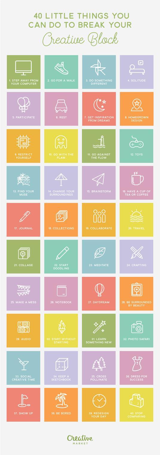
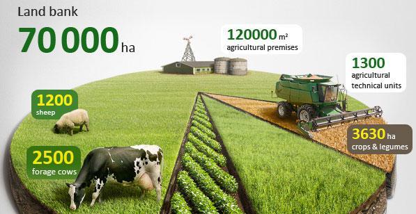
List infographic: You can use it to share a list of tips, resources, or examples. Below is an example:
You can also structure your infographics in different ways, including:
Timelines: You can use timelines to show how different events in history unfolded or how a complex process takes place. Infographics that visually track the evolution of something (like art or technology) over time are popular and effective choices.
Charts and graphs: Informational infographics often use charts and graphs to illustrate data. For example, you can use a pie chart to show the frequency with which different types of people reported using certain products or services.
Maps: Maps are a great way to share information about the world around us, from the spread of disease to the migration patterns of animals.
3. Consider the factors your infographic should have
What works for some people may not work for you and vice versa. But there are a few key points that every infographic should have to become a killer piece of content and get shared by thousands of people, if not more.
Here are some of the most important factors your infographic should have:
A solution to a problem
Excellent design
Educational and entertaining
Stats
Sources
4. Define your audience and goals
If you want to create infographics that are engaging and informative, you must know your audience and goals by heart. Naturally, the infographic you create should be something that the reader will find useful or interesting.
Consider the following questions when doing so:
Who do I want to reach?
What are their demographics?
Will my infographic appeal to a certain age group or gender?
What do I want them to learn from my infographic?
Your target audience is going to determine what data you add, which language to use, the overall style, and how detailed you need to go.
The next step is to identify your goals and analyze what information you want to include in your infographic. Are you trying to increase engagement on social media? Are you trying to increase the number of shares for your blog post? Are you trying to get more subscribers?
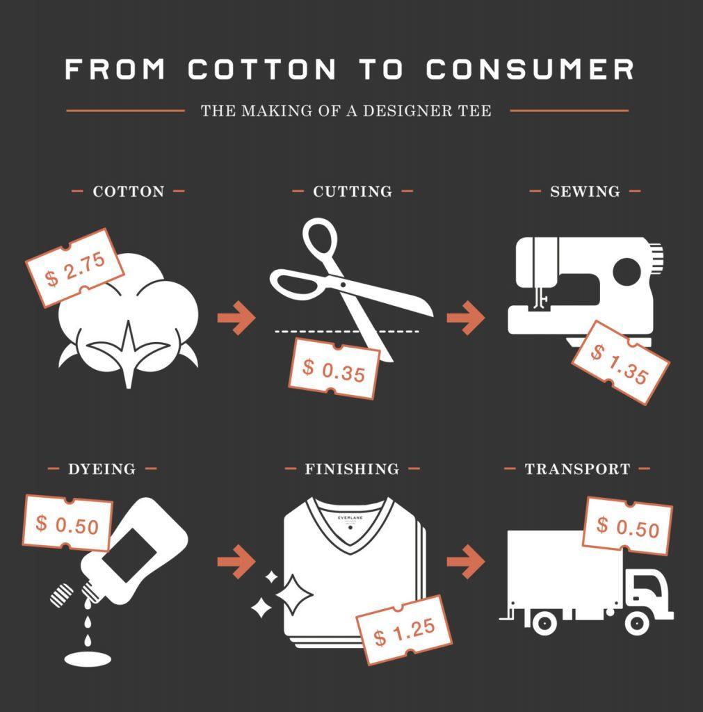
For instance, Everlane designed an infographic to explain why clothes are costlier than they should be. In the first part, they walk you through the course of what it takes to make a basic t-shirt and the expense in each step.
The second half of the infographic shows how companies chalk up the price and sell to customers at a costlier price than it needs to.
Define your audience target
5. Gather data
If you want to create infographics for your blog, you need one thing: data.
Gathering data is easy enough. It’s everywhere, and in most cases, all it takes is a Google search.
You can also use tons of public data available in existing data repositories. Platforms like Pew Research and Harvard Business Review can help you discover public opinion, media content, demographics, and more.
Then you have Statista for market research. If you visit Google Trends Datastore, you will find curated datasets from the Google News Lab.
However, there are some rules to follow if you want to create quality infographics:
Only use credible sources of information. Wikipedia or blogs are not credible sources of information - at least not when it comes to matters where accuracy is of importance. You want to use academic journals and studies, government statistics, and similar sources that are known for their accuracy.
The source must be named. You cannot just say stuff like “studies show” or “statistics show”. This is vague and does not prove the veracity of your claims. Instead, you need to name the source of your information.
Data must be accurate and recent. There is nothing worse than using old data, especially when it comes to infographics that deal with matters such as financial markets or technological innovations. An infographic using outdated data will look bad on your blog and will undermine the trustworthiness of all other articles posted on it.
6. Create a copy outline and a template layout
It’s best to start your infographic by planning out the structure of the content you want to include. An effective infographic has a clear message and uses headings, subheadings, and callouts to allow readers to skim for the information they want.
Your outline should include:
The story you want to tell — what is the main message?
The key points — what do you want readers to take away from your infographic?
A list of the facts and statistics you will use to support your message.
Chosen fonts and color palette
Some examples of infographics for reference
Promotion channels
The next would be to create a template layout. When you’re putting together a design that needs to be reproduced or shared online, creating a template for the layout will make it easier to share across social media, blogs, and your website.
Infographic templates make the process of creating an infographic easier unless you want to design from scratch. Choose one depending on the type of info you want to communicate.
7. Include your brand logo
It would be a branding mistake not to add your logo or company name to your infographic. Adding them at the top and bottom will increase brand awareness and recognition.
Here’s an example of an infographic with a company name:
Include your Brand Logo by Infographic
8. Follow the best practices of infographic design
The key to getting results from infographics is to follow the best practices of infographic design.
Here are some actionable tips to create infographics that will drive traffic, improve SEO, and engage your audience so that they’ll come back for more!
Use only one font for the headline and one for the body
Choose a color palette with only one primary color
Pick two to three secondary colors
Choose a neutral color
Your icons should match your color palette. They should also be similar in style.
If you are designing, split the infographic into two columns and make a large title card on top. Keep your background design simple. A backbone can have icons, visuals, or a line.
Keep your charts or data clean and simple. Stick to your color palette. And add labels with your charts.
Use plenty of white space around headlines and between sections. Don’t use extensive text.
Based on the topic, split your infographic into specific sections. Break them up with alternating colors and lines. Add the main label and icon or image in all sections.
After your first draft, check to see that all the main elements, as well as, spacing align.
Visual aesthetics are important. You will know this if you are familiar with visual content marketing. Here’s an infographic that was designed using photo manipulations, 3D tools, compositing, and drawing to create its aesthetic.
Example infographic design by practices tools
9. Think of yourself as a reader
As you are creating your infographic, think of yourself as a reader. Your infographic should solve a problem for your audience. Think about how your infographic can help them. If it doesn’t impress you, it certainly will not impress readers.
How will it look when readers receive it? What will they be looking at? What words and images will catch their attention? Ask yourself these questions and use them as guidelines in your design decisions.
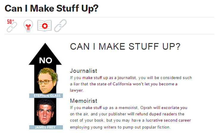
10. Be creative and original
Infographics are an easy way to get creative with your marketing, but you need to be careful not to fall into the trap of creating something that looks like every other infographic. The best infographics have a unique style and feel.
Consider this infographic, for instance:
Example Creative Unique Infographics
It brilliantly shows how okay it is for people in different positions to make stuff up starting from a journalist to a fantasy writer. It is an original idea. The visualization is another bonus.
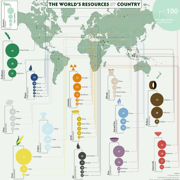
11. Use maps and charts
Using Relevant maps and charts to explain facts can make your Infographics appear real and supportive. And as per a study, there was an 80% increase in readership rates when content used visuals such as charts, graphs, images, and color design.
Here’s an example showing the world’s resources by country:
Example Use Maps and Charts by Infographic on your Blog
12. Promote your infographic profusely
To ensure your Infographic reach more audience, follow these strategies:
Connect and reach out to the influential bloggers who will share your content
Ask your subscribers to promote the Infographic on their blog. Use embed tweet or Click to Tweet. As per studies, infographics receive 3x more shares compared to other types of content.
Use social media
Write a press release
Submit your post to directories. Websites like Daily Infographic, Visual.ly, and Infographic Journal are dedicated to helping promote your infographic.
Infographics are an art form that has been around for years. It’s no surprise, then, that they’ve become so popular on the Internet as a new way to present information. They’re a simple way to make your brand stand out from the crowd and make your company more memorable — if not more successful.
Before you begin, make sure your infographic idea is well thought out. Be clear about what you want to achieve by creating it and why it’s important. If your idea is vague or imprecise, it will be difficult for anyone to understand what you’re trying to convey.
Other than that, use the aforementioned tips and ways to create an eye-catching infographic to wow your audience.
Summer is the CMO and Digital Commerce Solution Expert with 10+ years of experience. She specializes in Magento, Shopify, ERP, CRM, AI, and Blockchain, delivering strategic solutions that transform businesses. With a deep understanding of digital commerce, she helps brands scale and stay ahead in a competitive market.
A practical guide to GA4 ecommerce reports for Magento merchants, covering what to track, how to read each report, and specific tips to turn data into revenue decisions.
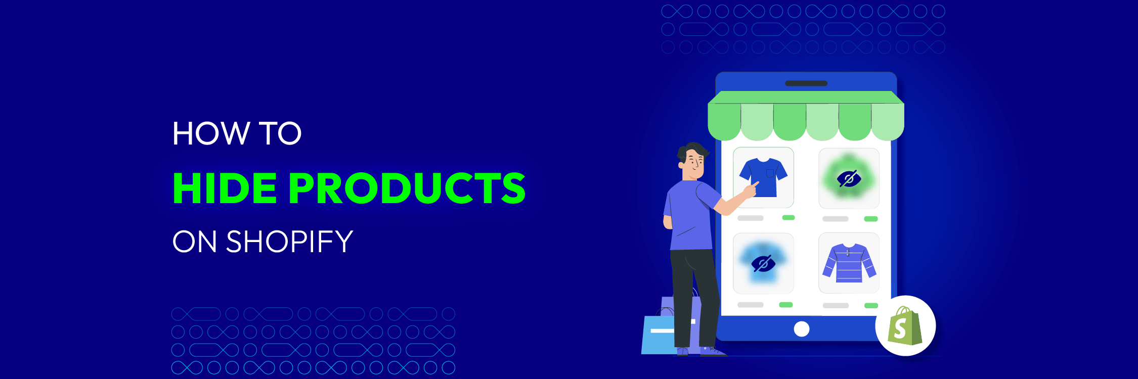
Explore the best 5 ways to hide products on Shopify. Learn how to manage visibility, protect pricing, and create a tailored shopping experience for buyers.
A practical guide to GA4 ecommerce reports for Magento merchants, covering what to track, how to read each report, and specific tips to turn data into revenue decisions.
Explore the best 5 ways to hide products on Shopify. Learn how to manage visibility, protect pricing, and create a tailored shopping experience for buyers.