10 Impressive Therapist Website Examples in 2024
Summer Nguyen | 08-15-2024
In the digital age, a therapist’s website serves as more than just an online presence—it’s a pivotal tool for connecting with potential clients and establishing trust. An effective therapist website must not only be visually appealing but also intuitive to navigate, providing essential information promptly and encouraging visitors to take action. Here, we delve into 10 standout therapist website examples in 2024, highlighting their strengths and areas for improvement, to inspire and guide you in creating or enhancing your own.
Table of Contents
Key Elements of an Impressive Therapist Website
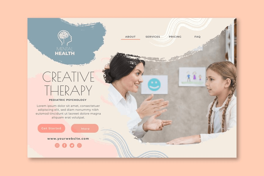
An effective website must be user-friendly and quickly lead visitors to the information they need.
For therapists, this means your website should immediately show how you can help them. It should also make it easy for them to contact you.
Here are some key features:
- Streamlined Navigation: Your website should be easy to navigate. Visitors should quickly find what they’re looking for without frustration. For example, you should have a clear menu with links to your services, about you, and how to contact you.
- Professional Design: Your website should look clean and serene. This could be the visitor’s first impression of you. Make it a positive one.
- Helpful Content: Share information that helps people understand what you do. You can explain how therapy works and what others can expect when working with you. This is like a friendly introduction when someone comes to your office.
- Mobile-Friendly Operations: Nearly 60% of web traffic is on mobile devices. Ensure your website works well on all devices. If it’s not mobile-friendly, customers may quickly turn to competitors.
- Easy Contact: Make it easy for people to contact you. Include a contact form where people can easily find it. You might want to create clickable links to call your phone number so mobile users can click and contact you immediately.
- Personal Touch: Add a bit about yourself, like your photo and why you became a therapist. This helps people feel they understand you better, making it easier for them to decide to call you. It helps you stand out and become memorable.
In summary, an effective therapy website should be welcoming, clear, and helpful. It should make people feel comfortable and show them how you can help them, much like a good first meeting.
Read more:
- Website Functionality Checklist: 6 Features to Focus on
- How to Check Website Performance: Free Tools and Methods
10 Impressive Therapist Website Examples
Mary Diorio Psychotherapy
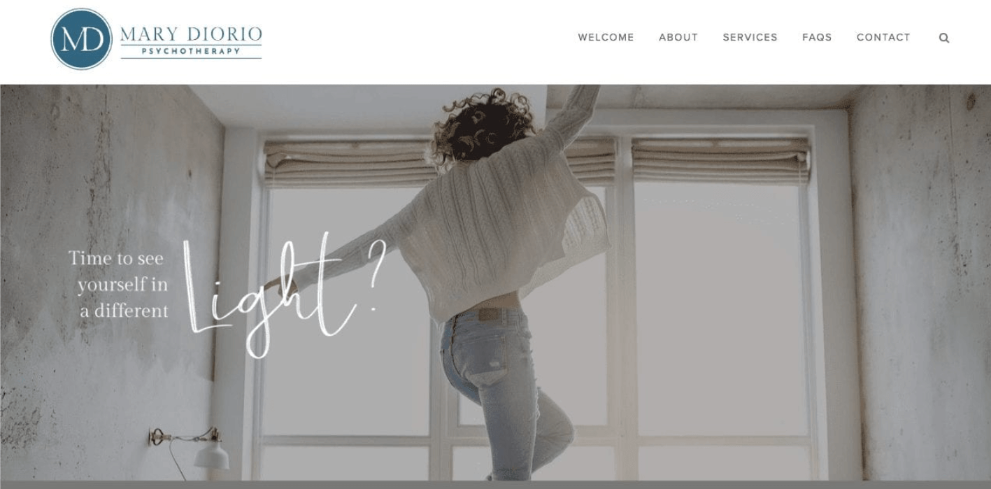
First on our list is the website of therapist Mary Dorio.
Let’s take a moment here to discuss everything that Mary’s website gets right.
The ways this therapy website stands out:
- Color Scheme: Mary’s website utilizes a beautiful and cohesive palette of blues, ranging from soft to vibrant tones. This creates a unified and charming visual appeal throughout the site.
- Fonts: The use of handwritten fonts adds a personal touch without being overly decorative. This choice enhances readability and contributes to the website’s inviting atmosphere.
- Clear Specializations: Mary effectively communicates her core areas of expertise through visually appealing sections with clear calls to action. This clarity helps visitors understand her services quickly and encourages engagement.
Wila Therapy
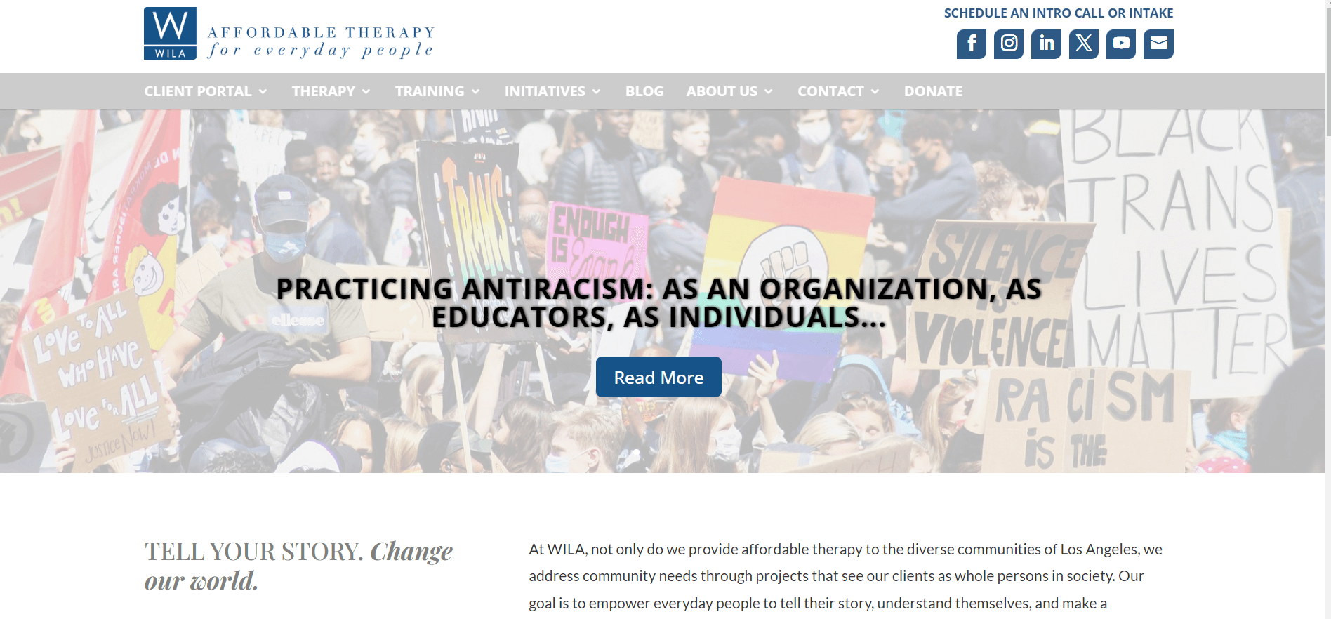
Let’s explore another in the list of therapist website examples, Wila Affordable Therapy, which is a great example of a well-organized and easily navigable group practice website.
What This Website Does Well:
- Contact Information and Call-to-Action: The website excels with clear contact details prominently displayed at the top, including a visible phone number and a strong call-to-action button, “Begin Therapy,” integrated effectively into the main image.
- Imagery: Unlike many therapy websites that often feature somber imagery, Wila Affordable Therapy opts for positive and hopeful visuals. This approach helps visitors envision positive changes through therapy, enhancing engagement and appeal.
- User Experience: Despite offering a range of services, the website maintains clarity and ease of navigation. Visitors can quickly find relevant information tailored to their needs.
Deep Eddy Psychotherapy
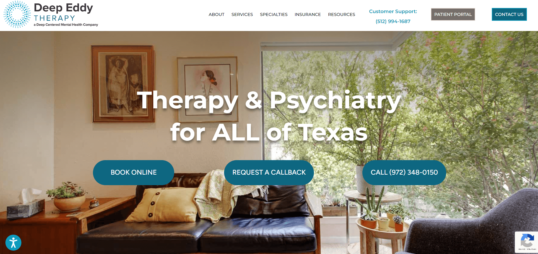
When we first encountered the Deep Eddy Psychotherapy website, it stood out as a standout among therapy sites. Their name, Deep Eddy Psychotherapy, instantly conveys their unique identity within the community. The main hero image of their office made a powerful impression, vividly portraying what clients can expect upon their first visit.
What We Appreciate About This Website:
- Strong Messaging: Their hero image prominently features: “Austin’s Premier Psychotherapy and Training Center for Over 30 Years. Heart-centered work based on cutting-edge science. Transformation is our expertise and passion.” This messaging not only connects deeply with Austin but also underscores their long-standing commitment to evidence-based therapy focused on emotional well-being.
- Clear Call-to-Action: They effectively place a clear contact button after their messaging, facilitating easy visitor engagement.
- Comprehensive Contact Information and Employee Bios: Their contact page offers clickable phone numbers, maps, and user-friendly “contact us” forms. Employee bios with friendly images enhance personal connection and reassure potential clients about their professional reception process.
- Effective Video Use: Their blog features introduction videos and informative clips that enhance accessibility and showcase their welcoming approach.
Southern California Counseling Center
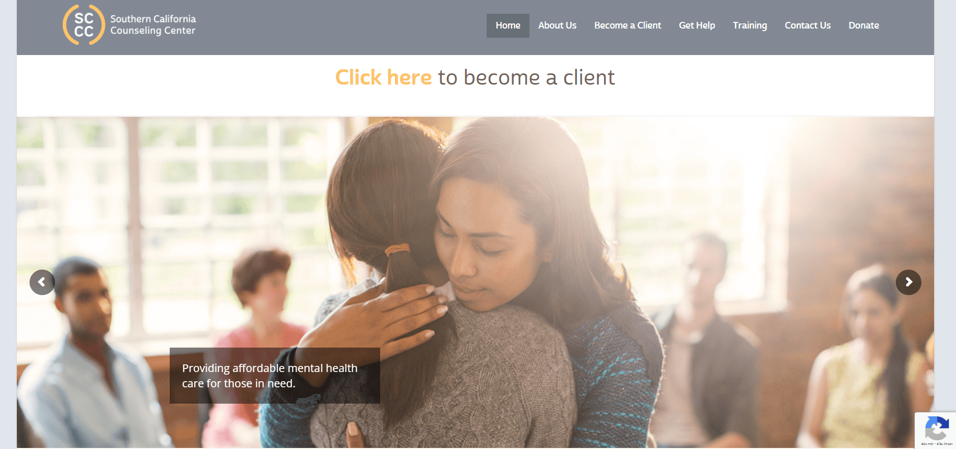
Next on our list of therapist website examples is the Southern California Counseling Center. Their website features a markedly different interface compared to most therapy sites, which I find genuinely intriguing and cleverly designed.
What They Do Right:
- Attention-Grabbing Hero Image: The hero image they’ve chosen is unconventional and attention-grabbing. Using illustrations to represent their clients allows visitors to envision themselves as clients, which is compelling. The blend of real photos with illustrations adds a contemporary and visually appealing touch, setting them apart from others.
- ‘Who We Are’ Section: The “Who We Are” section is beautifully designed with high-quality photos of staff members. Unlike overwhelming headshots, these photos are engaging and warm, showcasing different personalities effectively. The use of exceptional photography enhances the overall appeal of this section.
- Including a Homepage Video: They feature a professionally produced video on their homepage that effectively communicates their mission and commitments.
Couples Learn
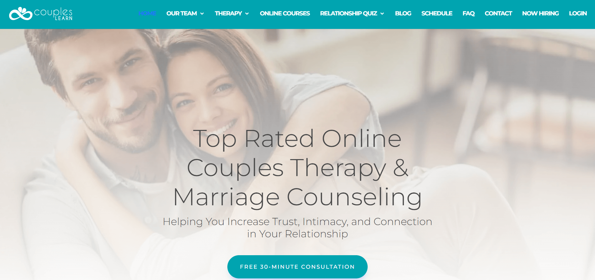
This website, Couples Learn, excels in several areas, and the first thing we appreciate is its color scheme. The color palette here is fantastic, executed very well, perfectly matching the theme the website addresses. The combination of navy blue, leaf green, and purple truly makes the website vibrant and dynamic.
What They Do Right:
- Clear Messaging: The website effectively communicates its therapy offerings and the benefits clients can expect, such as “increase trust, intimacy, and connection in your relationships.” The call to action for a free 30-minute consultation is prominently featured, enhancing user engagement.
- Video: A video introducing their services on the homepage enhances engagement significantly. Videos attract clicks and provide a dynamic way to showcase services, especially when subtitled for accessibility in public settings.
- Building Authority and Trust: The website focuses on building authority through curated five-star Yelp reviews that provide detailed insights into client experiences. They also prominently display their HIPAA compliance, crucial for online healthcare services.
- Strong About Us Page: The About Us page strikes a balance by presenting professional credentials and clinical approach in an accessible manner. Videos and client testimonials further enhance its appeal and credibility.
Individual and Relationship Therapy Center
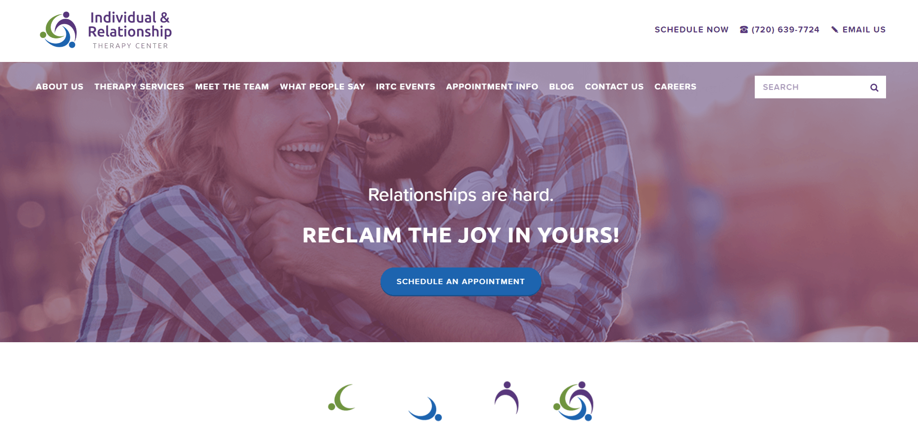
This website excels in many areas, starting right from the homepage.
What They Do Right:
- Contact Information: They prominently display all necessary contact details at the top of the page, offering multiple options for customers to connect—phone, email, or online scheduling. This ensures easy access based on customer preference.
- Value Proposition and Call to Action: Using centered text in the hero image effectively acknowledges customer challenges with phrases like “Relationships are hard,” followed by empowering messages like “Find joy within yourself!”
- Impressive Introduction Section: Professional images of their students featured on the homepage, transitioning to childhood photos, humanize therapists and make potential clients feel comfortable.
- Beautiful Office Photos: High-quality images of their office create a warm, inviting atmosphere, helping potential customers envision themselves there.
Ground Work Play Therapy
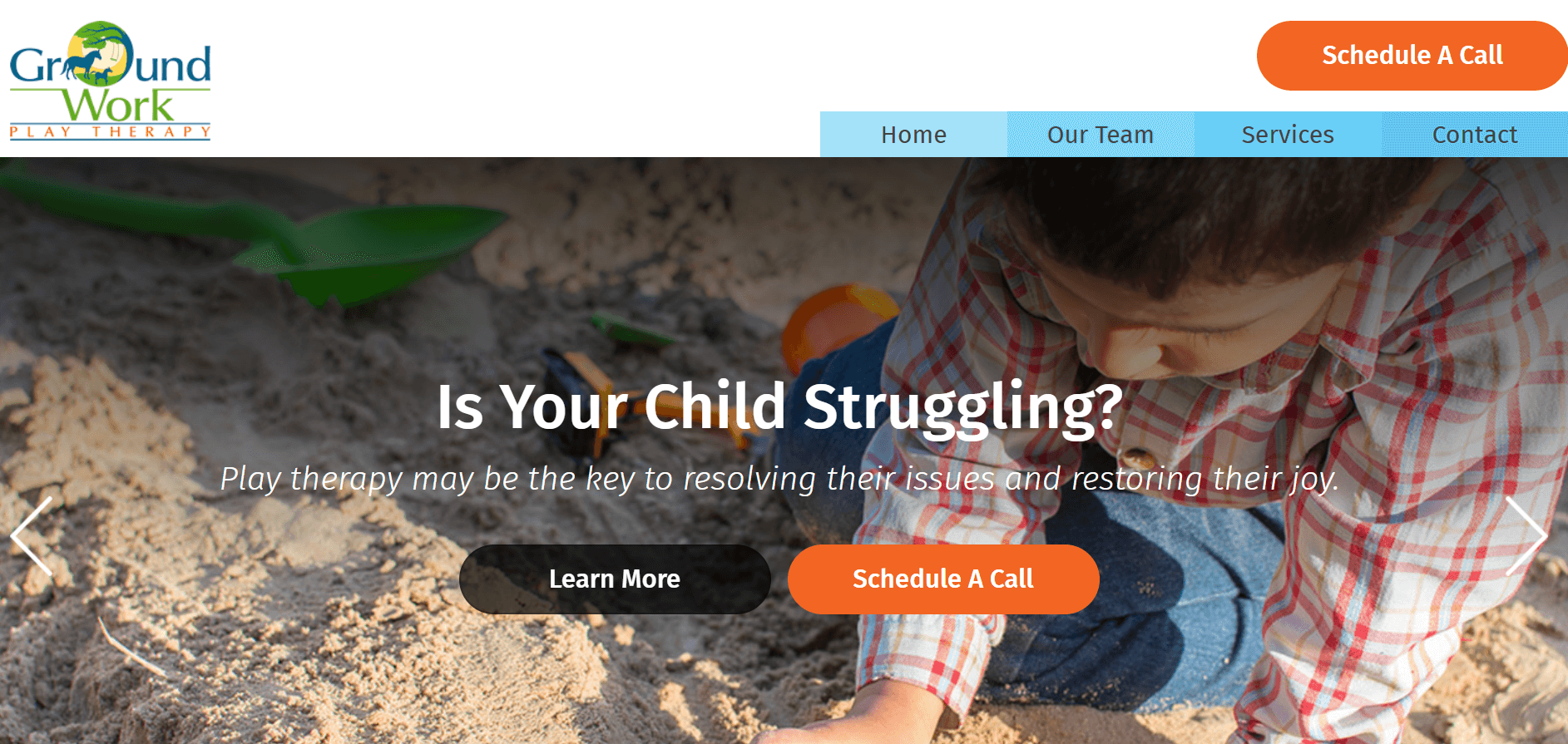
The Ground Work Therapy website is effectively engaging with their audience. Right from the start, the vibrant colors and lively feel of the website convey the personality of the clinic, nurturing a friendly, cheerful atmosphere. They’ve also chosen a great hero image that effectively communicates the unique focus of the clinic.
What They Do Right:
- Excellent Call to Action: They have a fantastic call to action with two options right in the headline that immediately grabs visitors’ attention and invites them to take action.
- Clear Service Categories: Their breakdown of three clear service categories demonstrates that their services are not just for children.
- “Schedule a Call” Button: It appears both in the hero image and at the top of the entire page, which is excellent. It provides multiple opportunities for visitors to click and get in touch.
- Visual Step-by-Step Contact Process: I appreciate how they visually break down the contact and start treatment process. This helps eliminate overwhelm when deciding to start and is a great way to encourage potential clients who may be feeling overwhelmed.
Thrive Works Therapy
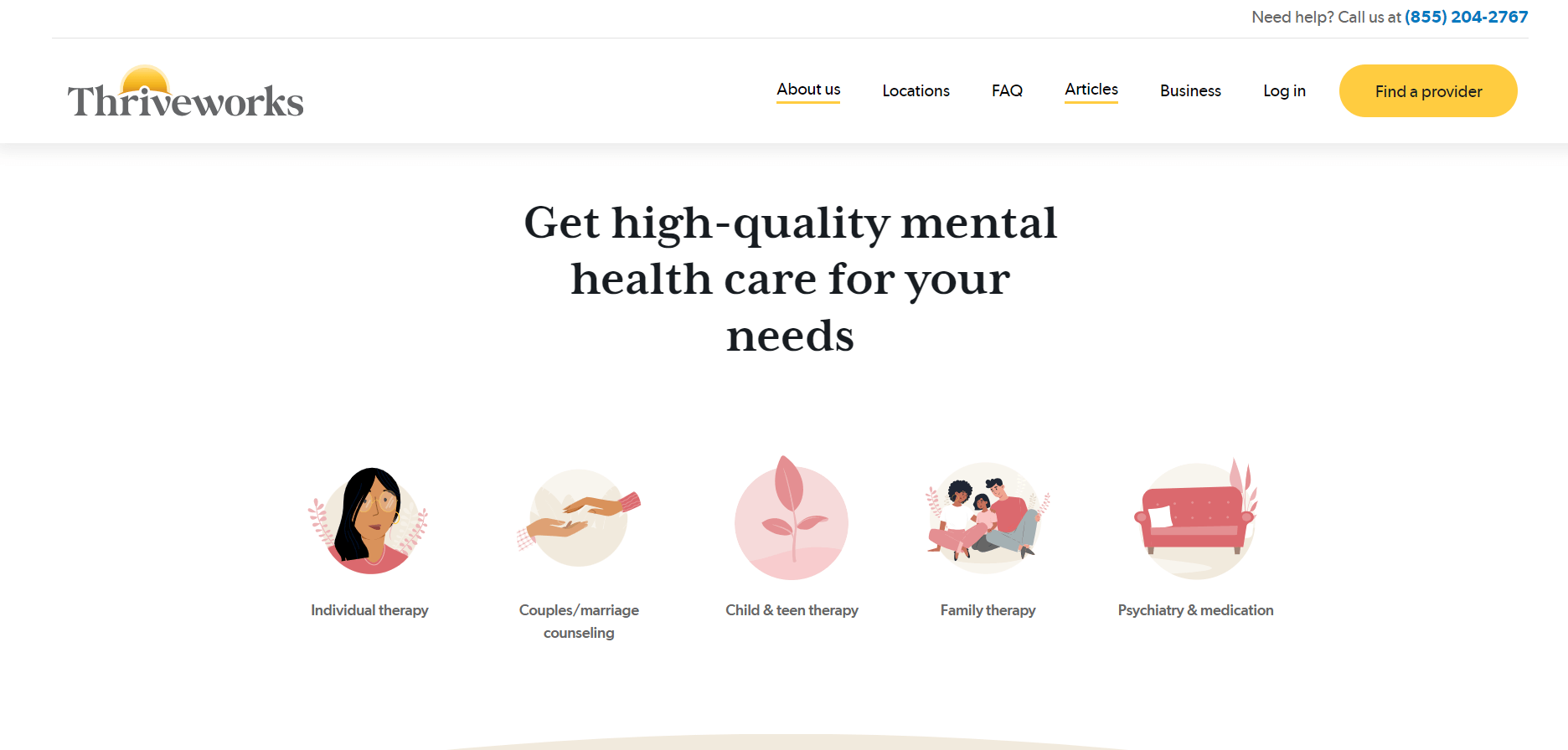
The therapy website Thrive Works is one of intriguing therapist website examples, and I want to highlight it here because it achieves something I don’t usually recommend, but it’s highly effective in this case, and I believe ultimately the impact will be very strong.
What They Do Right:
- Dual Call to Action: Thrive Works effectively features dual calls to action in their main image—one button invites visitors to call the office, while another allows them to schedule online. This approach acknowledges and accommodates different visitor preferences right from the start, enhancing accessibility.
- Chat Option: Unlike other therapy websites, Thrive Works includes a chat option, which significantly improves engagement with visitors. However, it’s crucial to ensure consistent and prompt responses to maintain its effectiveness.
In Shifra’s Arms
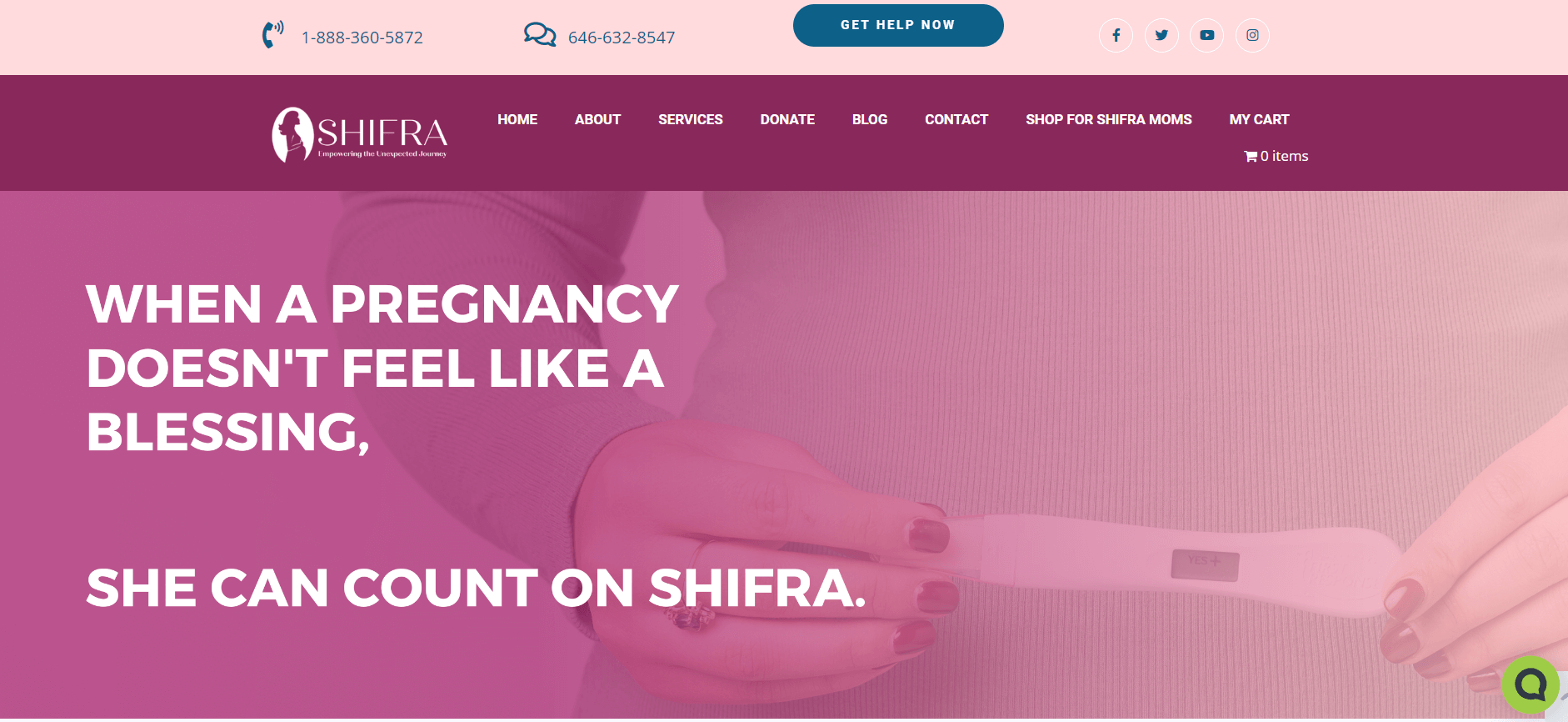
What They Do Right:
- Design/Aesthetics: I appreciate the color scheme on the website and how they use images throughout the homepage and across the site to create a warm and uplifting atmosphere.
- Ease of Navigation: One of the challenges with this website is making it accessible to the organization’s target audience while also being engaging and set up to interact with those interested in donating to their non-profit or volunteering. To achieve this, we’ve created different pathways for different types of users so that everyone has a positive experience and can easily navigate to sections of the website relevant to them.
- Relevant Video Content: The video featured on the homepage of this website is also strong and well-executed. It effectively explains the purpose of this non-profit organization in a concise and understandable manner.
Cassandra Sharp Physical Therapy
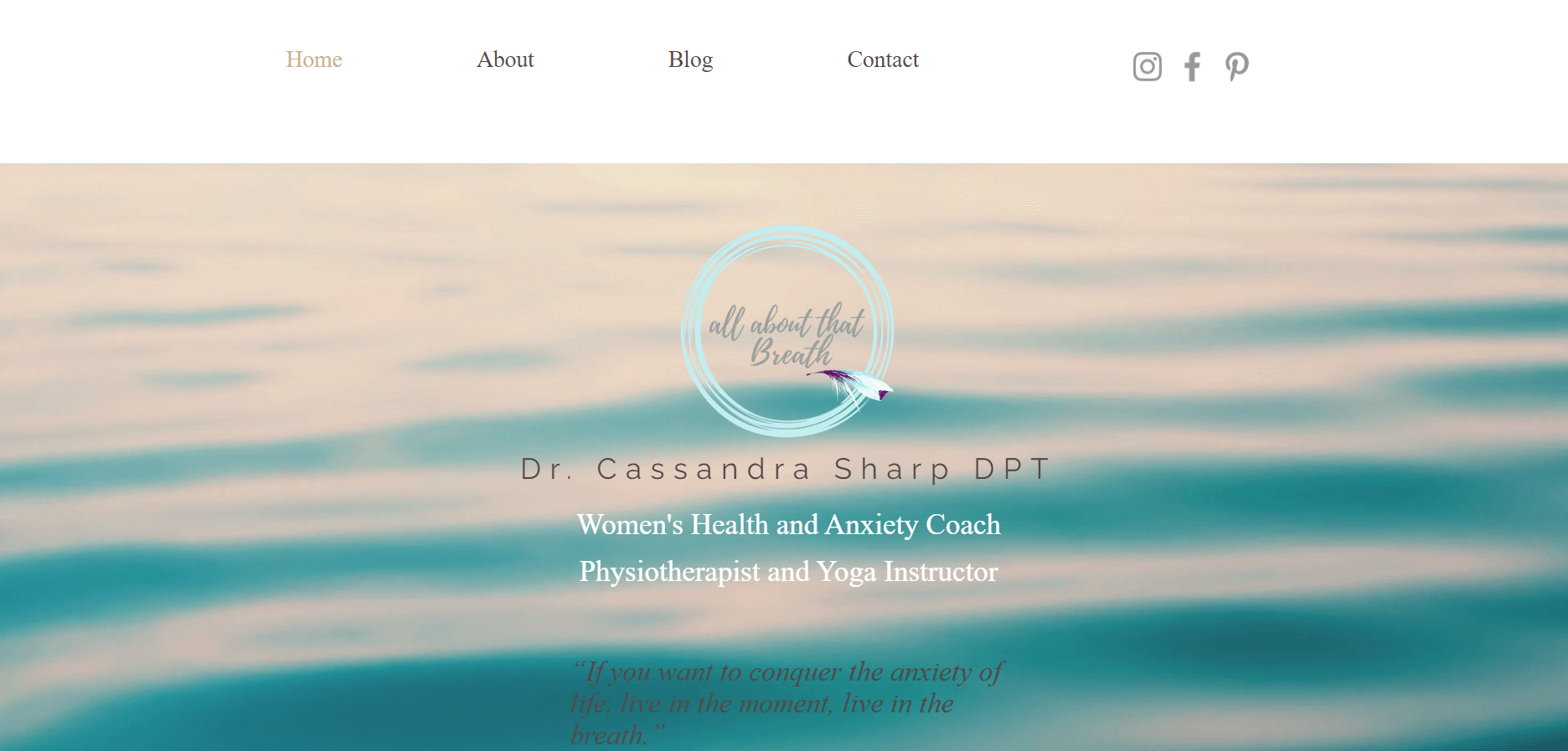
This website exemplifies an approach to physical therapy web design that is warm, expressive, and capable of fostering a sense of connection and trust among visitors.
What This Website Does Well:
- Visual and Emotional Impact: The website effectively reflects Cassandra’s holistic approach to therapy. The images provide a clear picture of the health approach you can expect when working with Cassandra. Including her personal photos as an expression of her commitment to travel and health through movement is a fantastic addition to the website.
- Motion: Small animations on the website create a dynamic feel and add interest without overshadowing or distracting from the website’s content.
Tips for Creating Effective Therapist Website
Whether you’re just starting or looking to increase your existing site, here are some simple and practical tips to help you create an effective therapist website:
- Focus on User Experience: A great therapist website should be easy to sail. Make sure visitors can speedily find the information they need, like services offered, contact details, and information about you. A clear menu and systematic content can make a big difference.
- Hold a Professional and Inviting Design: The design of your website should reflect the calm and welcoming atmosphere of your practice. Engage a soft color palette, professional fonts, and superior images that resonate with your therapy style.
- Emphasize Your Specialty: Clearly demonstrate your areas of proficiency so potential clients can easily apprehend how you can help them. Use headings, sections, or icons to arrange information about your services.
- Ensure Mobile Consistency: With many users entry websites from mobile devices, it’s important that your site looks good and functions well on all screen sizes. A responsive design supports keep visitors engaged and reduces the likelihood of them leaving the site.
- Make Contact Effortless: Provide numerous ways for visitors to get in touch, such as a contact form, email address, phone number, and even a clickable button for moment calls. Make these options easily accessible throughout your site.
- Add a Personal Touch: Include a photo of yourself, a brief bio, and why you chose to become a therapist. This helps potential clients feel more connected to you and more easy reaching out.
- Build Trust with Certificate and Reviews: Display your professional credentials, licenses, and any affiliations with reputable organizations. Include reviews or witnesses from satisfied clients to enhance credibility and reassure potential clients.
Building an effective therapist website is about making visitors feel welcome and supported. By focusing on these key elements, you can create a site that not only looks good but also serves as a valuable tool for growing your convention and helping clients find the support they need.
Recap
Creating an impressive therapist website goes beyond aesthetics; it’s about creating a space that fosters trust, clarity, and accessibility for visitors seeking support. From streamlined navigation to compelling visuals and engaging content, each of these examples demonstrates how strategic design and thoughtful implementation can enhance user experience and ultimately support client engagement. Whether you’re designing a new site or refining an existing one, integrating these key elements can significantly elevate your online presence and effectiveness as a therapist.


