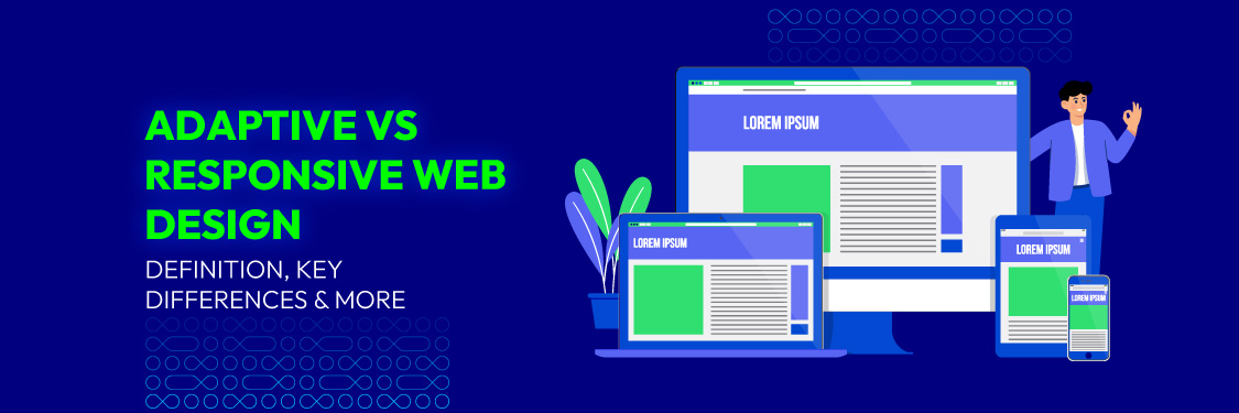
Adaptive vs Responsive Web Design: Definition, Key Differences & More
Summer Nguyen | 09-11-2024

Today, people access websites through a variety of devices, including smartphones, tablets, and desktops. This diversity in screen sizes and device types means that a website must provide a seamless experience across all platforms. Ensuring that your site works well and looks appealing on every device is crucial for meeting user expectations and boosting engagement.
With many design options available, choosing the right approach to ensure your website functions flawlessly on all devices can be challenging. In this blog post, we’ll explore the key differences between adaptive vs responsive web design to help you make an informed decision for your website development.
Understanding the Basics
When designing a website, choosing between adaptive vs responsive web design is a critical decision that impacts user experience, performance, and overall effectiveness.
Adaptive web design is a method where multiple layouts are created for different screen sizes. This approach allows for highly tailored user experiences as the design adapts to the specific device being used. However, it can be more complex and resource-intensive to implement, requiring multiple versions of the website to be maintained.
Responsive web design, on the other hand, relies on a fluid grid system that adjusts automatically to fit any screen size. This approach is generally easier to implement and maintain, as it requires only one version of the website. However, the design might not be as finely tuned to specific devices compared to adaptive design.

Choosing the right approach is crucial because it affects not only the look and feel of your website but also its performance across various devices. A well-chosen design approach ensures that users have an enjoyable experience, whether they’re browsing on a smartphone, tablet, or desktop.
Quick Comparison: Adaptive vs Responsive Web Design
Once we’ve covered the basics, let’s dive deeper into how these two approaches work, along with their respective advantages and disadvantages. The following table provides a clear comparison:
| Aspect | Adaptive Web Design | Responsive Web Design |
|---|---|---|
| Layout and Structure | Fixed layouts for specific devices, limited flexibility. | Fluid layouts that adjust to screen size, offering more flexibility. |
| Performance | Potential for faster loading on specific devices. | Generally good performance, but dependent on image optimization. |
| User Experience | Tailored experiences for specific devices, potential for inconsistencies. | Consistent experience across devices, may require more design effort. |
| Personalization | High potential for personalized experiences. | Limited personalization, but easier to implement. |
| Security and Privacy | Can optimize security settings per device. | Consistent security measures across devices. |
| Accessibility and Compatibility | Customizable for each device, may have compatibility issues. | More universally accessible, with fewer compatibility concerns. |
| SEO | Requires separate SEO optimization for each version; potential for inconsistent SEO performance and complex crawlability. | Consistent SEO across devices due to a unified design; simplifies SEO efforts and aligns with mobile-first indexing. |
| Omnichannel Experience Integration | Customizable for specific channels, may require more effort. | Easier to integrate across channels due to consistent design. |
| Green Design | May require more resources due to multiple layouts. | More resource-efficient with a single design. |
Adaptive vs Responsive Web Design: In-Depth Comparison
In this part, to better understand adaptive and responsive web design, we’ll explore each of the above aspects in greater detail.
Layout and Structure
Adaptive web design uses fixed layouts tailored to specific device sizes, meaning the website serves a pre-defined layout based on the screen dimensions it detects. For example, separate layouts are created for desktop, tablet, and mobile views.
- Device-Specific: Multiple versions of a website are created, each optimized for a particular device. This ensures users get a layout designed specifically for their screen size.
- Limited Flexibility: While adaptive design offers precise layouts for each device, it can lack flexibility. New devices with different screen sizes may require additional design work.
Adaptive design provides an optimized experience for targeted devices, but may not perform well on devices outside those predefined sizes.
Responsive web design uses fluid layouts that adjust automatically to any screen size. Instead of fixed layouts, it relies on flexible grids and media queries to adapt content dynamically across devices.
- Fluid and Flexible: Elements resize proportionally within a fluid grid system, ensuring a consistent appearance on any device, from large desktops to small smartphones.
- Dynamic Adjustments: Media queries allow the layout to change based on the screen’s dimensions and orientation, ensuring a uniform experience across all devices.
Responsive design delivers a consistent experience across devices but requires careful planning to ensure all elements look and function well on various screen sizes.
Performance
Performance is a critical factor in web design, directly affecting user experience and engagement. Both adaptive and responsive design approaches have unique strengths and challenges when it comes to loading speeds and overall performance.

Adaptive web design can lead to faster loading times by serving pre-optimized content tailored to specific devices. It delivers a layout specifically created for each screen size, minimizing unnecessary resources.
- Optimized for Specific Devices: Different versions of the site are created for desktop, tablet, and mobile, ensuring only necessary resources are loaded, reducing load time.
- Example: News sites and e-commerce platforms often use adaptive design to ensure quick load times on mobile by prioritizing essential content.
However, maintaining multiple versions can be resource-intensive and may result in inconsistent performance across devices.
Responsive web design offers good performance across devices by using a single, fluid layout that adjusts to different screen sizes. Effective resource management, especially image optimization, is crucial for maintaining quick loading times.
- Resource Management: Careful optimization of images and scripts is needed to ensure efficient loading on all devices.
- Example: Blogs and content-heavy sites use responsive design to balance performance with ease of use, often employing techniques like lazy loading.
While responsive design ensures consistency across devices, performance can suffer if resources aren’t properly optimized, making tuning and testing essential.
User Experience
Adaptive design tailors the user experience to each device, creating layouts that are optimized for different screen sizes. This approach ensures that users on each device type receive a version of the site that best suits their needs. However, this device-specific tailoring can lead to inconsistencies in the user experience across different devices, especially if new screen sizes are introduced and not immediately accounted for.
Responsive design offers a consistent experience across all devices by using a single, fluid layout that adapts to any screen size. This uniformity ensures that users have a seamless experience, whether they’re on a smartphone, tablet, or desktop. However, achieving this consistency can require more design effort to ensure that all elements work well across a wide range of devices.
Personalization
Personalization allows for tailored content and features based on user preferences. Effective personalization can enhance user satisfaction and engagement.
Adaptive web design excels in personalization by tailoring custom site versions for different user groups or devices, making it easier to deliver content based on behavior and preferences. It’s ideal for integrating AI and Machine Learning for dynamic experiences, but maintaining multiple versions can be complex.

Responsive web design offers simpler, though more limited, personalization by applying unified strategies across a single design. It allows real-time adaptation using analytics tools but lacks the granular control of adaptive design, which may reduce the effectiveness of content delivery for specific user groups.
Security and Privacy
In terms of security and privacy, both adaptive and responsive web designs have unique characteristics that influence how user data is protected and managed. Ensuring robust security across all platforms is essential for maintaining user trust and compliance with privacy regulations. Here’s a closer look at how each design approach handles security and privacy:
| Aspect | Adaptive Web Design | Responsive Web Design |
|---|---|---|
| Security Settings | Tailored measures for each device/version, including specific encryption and access controls | Centralized security measures for all devices |
| Data Control | Better control over user data on individual versions, but requires careful management | Centralized management of user data; less granular control |
| Maintenance | Requires individual security management for each version, increasing complexity | Simplified maintenance with a single design |
| Updates | Security patches must be applied separately to each version, which is time-consuming | Single update for the entire design |
| Challenges | Complexity in securing all versions individually; potential for inconsistencies | Centralized security may lack the granularity needed for specific device requirements |
Accessibility and Compatibility
Adaptive design can be optimized for accessibility and compatibility with new technologies, but integrating these updates can be complex. Since it requires separate versions for different devices, maintaining consistent accessibility features and ensuring compatibility across all platforms can be challenging.
Responsive design offers easier integration with new technologies like Progressive Web Apps (PWA) and Accelerated Mobile Pages (AMP). Its single, fluid design ensures broad compatibility across various devices and platforms, making it simpler to maintain accessibility standards across the board.
SEO
SEO for adaptive design requires separate optimization for each version of the site, which can be time-consuming and may lead to inconsistencies in search rankings across devices. Each version also needs to be indexed separately, adding complexity to the crawlability process.
Responsive design simplifies SEO efforts by maintaining a single, unified design across all devices. This consistency benefits search engine optimization, as it aligns with Google’s mobile-first indexing and ensures a uniform user experience across devices. A single URL structure also helps search engines crawl and index the site more effectively, often leading to better search rankings.

Omnichannel Experience Integration
Adaptive design allows for customization tailored to specific channels, such as desktop, mobile, or tablet. This means that each channel can have a unique layout optimized for its context. However, integrating these custom designs across multiple channels can be challenging, requiring more effort to ensure a cohesive omnichannel experience.
Responsive design simplifies omnichannel integration by using a single, consistent layout that adapts to various devices and screen sizes. This approach ensures a uniform experience across all channels, making it easier to maintain a coherent brand presence and user experience without needing extensive customization for each platform.
Green Design
Today, being eco-friendly is important, even for web design. Green design means using resources wisely and reducing environmental impact. It focuses on being efficient and sustainable. When choosing between different web design methods, it’s useful to see how each one affects resource use and the environment.
Below is a comparison of how adaptive and responsive web designs align with these green design principles:
| Aspect | Adaptive Web Design | Responsive Web Design |
|---|---|---|
| Resource Consumption | Multiple versions of the site can lead to higher resource usage and increased energy consumption | Single version reduces overall resource use and aligns with green design principles |
| Efficiency | Higher resource demands due to maintaining separate versions | More efficient as it uses one design for all devices |
| Environmental Impact | Potentially greater environmental footprint due to the need to host and manage several versions | Lower environmental impact through streamlined design and reduced server load |
Practical Application: When Each Work Best?
When to Choose Adaptive Web Design?
Adaptive design is ideal for projects where high customization and detailed control are crucial. It excels in creating unique experiences tailored to different devices or user segments. Consider adaptive design when:
- Complex User Needs: When specific device features or user preferences require custom solutions.
- Targeted Marketing: When you need to deliver personalized content and offers tailored to user behavior or demographics.
- High-Value Projects: When you have the resources to maintain multiple versions of the site to ensure optimal performance and user experience.
Example: For a large e-commerce company, adaptive design can improve UX by customizing the site for different customer segments. This might involve tailoring the layout and content for desktops, tablets, and smartphones, or even personalizing based on user behavior and preferences. The high level of customization allows for detailed control over how users interact with the site, improving usability and engagement.
When to Choose Responsive Web Design?
Responsive design is ideal for projects where simplicity and cost-efficiency are priorities. Opt for responsive design when:
- Consistent Experience Across Devices: When you need a unified experience that works well on all devices.
- Minimal Customization Needed: When detailed customization for various screen sizes is not necessary.
- Limited Budget: When your budget for web design is constrained.
Example: For a blog or news site, responsive design ensures that content remains accessible and attractive across all devices. The flexibility of responsive design means you don’t need to create many versions of your site. This approach not only optimizes resources but also provides a seamless experience for users on any platform.
By understanding your project’s needs and considering these examples, you can make an informed decision between adaptive vs responsive web design to achieve your goals.
Conclusion
Ultimately, the ideal choice depends on your project requirements, user needs, and resources. By thoroughly evaluating the advantages and limitations of each solution, you can make a decision that matches your goals and delivers an optimal user experience.
Whether you opt for adaptive or responsive design, understanding these strategies will help you create a website that not only meets your needs but also enhances user satisfaction and engagement across all devices.


