
How To Optimize Checkout Page On Mobiles in Magento 2
Vinh Jacker | 03-05-2019
The Most Popular Extension Builder for Magento 2
With a big catalog of 224+ extensions for your online store
Overview
The use of mobiles for online shopping now using digital wallets, online payment methods is increasing with impressive speed. Until 2019, the number of mobile phone users is forecasted to reach 4.68 billion worldwide (The Statistics Portal). Moreover, recent data from Forbes suggests that more than 64% of e-commerce shoppers make purchases via their mobile. Besides the convenience, however, using mobile in shopping especially in the checkout process has some disadvantages since the size of mobiles screen is pretty small and hard to show all the information on one page. Hence, optimization for checkout page is exceptionally crucial to any e-commerce business since it affects directly to your store’s revenue. In this blog, Mageplaza would like to list you some helpful tips to optimize customers’ experience on your site and thus boost your sales significantly.

Why Must E-shops Optimize Their Mobile Checkout Page?
In view of the fact that the usage and purpose of desktops and mobiles are somehow dissimilar, thus their designs are much more different. As a sequence, the needs and behaviors of shoppers using mobiles are not the same as desktop users. In which, mobile shoppers are often on-the-go, doing multiple task in one time such as taking to friend while doing their job. That means speed for them is essential. With mobile users, they are using fingers and thumbs to navigate on the screen, which is more likely to get errors than a trackpad or mouse. It is more onerous to click through to a new field or page on mobile than it is on a keyboard. Thus, mobile checkout needs to be designed with these specifics in mind. Here are eight must-have features and design elements that we would like to suggest online-business doers.
Eight Useful Tips For Optimization Checkout Page On Mobile
1. Checkout Can Be Done In One Step
In the checkout process, customers have to go through several filling information steps often including Shipping address, shipping method, payment method and order summary. If these steps are separated into individual pages, it seems like a very long process and thus lessens your buyers’ patience.
The recommendation is putting all together on one page. In order to simplify the checkout process, One Step Checkout module from Mageplaza gathers all complicated default steps to display them on one page only. Your customers now can go through 6 steps with ease and no need to wait for loading to another page. This convenience keeps them stay still and finish their checkout instantly.

2. Larger Space For Text Filling
Due to the narrow screen size of the mobile, customers need the big enough field to fill in the order related information. For example, when customers type their address, which often pretty long and easy to get a typing error.
Hence, bring customers a larger space to fill the words more accurately is the best way to avoid abandoned carts. Providing help icons or text about what information has to field which good touch response will significantly increase the overall UX.
3. Allow Guest Checkout
Many customers come to check out having to register an account often decide to abandon their cart at that moment. Since they always want their shopping to be fast and simple, why do not let them checkout as guest? Besides, if you want to save your customers’ time and collect their information both at the same time, you should let them register account shortly right on the checkout page. By this, you can prevent considerable loss on your site.
4. Address Auto-Suggestion
Filling Address often takes time and easy to get mistakes since the characters of a full address are pretty long. Including an address suggestor a portable checkout page chops down a lot of time required to enter a full address. Customers only have to fill in several beginning characters of the address, then the suggestions will be shown out, let them choose quickly.
5. Use Relevant Keyboards
A lot of people get frustrating when they have to fill phone number but there only text keyboard available, or in reverse, they can’t find the letter keyboard when they have to insert the name or addresses. I am sure that not many in this situation can be patient enough to finish the checkout process. Hence, store owners had better check the input fields and keyboard so that they are matching with the content format required in each field.
6. Minimize Content To Maximize Speed
Online shoppers get distracted easily. This is why you should reduce the number of banners, videos, images, and advertisements to a minimum. All additional information relevant to the sale and the shopping experience like frequently asked questions, feedbacks, comments, and so on should open in a new window. You should bear in mind that there is not enough space for content, so keep it to a minimum level. Your customers will be more focus on their checkout process, which means that you get the sales more easily.
7. Show Trust Badge
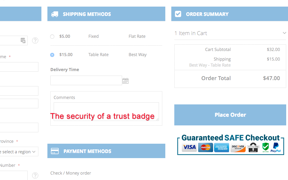
Some customers still doubt about the checkout security on mobile, which usually leads them to cart abandonment. In order to build trust and credibility from your customers, online stores should put trust badge on the checkout page. The checkout page is among one of the most critical places to add the security of a trust badge. These small trust marks can give a significant impact on a store’s conversion rates and help you get more revenue from existing traffic.
8. Bigger Action Button
Another point need to keep an eye to is that the buttons on your mobile site should be designed differently from your desktop version. For one, they need to be a good bit bigger to be readable and work properly. Using your fingers to navigate a touch screen panel is still somewhat tricky, thus try to avoid making it harder by having tiny buttons. Make them bigger on mobile, so they’re easily clickable. Also, make sure there is a suitable amount of distance between them. Clicking ‘back’ instead of ‘next’ can be frustrating for mobile web users.
Ensure that the only colored button on the checkout is the call to action button making it tempting to press. Use lighter colors for less priority CTA and darker colors for important ones.
Final Words
You must have found a lot of articles and research done on the ideal desktop e-commerce checkout page but a minimal study on the mobile eCommerce checkout page. People using mobile for eCommerce checkout is almost equal to the desktop usage, in fact minimally more. Hence, it is vital for us to make an ideal e-commerce checkout page, more responsive themes for better customer experience.
One Step Checkout for Magento 2
Cut down 80% of checkout time & increase 30% of conversion rates (Hyva ready)
Check it out!
Table of content

With over a decade of experience crafting innovative tech solutions for ecommerce businesses built on Magento, Jacker is the mastermind behind our secure and well-functioned extensions. With his expertise in building user-friendly interfaces and robust back-end systems, Mageplaza was able to deliver exceptional Magento solutions and services for over 122K+ customers around the world.
Related Post

Top 10 advantages of PHP over other languages
Join us to learn what the PHP programming language is and advantages Of PHP in practical applications!
14 mins read
|
07-25-2024
Shopify Vs Wix Vs Woocommerce: Which Platform Is The Best For You?
Shopify vs Wix vs WooCommerce: compare pricing, ease of use, features, scalability, integrations, and support to boost your online store. Discover the best ecommerce platform
14 mins read
|
07-25-2024
Mobile Web Development: A Comprehensive Guide for 2024 and Beyond
Your guide to mobile web development. Learn why it's vital, discover best practices, and leverage the latest technologies to drive business growth.
19 mins read
|
07-25-2024
Frontend Web Development: The Ultimate Guide for You
What is frontend web development and why is it crucial for your business? Learn the basics, benefits & key technologies in this guide to understand about the frontend.
14 mins read
|
07-25-2024
Website Support & Maintenance Services

Make sure your store is not only in good shape but also thriving with a professional team yet at an affordable price.