Cookies help us enhance your experience on our site by storing
information about your preferences and interactions. You can customize your
cookie settings by choosing which cookies to allow. Please note that disabling
certain cookies might impact the functionality and features of our services,
such as personalized content and suggestions.
Cookie Policy
These cookies are strictly necessary for the site to work and may not be disabled.
Cookie name
Description
Lifetime
Provider
_ce.clock_data
Store the difference in time from the server's time and the current browser.
1 day
Crazy Egg
_ce.clock_event
Prevent repeated requests to the Clock API.
1 day
Crazy Egg
_ce.irv
Store isReturning value during the session
Session
Crazy Egg
_ce.s
Track a recording visitor session unique ID, tracking host and start time
1 year
Crazy Egg
_hjSessionUser_2909345
Store a unique user identifier to track user sessions and interactions for analytics purposes.
1 year
HotJar
_hjSession_2909345
Store session data to identify and analyze individual user sessions.
1 day
HotJar
apt.uid
Store a unique user identifier for tracking and personalization.
1 year
Mageplaza
cebs
Store user preferences and settings.
Session
Mageplaza
cf_clearance
Store a token that indicates a user has passed a Cloudflare security challenge.
1 year
Cloudflare
crisp-client
The crisp-client/session cookie is used to identify and maintain a user session within the Crisp platform. It allows the live chat system to recognize returning users, maintain chat history, and ensure continuity in customer service interactions.
Session
Crisp
_ga
Store a unique client identifier (Client ID) for tracking user interactions on the
2 years
Google
_ga_7B0PZZW26Z
Store session state information for Google Analytics 4.
2 years
Google
_ga_JTRV42NV3L
Store session state information for Google Analytics 4.
2 years
Google
_ga_R3HWQ50MM4
Store a unique client identifier (Client ID) for tracking user interactions on the website.
2 years
Google
_gid
Store a unique client identifier (Client ID) for tracking user interactions on the website.
1 day
Google
_gat_UA-76130628-1
Throttle the request rate to Google Analytics servers.
1 day
Google
Advertising cookies
Advertising cookies deliver ads relevant to your interests, limit ad frequency, and measure ad effectiveness.
Advertising cookies deliver ads relevant to your interests, limit ad frequency, and measure ad effectiveness.
Cookie name
Description
Lifetime
Provider
_gcl_au
The cookie is used by Google to track and store conversions.
1 day
Google
__Secure-3PAPISID
This cookie is used for targeting purposes to build a profile of the website visitor's interests in order to show relevant and personalized Google advertising.
2 years
Google
HSID
This security cookie is used by Google to confirm visitor authenticity, prevent fraudulent use of login data and protect visitor data from unauthorized access.
2 years
Google
__Secure-1PSID
This cookie is used for targeting purposes to build a profile of the website visitor's interests in order to show relevant and personalized Google advertising.
2 years
Google
SID
This security cookie is used by Google to confirm visitor authenticity, prevent fraudulent use of login data and protect visitor data from unauthorized access.
2 years
Google
APISID
This cookie is used by Google to display personalized advertisements on Google sites, based on recent searches and previous interactions.
2 years
Google
__Secure-1PAPISID
This cookie is used for targeting purposes to build a profile of the website visitor's interests in order to show relevant and personalized Google advertising.
2 years
Google
__Secure-3PSID
This cookie is used for targeting purposes to build a profile of the website visitor's interests in order to show relevant and personalized Google advertising.
2 years
Google
SSID
This cookie is used by Google to display personalized advertisements on Google sites, based on recent searches and previous interactions.
2 years
Google
SAPISID
This cookie is used by Google to display personalized advertisements on Google sites, based on recent searches and previous interactions.
2 years
Google
__Secure-3PSIDTS
This cookie collects information about visitor's interactions with Google services and ads. It is used to measure advertising effectiveness and deliver personalised content based on interests. The cookie contains a unique identifier.
2 years
Google
__Secure-1PSIDTS
This cookie collects information about visitor's interactions with Google services and ads. It is used to measure advertising effectiveness and deliver personalised content based on interests. The cookie contains a unique identifier.
2 years
Google
SIDCC
This security cookie is used by Google to confirm visitor authenticity, prevent fraudulent use of login data, and protect visitor data from unauthorized access.
3 months
Google
__Secure-1PSIDCC
This cookie is used for targeting purposes to build a profile of the website visitor's interests in order to show relevant and personalized Google advertising.
1 year
Google
__Secure-3PSIDCC
This cookie is used for targeting purposes to build a profile of the website visitor's interests in order to show relevant and personalized Google advertising.
1 year
Google
1P_JAR
This cookie is a Google Analytics Cookie created by Google DoubleClick and used to show personalized advertisements (ads) based on previous visits to the website.
1 month
Google
NID
Show Google ads in Google services for signed-out users.
6 months
Google
Analytics cookies
Analytics cookies collect information and report website usage statistics without personally identifying individual visitors to Google.
Analytics cookies collect information and report website usage statistics without personally identifying individual visitors to Google.
Cookie name
Description
Lifetime
Provider
_dc_gtm
Manage and deploy marketing tags through Google Tag Manager.
1 year
Google
1P_JAR
Gather website statistics and track conversion rates for Google AdWords campaigns.
1 month
Google
AEC
1 month
Google
ar_debug
Debugging purposes related to augmented reality (AR) functionalities.
1 month
Doubleclick
IDE
The IDE cookie is used by Google DoubleClick to register and report the user's actions after viewing or clicking on one of the advertiser's ads with the purpose of measuring the effectiveness of an ad and to present targeted ads to the user.
1 year
Doubleclick
ad_storage
Enables storage, such as cookies (web) or device identifiers (apps), related to advertising.
1 year
Google
ad_user_data
Sets consent for sending user data to Google for online advertising purposes.
1 year
Google
ad_personalization
Sets consent for personalized advertising.
1 year
Google
analytics_storage
Enables storage, such as cookies (web) or device identifiers (apps), related to analytics, for example, visit duration.
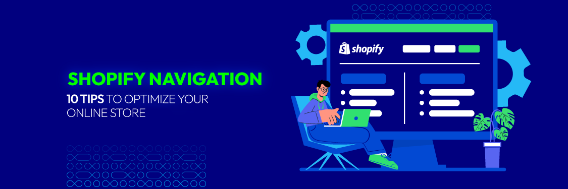
Shopify Navigation: 10 Tips to Optimize Your Online Store - Mageplaza
Shopify Navigation: 10 Tips to Optimize Your Online Store
Summer Nguyen|01-24-2024
Did you know that 94% of online users consider easy navigation the most important website feature?
In the world of Shopify, this translates to more than just a good user experience – it directly impacts your sales. A well-crafted Shopify navigation menu is your store’s roadmap, guiding customers towards purchases and boosting conversions.
In this guide, we’ll uncover the secrets to creating intuitive navigation that keeps your visitors engaged and leads them straight to checkout.
What is Shopify navigation?
Shopify navigation refers to the system of menus and links that help customers find their way around your online store. It’s a crucial aspect of your store’s design as it impacts the user experience and how easy it is for customers to find the products or information they are looking for.
Typical Shopify navigation elements:
Header: Contains the main navigation bar, logo, search bar, and sometimes a cart icon.
Footer: Often includes links to secondary pages (About Us, Contact, etc.), policies, and social media.
Product Filtering: On collection pages, users can filter products by various attributes (size, color, etc.).
Breadcrumb Navigation: Helps users understand their location within the site’s structure.
Creating an intuitive and well-organized navigation structure is crucial for providing a positive user experience in an online store. It helps customers quickly find what they are looking for, encourages exploration, and can contribute to increased sales and customer satisfaction.
Features of good Shopify navigation
Good Shopify navigation goes beyond basic functionality and incorporates features that enhance the user experience, making it easier for customers to find what they want and encouraging them to explore more of your store. Here are some essential features:
Mega Menus: These expanded menus provide a visually appealing way to showcase a wide range of products or categories. They often include images, subcategories, and even featured products, creating an engaging browsing experience.
Sticky Navigation: This feature keeps the navigation bar visible at the top of the screen even as users scroll down the page. It ensures quick access to navigation options regardless of where the user is on the page.
Breadcrumbs: These navigational aids show the user’s path within the website’s hierarchy. They provide context and make it easy to backtrack to previous categories or pages.
Filtering and Sorting Options: Especially important on category and collection pages, these tools allow users to refine their search based on attributes like price, size, color, or other relevant criteria.
Product Quick View: This feature enables users to see a product’s details in a popup window without leaving the current page. It’s a convenient way to compare products and get a quick overview before deciding to view the full product page.
Recently Viewed Products: This feature displays a list of products that the user has recently viewed. It helps them easily revisit items they were interested in and encourages them to add them to their cart.
Faceted Search: This advanced search function allows users to filter products based on multiple attributes simultaneously. It’s particularly helpful for stores with a wide range of products.
Prominent Call-to-Action Buttons: “Add to Cart” or “Buy Now” buttons should be easily visible and accessible throughout the navigation and product pages to encourage immediate purchase decisions.
Personalized Recommendations: Based on user behavior or browsing history, suggest relevant products or categories to enhance the shopping experience and drive cross-selling.
Visual Cues for Sales and Promotions: Use eye-catching banners, labels, or icons to highlight ongoing sales, discounts, or special offers, drawing attention to products that might interest the user.
By incorporating these features, you can create a Shopify navigation that is not only functional but also engaging and user-friendly. This can lead to increased customer satisfaction, longer browsing sessions, and ultimately, higher conversion rates.
Types of Shopify navigation
Shopify navigation comes in different types, each with its own advantages and best-use cases:
Horizontal Navigation Bar
Location: Typically placed at the top of the page.
Features: Offers a clean, simple way to display main categories. Can include dropdowns for subcategories
Best for: Stores with a limited number of categories or those that prioritize a minimalist design.
Vertical Sidebar Navigation
Location: Usually positioned on the left side of the page.
Features: Provides ample space for categories, subcategories, and even filtering options. Can be collapsible for a cleaner look on smaller screens.
Best for: Stores with extensive product catalogs or those that want to offer detailed filtering options.
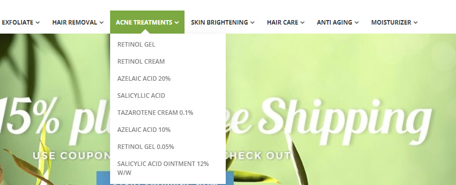
Dropdown Menu
Location: Integrated within horizontal or vertical navigation bars.
Features: Reveals subcategories or additional options when the user hovers over or clicks on a main category.
Best for: Adding hierarchical structure to navigation without taking up too much space.
Mega Menu
Location: An expanded version of a dropdown menu.
Features: Offers a large canvas for showcasing categories, subcategories, images, promotional banners, and even featured products.
Best for: Stores with diverse product ranges or those that want to create a visually engaging navigation experience.
Hamburger Menu
Location: Represented by three horizontal lines, usually placed in the top corner on mobile devices.
Features: Collapses the navigation menu into a compact icon to save screen space. Expands when clicked to reveal the full menu.
Best for: Optimizing navigation for mobile devices.
Footer Navigation
Location: At the bottom of the page.
Features: Typically includes links to secondary pages (About Us, Contact, Shipping, etc.), policies, and social media links.
Best for: Providing additional information and resources that don’t fit into the main navigation.
Tips to Optimize Your Shopify Navigation
Optimizing your Shopify navigation is crucial for providing customers with a seamless and user-friendly experience. You can use some tips below for navigation optimization.
Streamline Main Menu
This is the most fundamental aspect of Shopify navigation and should be addressed first. A clear, concise main menu sets the foundation for the rest of the navigation structure. Here’s how to optimize it:
Prioritize essential pages:
Home: Always include a link to your homepage.
Shop: This should lead to your main product catalog or collection pages.
About Us: Tell your brand story and build trust.
Contact: Make it easy for customers to reach out.
Account: Allow customers to create profiles, track orders, and save preferences.
Limit top-level items:
Aim for 5-7 main menu items maximum. Too many choices overwhelm users.
Use clear, concise labels that accurately describe the page content.
Avoid jargon or overly creative names that might confuse customers.
Consider menu placement:
Most Shopify themes offer horizontal top navigation. This is generally preferred for its familiarity and visibility.
Experiment with different placements to see what works best for your store.
Visual hierarchy:
Use font size, weight, and color to distinguish between top-level items and submenu items.
Ensure the menu contrasts well with your site’s background for readability.
Utilize Dropdowns and Submenus
Dropdowns and submenus add a layer of organization to your main menu. Group related products into subcategories within each main category. This makes navigation intuitive and helps customers quickly drill down to specific items they’re interested in.
Hierarchy: Create a clear hierarchy with your main menu as the top level, followed by dropdowns for subcategories, and potentially additional submenus for further categorization.
Visual Cues: Use visual cues like indentation or arrows to indicate that a menu item has a dropdown.
Mega Menus: For stores with a large number of products, consider using mega menus, which display multiple columns of subcategories and even product images within the dropdown.
Limit Depth: Avoid going too deep with submenus. 2-3 levels of depth are usually sufficient for most stores.
</p>
</div>
Optimize Product Categorization
Logical arrangement: Organize categories into groups that make intuitive sense to your customers. For example, a clothing store might have main categories like “Men,” “Women,” and “Children”.
Customer perspective: Think about how your customers would naturally group and search for products. Use terminology that they would understand.
Clear names: Use clear, descriptive names for categories and subcategories. Avoid vague or overlapping names.
Multiple categories: If a product fits into multiple categories, strategically place it in the most relevant one or create a “Featured Products” section to showcase it.
Regular review: As your product inventory changes, periodically review and update your categories to ensure they remain accurate and helpful.
Implement Effective Search Functionality
Effective search functionality plays a crucial role in enhancing user experience and providing efficient access to information on a website. Follow these tips to create a robust search feature.
Prominent Placement: Place the search bar in a highly visible location, typically in the header or top center of your store.
Auto-Suggest: Implement an auto-suggest feature that predicts what the customer is searching for as they type, saving them time and effort.
Filters: Add filters to your search results page to allow customers to refine their search by criteria like price, brand, size, etc.
Search Results Page: Optimize the search results page with relevant product information, images, and clear calls to action.
Ensure Mobile Responsiveness
According to Semrush, there were 313% more visits on mobile compared to desktop in 2023. Therefore, prioritize a seamless experience on mobile devices as this is where a significant portion of users will access your store.
To achieve this goal, follow these tips:
Use a mobile-responsive theme: Shopify offers many themes that automatically adjust to different screen sizes, making it easy and effective for your online store to adapt to any device.
Simplify your Shopify navigation: Mobile screens have limited space. Streamline your main menu, use a “hamburger” menu icon (three horizontal lines) to hide submenus until they’re needed.
</p>
</div>
Consider a sticky header: A sticky header that remains at the top of the screen as users scroll can make navigation easier.
Optimize images on your site: Use Shopify’s built-in image optimization tools or compress images before uploading.
Prioritize essential content: Display the most important information upfront on mobile, such as your logo, search bar, and main product categories.
Use large, touch-friendly buttons: Make sure buttons are easy to tap with a finger, especially on smaller screens.
Streamline checkout: Optimize your checkout process for mobile by minimizing form fields and allowing guest checkout.
Use apps: Explore Shopify’s App Store for tools that can further enhance your mobile navigation and user experience.
Use Breadcrumbs
Breadcrumbs show users where they are on your website. They help users navigate, especially on large sites, by making it easy to go back to previous pages.
There are some factors to know when using breadcrumbs:
Clear Hierarchy: Clearly display the path from the homepage to the current page.
Clickable Links: Make each breadcrumb segment a clickable link to allow easy backtracking.
Separator: Use a visual separator (“>” or “/”) between each breadcrumb segment.
Placement: Typically place breadcrumbs above the page title or below the main navigation.
Consider Breadcrumb Schema: Implement breadcrumb schema markup to enhance SEO.
Fix Broken Links
For a seamless customer experience and to keep your online business credible, you must fix broken links in your Shopify navigation. If users encounter this situation often, they will shop at another store. Therefore, this is an important feature to fix in Shopify navigation.
Specifically, you can apply the following options to fix broken links in Shopify:
Identify Broken Links: Regularly check for broken links using website auditing tools, link checkers, or Google Search Console.
Review Navigation Menus: Check your main navigation menu and dropdowns for broken links to pages, collections, products, or external sites.
Update or Remove Broken Links: Fix or remove links with the correct URL, or redirect to a relevant page if the content has moved.
Update URL Redirects: Use URL redirects in the ‘Online Store’ settings for moved or renamed pages, products, or collections.
Update External Links: Ensure external website links are valid, updating or removing broken ones.
Check Footer Links: Verify that footer links to policies, contact info, and other pages work correctly.
Test Mobile Navigation: Check that all navigation elements work properly on mobile devices.
Embrace Social Sharing
Embracing social sharing buttons and practices on your Shopify store can significantly enhance your online presence, increase brand reputation, and drive traffic to your site. Here are some tips on how to effectively incorporate social sharing:
Add social sharing buttons: Integrate social sharing buttons prominently on product pages, blog posts, and other relevant content. Shopify allows you to include these buttons easily through your theme settings or third-party apps.
Choose relevant social media platforms: Pay attention to social media channels that correspond with your target audience. Include buttons for popular platforms like Facebook, Twitter, Instagram, Pinterest, and others relevant to your niche.
Optimize button placement: Place social sharing buttons in visible locations on your product pages, such as near product images or descriptions. Also, consider adding buttons to other high-traffic areas like the shopping cart or checkout confirmation page.
Utilize open graph tags: Implement open graph meta tags on your product pages. It helps control how your content appears when shared on social media platforms, providing a more visually appealing representation.
Enable social login: Users can log in or create accounts using their social media credentials. This streamlines the registration process and makes it easier for users to share content directly from their accounts.
Create shareable content: Craft compelling and shareable content. Whether it is product descriptions, blog posts, or images, focus on creating content your audience will find valuable and want to share with their networks.
Pay attention to the user’s habits
A big challenge in Shopify navigation is balancing uniqueness with your expectations while making it easy for users to use your site. Because most users, when browsing the web, have specific conventions because of many years of habits. These conventions include:
Place the main navigation at the page’s top (or left).
Place the logo at the page’s top left (or center).
Make the logo clickable so it always brings visitors back to the homepage.
Some links and buttons change color/appearance when you hover over them.
Use the shopping cart icon on an e-commerce site. This icon also has a number badge representing the number of items in the cart.
Make sure the images have buttons and sliders so users can click to view the images manually.
Consider An AI Chatbot
Integrating an AI chatbot into your Shopify store’s navigation can enhance customer engagement, provide real-time assistance, and streamline the shopping experience.
Choose a chatbot platform or service that integrates seamlessly with Shopify. Some popular options include Shopify Chat (Shopify’s built-in chat feature), Tidio, or Chatbot Apps on the Shopify App Store.
After choosing the right platform for your store, you can install and set up the chatbot app selected through the Shopify App Store.
Follow the app’s installation instructions, which typically involve connecting your Shopify store to the chatbot platform.
Configure the chatbot’s settings within the app dashboard. Customize the chatbot’s appearance, behavior, and other preferences to align with your brand and customer service strategy.
Define the conversation flows and responses that the chatbot should provide. Consider common customer queries related to product information, order status, shipping details, and other frequently asked questions.
Ensure that the chatbot is integrated with your Shopify store’s data. This may involve connecting the chatbot to your product catalog, inventory system, and order management to provide accurate and up-to-date information.
Remember that the success of your AI chatbot installation depends on continuous monitoring, optimization, and responsiveness to consumer requests. Evaluate the chatbot’s performance regularly and make changes to improve the overall customer experience.
Common issues on Shopify navigation
While Shopify is a robust platform, like any system, it can encounter common issues related to navigation. Here are some common issues you might face with Shopify navigation
Unresponsive or slow navigation: Optimize your images, use a responsive theme, and minimize the use of third-party apps that may impact performance. Consider a content delivery network (CDN) for faster loading times.
Mobile responsiveness problems: Choose a mobile-responsive theme, test your navigation on various devices, and adjust styles using media queries if needed.
Issues with mega menus: Verify that your theme supports and configures them correctly. Consider checking for theme updates or using a third-party app for mega menu functionality.
Inconsistent design: Maintain a consistent design throughout your store. Use the theme settings to control fonts, colors, and styles, ensuring a cohesive look and feel.
Regularly analyzing your Shopify store, running tests, and remaining up to speed with the newest theme and app versions may assist you in identifying and addressing navigation issues as soon as possible. Furthermore, Shopify’s help and community forums are excellent resources for resolving common issues.
Conclusion
Surely, with our information above, readers will better understand what a Shopify navigation bar is and the most effective way to improve website navigation. This extremely useful tool helps your store impress and retain customers longer. You can apply our suggestions above to optimize the Shopify navigation better.
Summer is the CMO and Digital Commerce Solution Expert with 10+ years of experience. She specializes in Magento, Shopify, ERP, CRM, AI, and Blockchain, delivering strategic solutions that transform businesses. With a deep understanding of digital commerce, she helps brands scale and stay ahead in a competitive market.
A practical guide to GA4 ecommerce reports for Magento merchants, covering what to track, how to read each report, and specific tips to turn data into revenue decisions.
Explore the best 5 ways to hide products on Shopify. Learn how to manage visibility, protect pricing, and create a tailored shopping experience for buyers.
